On Feb 1, 2024 at 6 pm EST, I’ll show you how to letter your comics in Clip Studio Paint, why good lettering in comics matters, where to download fonts, and so much more!
There will be a Q&A section at the end of the presentation, as well, for the audience to ask questions.
Today, I’ll show you how I use Trello to track and manage all of my comics and projects!
I have been using Trello for two years now. It has been an absolute game-changer for me and how I organize my projects. If you’ve ever wondered how I’m able to make so many comics, give this a watch.
Members of my Art Club saw this video before it became public. If you would like to get early access to tutorials (and club-only downloads), join on my Subscribe page.
Oh! If you’re in Toledo, OH, I’m at Toledo Game Room tomorrow (May 6) for Free Comic Book Day! I’ll have discounted merch and other cool stuff.
That’s all for now. Thanks for bearing with me and my shameless plugs. I gotta get back to packing boxes for Free Comic Book Day and the upcoming move.
Are you an aspiring comic artist struggling with basic character design? Do you even know what the basics ARE?
Well, strap in and join me on this live stream! I’ll walk you through what I’ve learned in 8+ years of drawing comics. Plus, I’ll show you some of my favorite character designs in media.
“But I don’t have time to watch an entire archived live stream!” Well, I DO encourage you to set the time aside to watch this. But here are some important bullet points to keep in mind:
The Silhouette Test – this is a tried and true method, and is even used by Disney’s animation team. Basically, does the silhouette of your character stand out in a lineup?
Symbols – what symbology is present in your world? How does that affect the character? Do they wear colors or symbols that resonate with them?
Contrast – If you’re designing multiple characters, how can you make them stand out from each other? Can you have different or complimentary colors to each character? What if one character styles their hair up, but the other lays it down? etc.
Similarity – If you’re designing a team, how can you indicate that – but still have them stand apart from each other? What elements do they have in common? WHY are they in common?
Simplify – when you draw comics, keep the design SIMPLE. You will be drawing these characters repeatedly. Don’t make it complicated or you will hate yourself.
And finally… Be Open-Minded and Be Curious!
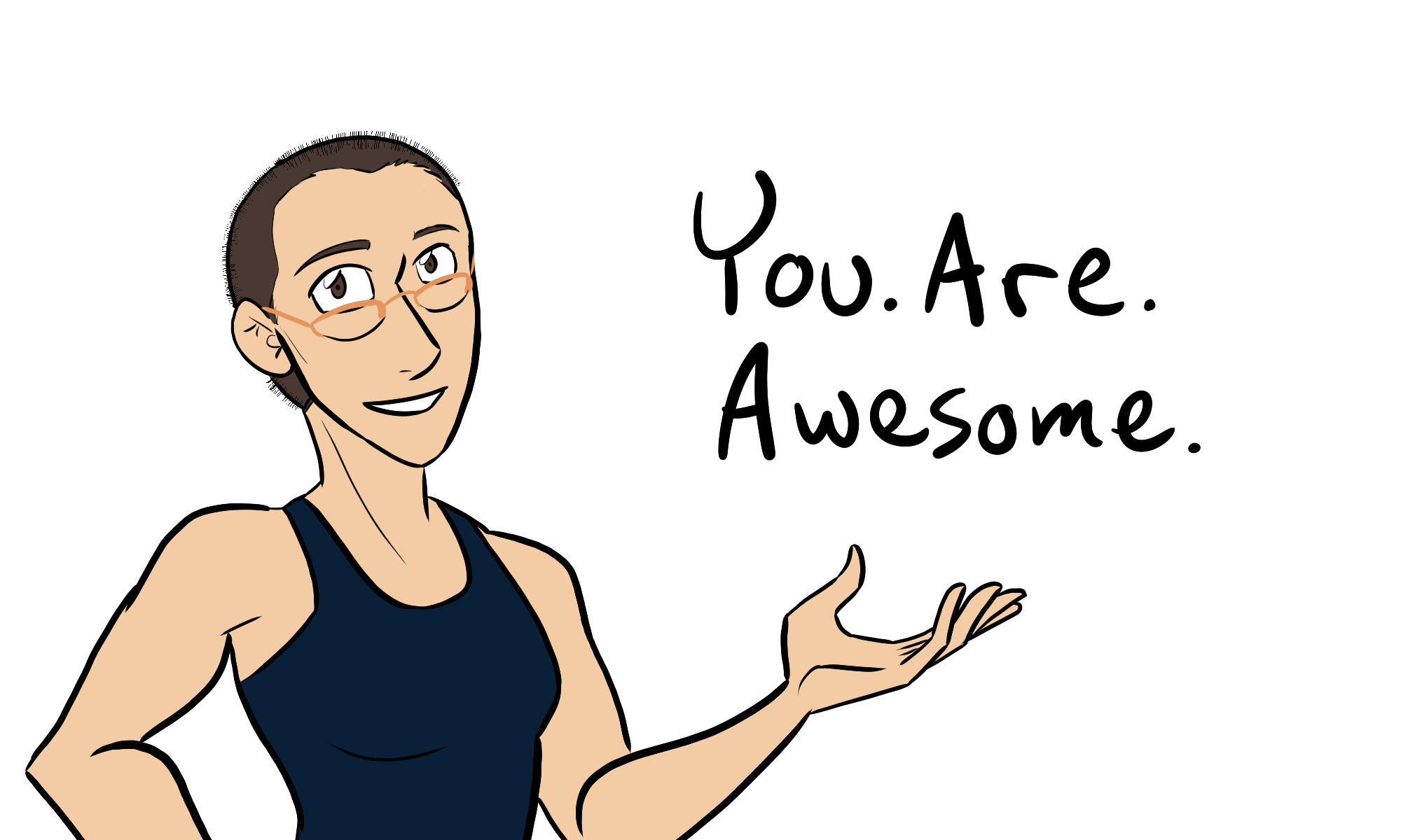
I hope this helps you on your creative journey. Thank you for watching and reading!
In this archived live stream, I show you some Clip Studio Paint tips and tricks!
Clip Studio Paint is my preferred drawing program. I’ve been using this for years, yet it feels like I learn something new every day. And here, I wanted to share with you some Clip Studio Paint tips and tricks I’ve recently learned!
I streamed this back on May 29 on YouTube. Now it can be archived here for your reference.
Here are some timestamps for easy reference:
BASICS:
3:00 for opening and setting up a new document. (Includes how to change canvas color)
4:00 recording timelapses
4:45 hand-lettered effects
7:00 coloring entire layers
8:17 how to change colors of specific elements in a layer using “lock transparent pixels”
INTERMEDIATE:
10:30 a nifty trick erasing bordered lines
13:00 add outlines to objects already drawn
13:45 add shoelaces and other costume details
25:03 my old method of adding symmetry
26:00 make rulers visible
27:20 add guidelines
28:20 group layers together
31:20 how to make custom brushes
Did I forget something in the live stream? Leave a comment below and let me know!
Do you have questions? Let me know, too. I plan on doing another live stream like this one, showing even more tips and tricks.
One of the backers of The Legend of Jamie Roberts, Chapter 1 had asked to see some scripts for the comic as part of the PDF reward. This question made me realize that my scripting process is not like how I’ve seen other comics makers work on their scripts.
Why?
Well, most comic makers I know only WRITE the script. Usually in a movie-script-like format, in which it goes like this:
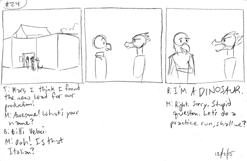
Panel 3:
Billy stares at Marc Macaw in disbelief. Marc Macaw realizes his gaff and smiles a bit sheepish.
BILLY: …I’M A DINOSAUR.
MARC: Right. Sorry. Stupid question. Let’s do a practice run, shall we?
Truth be told, this format is how I write my rough draft of my comic scripts.
The only comic I’ve made that this didn’t apply to was Johnson & Sir. That one, I wrote out the story page by page. It’s not a method I would recommend to anyone unless you’re writing gag comics.
Rough Draft: type it up in my version of a comic script format.
Second Draft: Read the rough draft and thumbnail the pages. I make adjustments as I go.
Sometimes the second draft is a re-typing of the rough draft. If that’s the case (like with The Case of the Wendigo), the thumbnailing stages will actually be my Third or even Fourth draft.
What are thumbnails?
This is a term I stole from animation – it means to VERY roughly sketch out how a page looks. I’m talking stick figures and bubbles. Thumbnails are in a sketchbook and are meant to just show how the page would look in a rough layout.
I find thumbnailing the pages to be helpful, even if I wait several months between the rough draft and the thumbnail draft (or, Thumb Draft, if you will).
When I work on the Thumb draft, I can sketch out how the page looks according to the script. And if I don’t like how many words a character says, or I don’t like how certain scenes pan out, I can draw a different result.
As a visual person, it helps me to SEE how a scene pans out, rather than just read about it.
So if you’re having an issue in your comic script, try drawing it out in rough stick fugure-ish form. It may help you visualize the scene easier.