This is Roxie, a transgender roller derby girl and star of the webcomics Validation and ROXIE. I painted this as part of a series of watercolor paintings as a fundraiser for the Zebra Youth Coalition in Orlando, Florida.
I want to say I painted this with Qor watercolors? It’s actually been so long since I painted it that I forgot!
The original paintings have since sold out. If you see this out in the wild, it’s most likely a print.
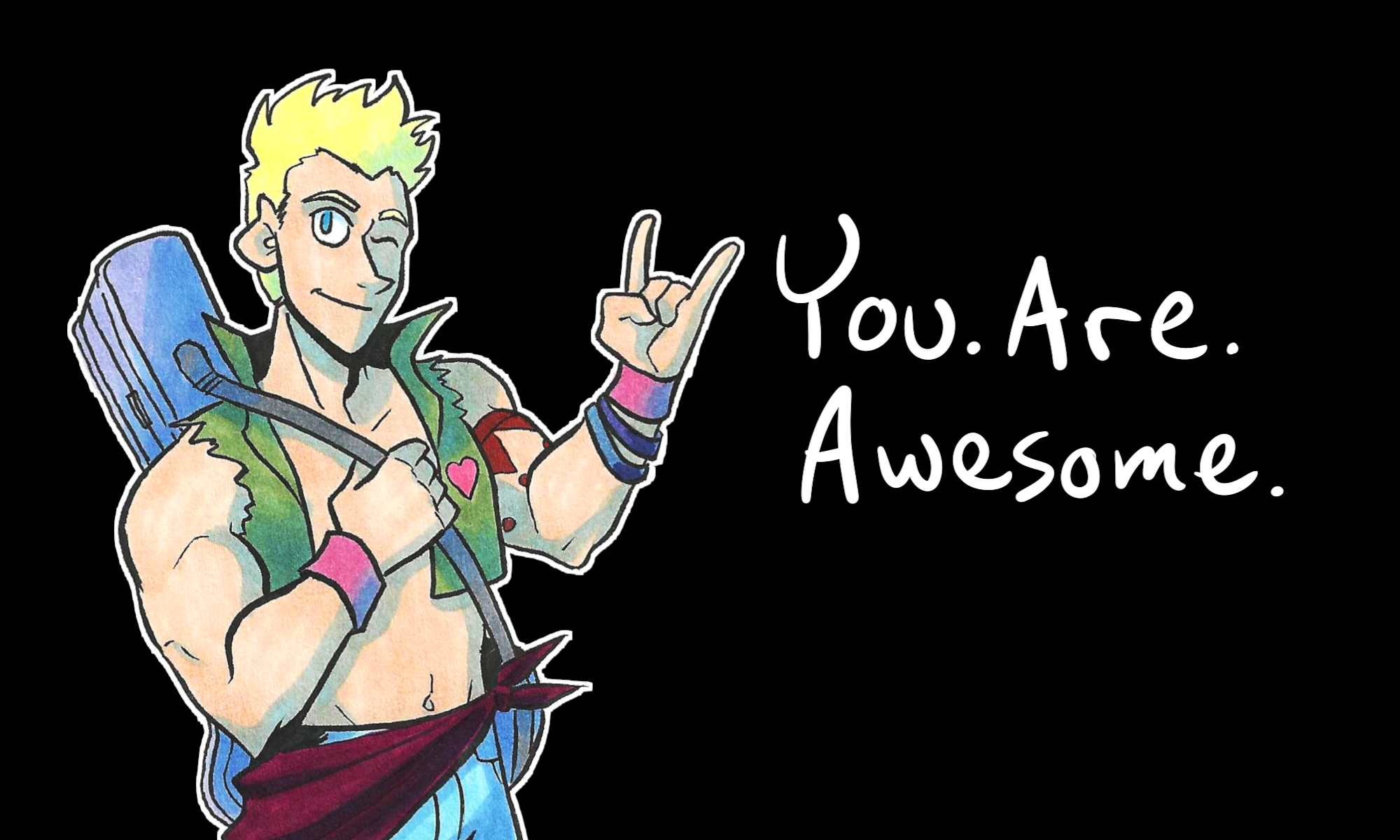
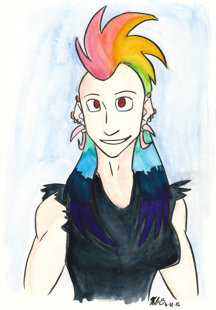
I wanted to share this because here in Toledo, OH, it’s PRIDE month! To celebrate, I’m sharing Pride-related illustrations each week during August.
Stay tuned for more Pride art! Or, to get sneak peeks ahead of time, sign up for my email newsletter (it’s free, spam-free, and I don’t sell your email to anybody).
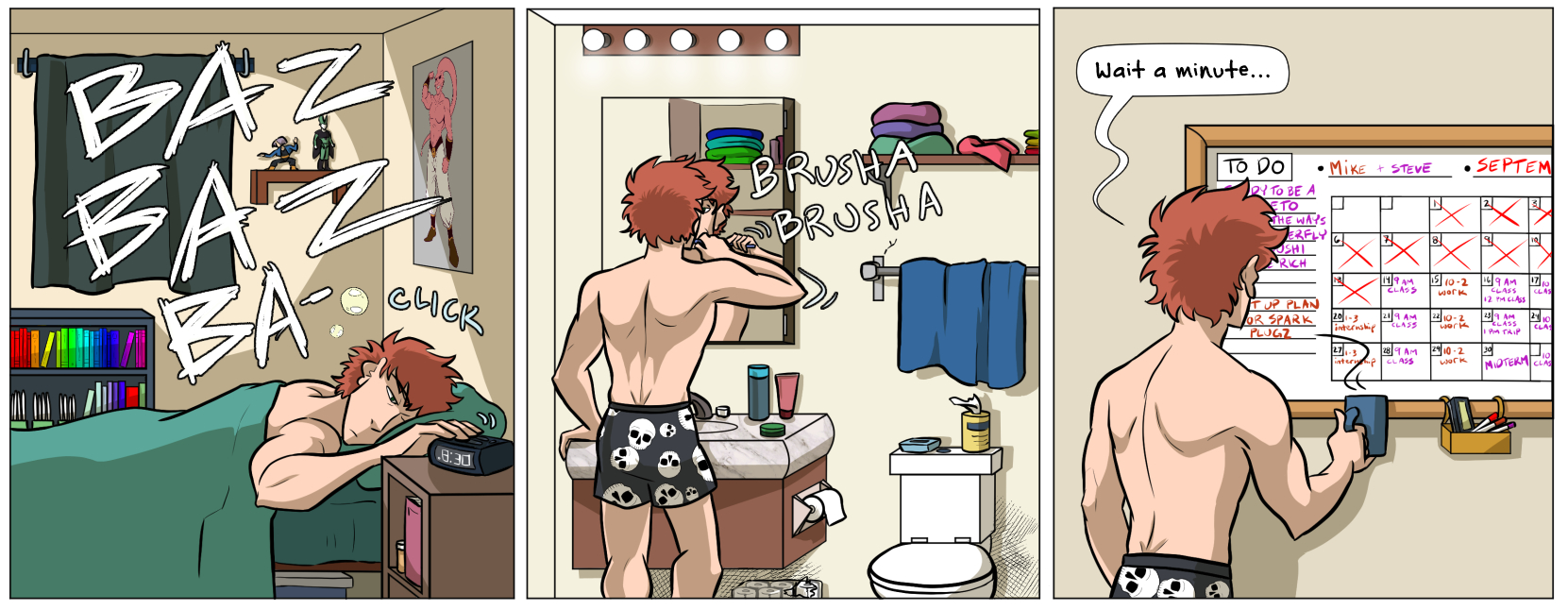
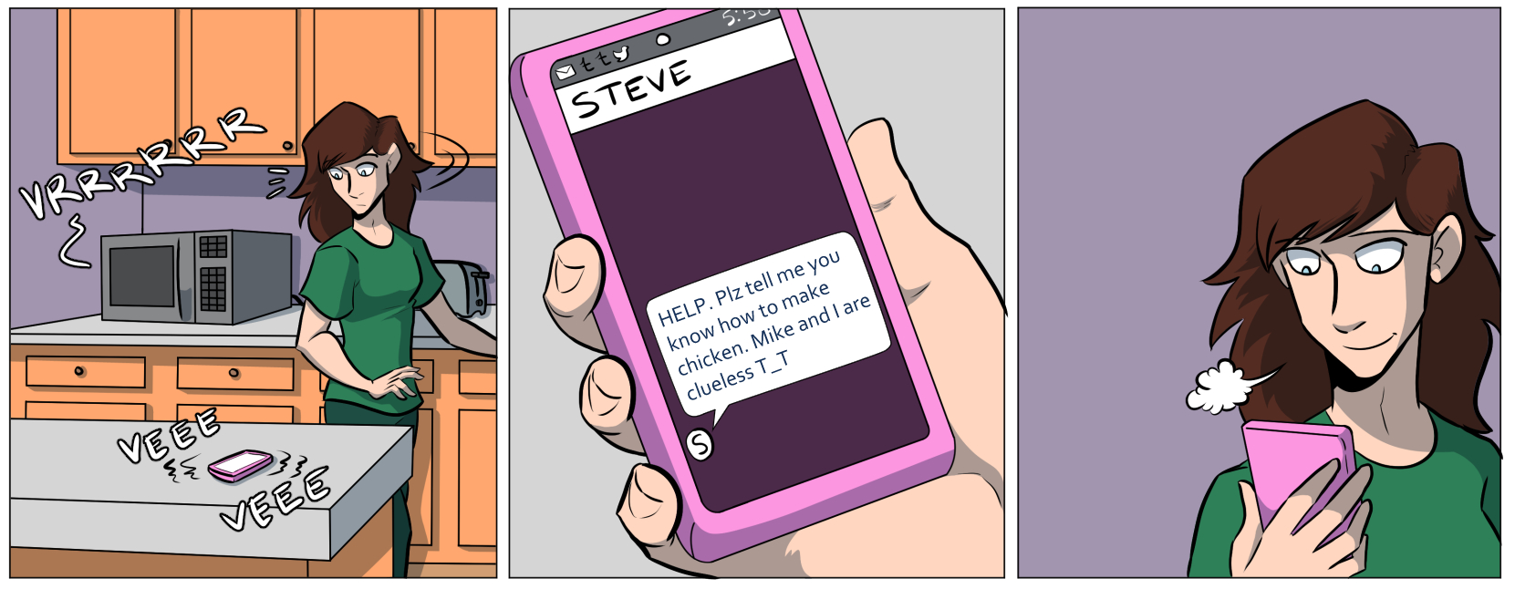
New Punk Signal – two college boys, Mike and Steve, have big dreams to support their friends and their indie music…until the pandemic hits and shuts everything down. Now they have to figure out how to support the people they love when the world is changing its frequency.
Fwishi’shi – Fuloos is a bird-man who lives alone in a home by the sea. By day, he runs a radio show in the small town of Seabank. One day, he meets a fan of his work and her boyfriend – and everything changes.
These two stories are about community, assistance, and platonic love that saves the day. And with your help, I’d love to get these stories into the hands of more readers with the power of KickStarter!
So New Punk Signal is a comic spin-off-slash-sequel to Validation and ROXIE, following resident himbos Mike and Steve. And Fwishi’shi is – for the first time in my book catalog – a written novella. It’s not a comic (gasp)! It’s also set in the same universe as two comic projects I’ve done called Johnson & Sir and Thoughtful Dinosaur.
I like to think that you don’t need to read the other books to understand what’s going on in New Punk Signal and Fwishi’shi. But if you would like to delve more into those worlds, these extra stories are available as add-ons in the campaign! If you’re inclined, there’s also The Radio Tower Tier, where you can get all of these stories in one bundle.
THE HOW
The good news is – a lot of expenses for Fwishi’shi are covered by a grant from the Toledo Arts Commission! Thank you to the commission for covering the cost of the ISBNs, printing 20(ish) copies of the book, and printing bookmarks.
However, New Punk Signal needs a little support to get to print. Also, if Fwishi’shi gets a lot more than 20 orders, I need a little help to cover printing. There’s also the added wrinkle of distributing these books once they’re printed.
For these reasons, I’ve opted to run a KickStarter – not only to help New Punk Signal get printed, but to get BOTH books in the hands of readers with KickStarter’s reach.
So in short – the asking goal is low because some expenses are already covered thanks to the Toledo Arts Commission (yay)! But KickStarter will help get these books out to the masses.
THE WHEN
Because of grant deadlines and printer timelines, this campaign will run UNTIL Aug 31. Once the funding period ends, I can place orders to the printers right away. The goal is to get everything printed and in the hands of backers by September 30.
THE WHY
New Punk Signal and Frishi’shi are both projects I made during the COVID-19 pandemic lockdown. Both were created to process my feelings and what I had seen work – and not work – during this time. I’ve also come to realize that as time goes on, the more my stories focused on the importance of community and helping friends along the way. And, as a result, both of these stories are my love letter to the importance of platonic love.
We live in a culture that romanticizes individualism, and only allows exception for romantic love. I wanted to challenge both by creating New Punk Signal and Fwishi’shi, stories that focus on the importance of interpersonal connections outside of romance.
So if you can, check out the campaign and choose the reward tier that works best for you! We also have add-ons such as spin-off comics, prints, and even art books!
Broke? Share this campaign far and wide! Shares help more than you know.
This post is the first in a week-long blog post update extravaganza! (It’s when I update my blog everyday, Monday through Friday, just for this week).
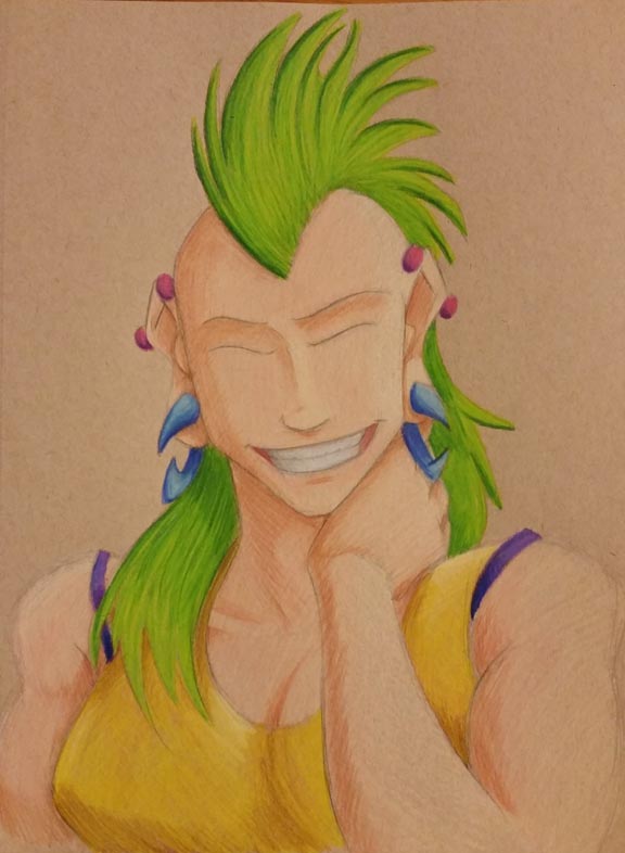
I just finished a new illustration in colored pencil! So to celebrate, I wanted to show the progression of how I made it and the tools I used. And at the end of the blog post, you can see the finished piece.
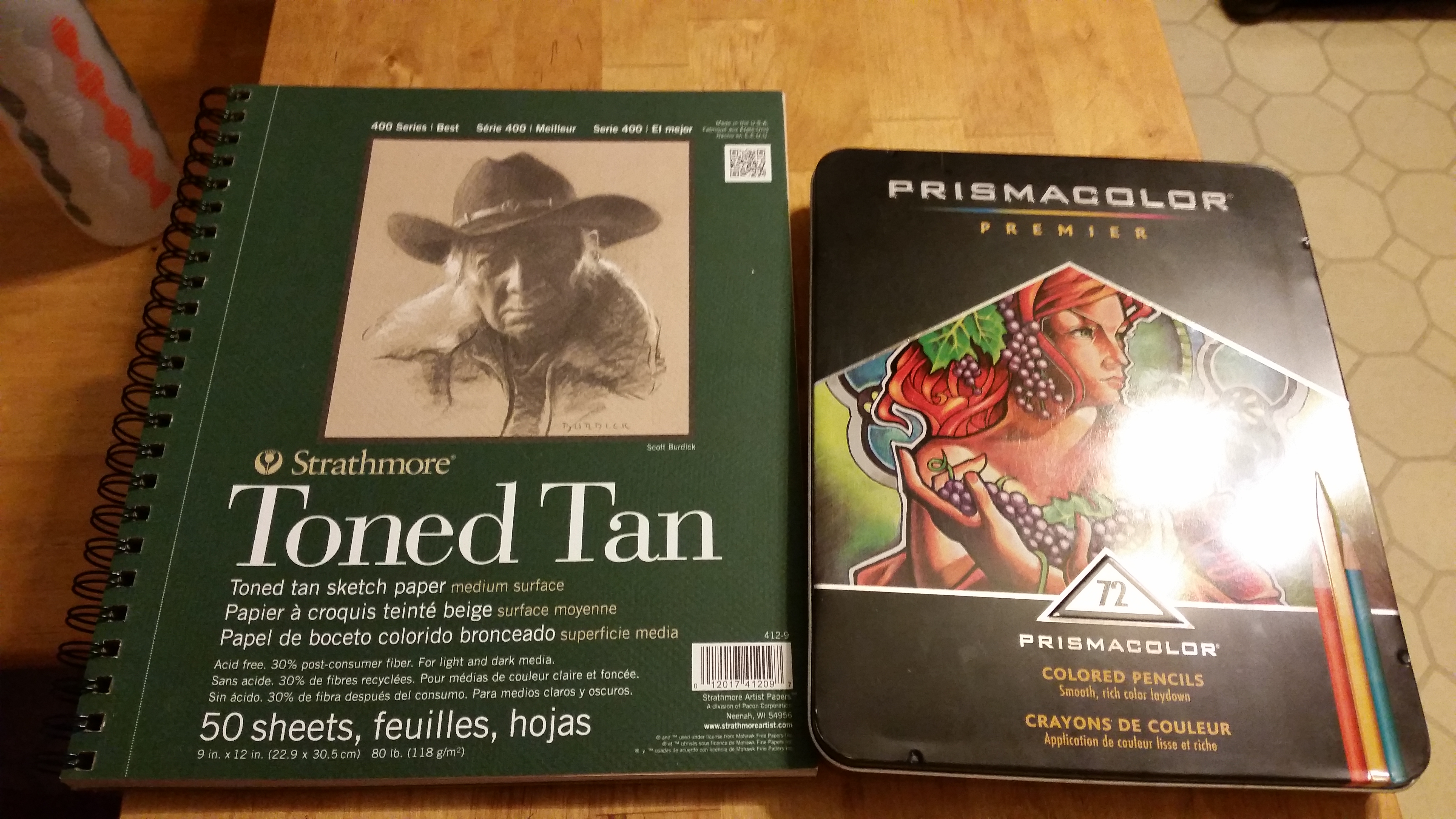
To start, I grabbed my Prismacolor 72 piece colored pencil set (which I had left over from my first ever art class in college. Hold on to your supplies, students!) and an 9 wide inch by 12 inch pad of Strathmore Toned Tan paper.
Once I got those, I drew the black and white version of what I wanted to color. I sketched in (lightly) where the shadows would lie with my trusty F hardness sketch pencil. I use that pencil for all of my drawing and sketching.
Then I go over those lines with my mechanical pencil, which I believe is a B hardness in lead, so it’s darker than the F.
Next, I color over the whole sketch with a white colored pencil. I do this so that…
I don’t lose my shadows
I have a layer of colored pencil between my pencil lines and my actual colors, thus
making my art much cleaner and less muddy.
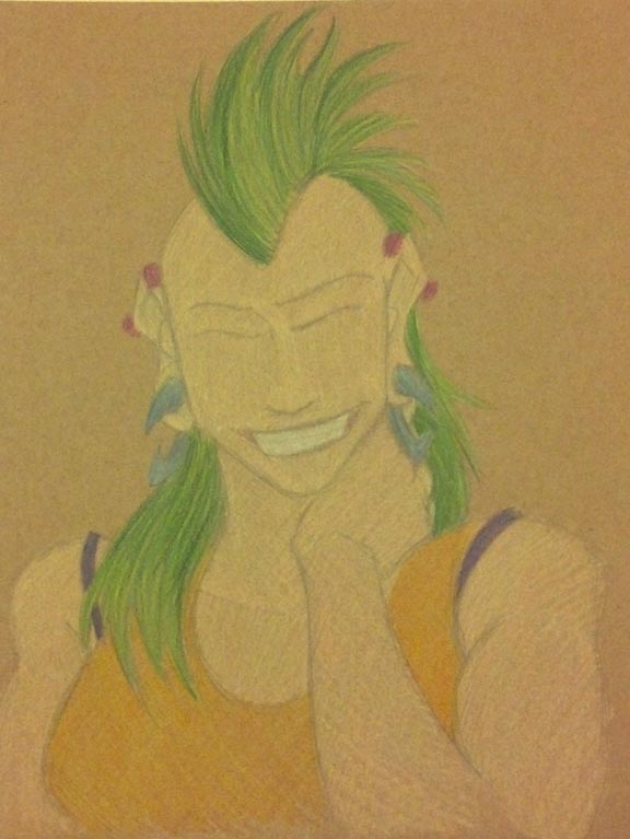
Once the white is laid down, I lay down the brightest colors I’m going to use, and color from light to dark.
The first layer of colors end up looking a little like this:
Click to enlarge.
It’s not the prettiest…yet.
Also, I did not use light peach straightaway for the skin tone. I laid down the highlight color, which is a mix of Cream and Beige.
Alright, so I drew the light colors first. What next?
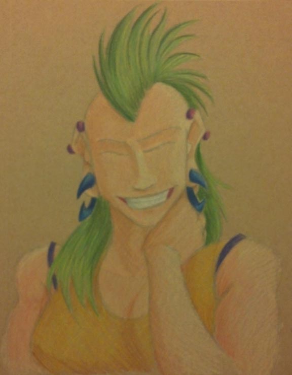
The shadows!
Click to enlarge.
I really wanted to try and find colors that would compliment Roxie’s hair, which is why I went with fuchsia industrial piercings, dark blue gauges, a purple camisole, and an orange-yellow tank top.
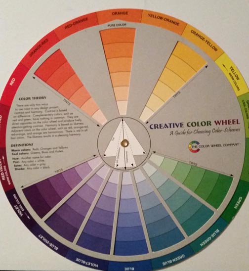
Also, use the color wheel. It is your friend.
I got this sucker for around 6 or 7 US Dollars at a craft store in college. (Click to enlarge). One side is tints and the other is shades.
I used this to help me find the complimentary colors mentioned above, and it also helped me find what colors to use for shading.
So at this point, I have colored the highlights and the shades. There’s just one layer missing…
Oh I know! The mid tones!
I took the colors I wanted for the mid tones in each area, which went a little like this:
Mohawk: Spring Green
Shirt: Canary Yellow
Gauges: Cloud Blue
Camisole: Violet
Piercings: Magenta
Skin: Light Peach
Teeth: Cool Grey 20%
But after I colored the mid tones and finished out a few minor details (like the teeth), I noticed that the shade tones got lifted up a little.
So I went back over the mid tone layer with the shades again. Which went like this:
Mohawk: Dark Green
Shirt: Dark Brown
Gauges: Ultramarine
Camisole: layers of Violet Blue, Ultramarine, and Indigo Blue
Piercings: Mulberry
Skin: Sienna Brown
Teeth: French Grey 60%
Then I added some neutral tones like brown in the linings of the mouth.
The last step was VERY LIGHTLY adding Black on the edges to help delineate shadow.
Finally, at long last…
FINISHED! Click to enlarge.
This portrait is finished!
Looking at it, there are still some errors that I notice (like her nose), but I have to say…
This is the first colored pencil piece of art I have made in a little over five years. I think I did alright. It’s not the best, but it’s not the worst. With practice, I’ll get better.
So what do you think? Should I do more portraits in colored pencil? Let me know your thoughts in the comments below!
In other news, the KickStarter for Seeing Him is wrapping up, and, to be honest, I don’t think we’ll make the goal.
But that’s ok! Kia and I have been talking behind-the-scenes and we have a few ideas for what to do next. I’ll be able to share them with you soon.