In this post, I’ll be talking a lot about the “Seeing Him” Webcomic KickStarter project, where Kia and I run a KickStarter to jump start our new webcomic.
Don’t know what “Seeing Him” is? Go to the KickStarter Page, or go here!
Did you look? Cool. Anyway…
This update will come to you in THREE PARTS.
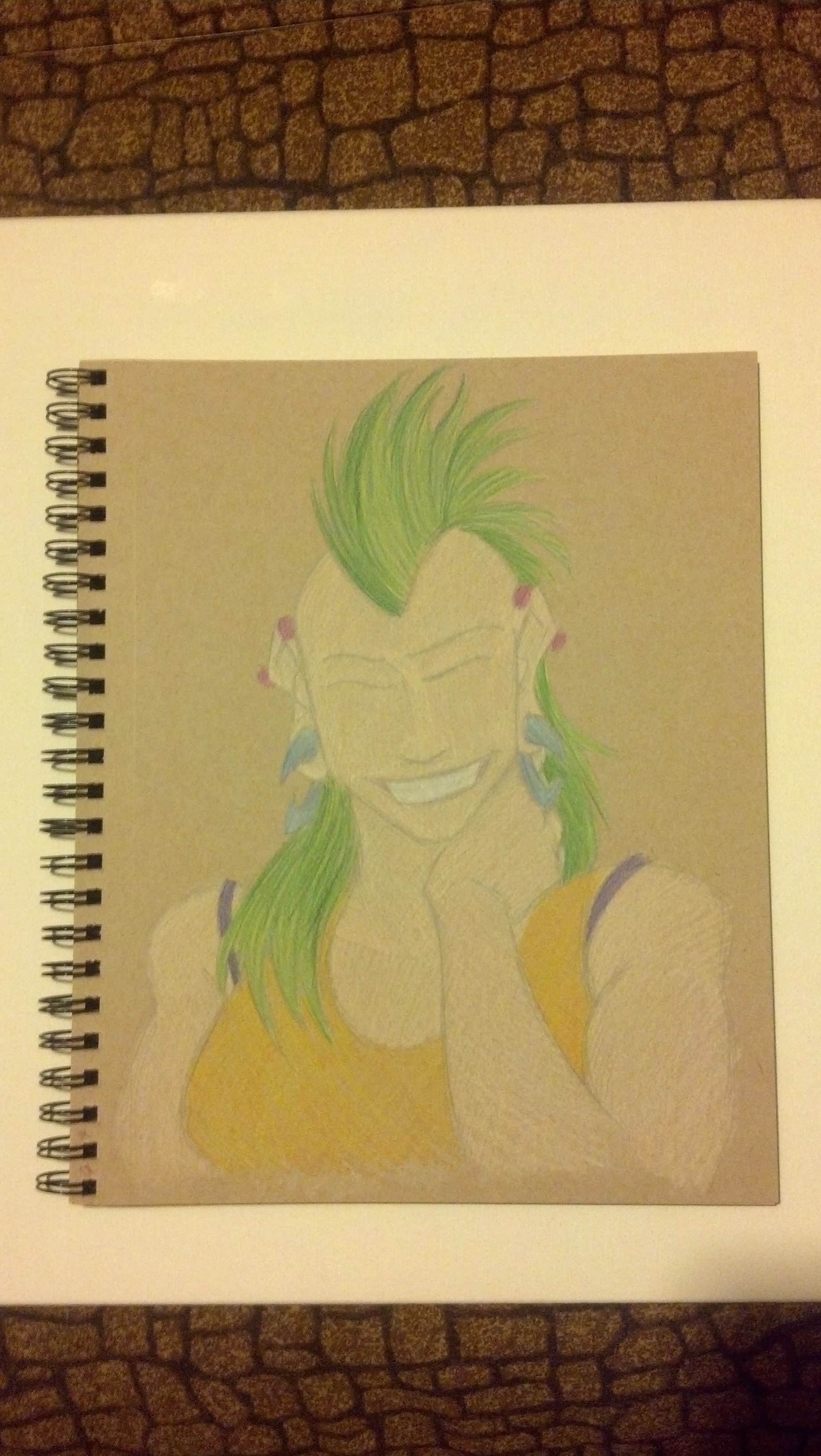
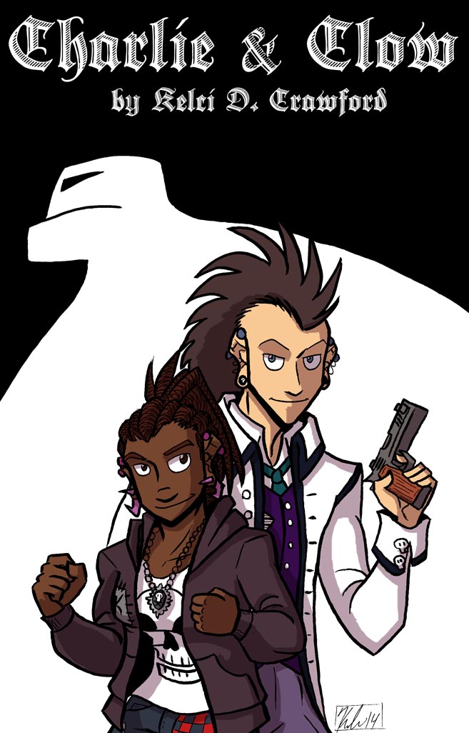
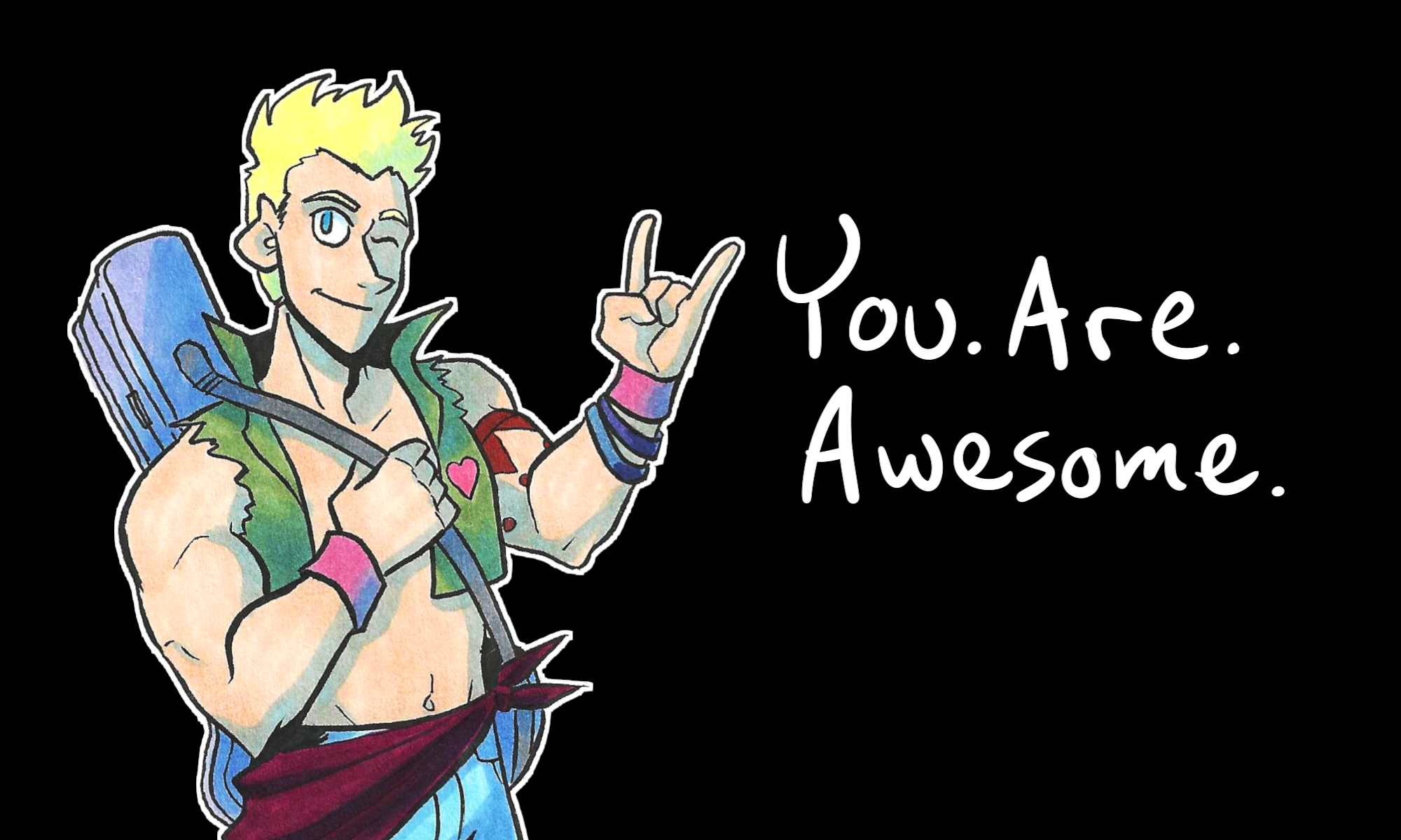
PART 1: NEW ART!
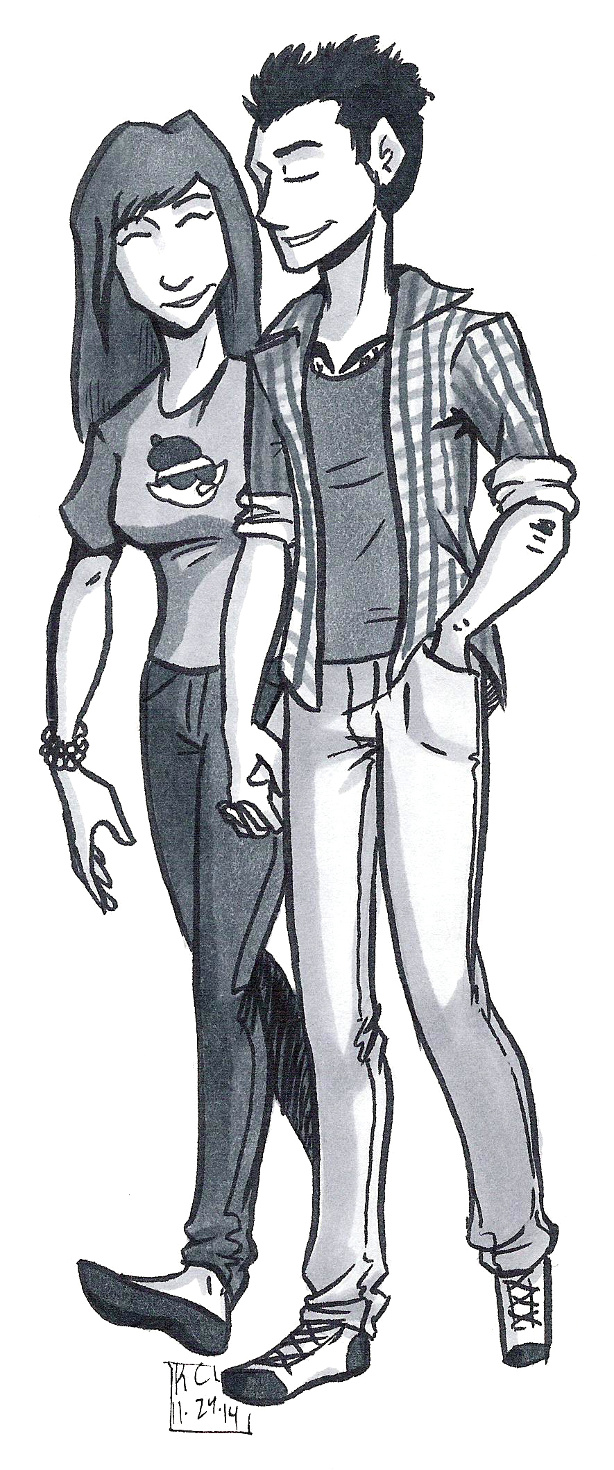
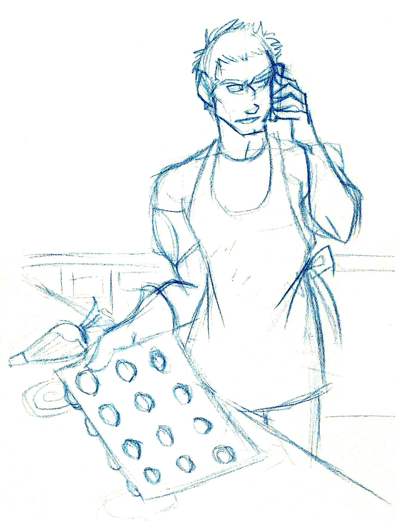
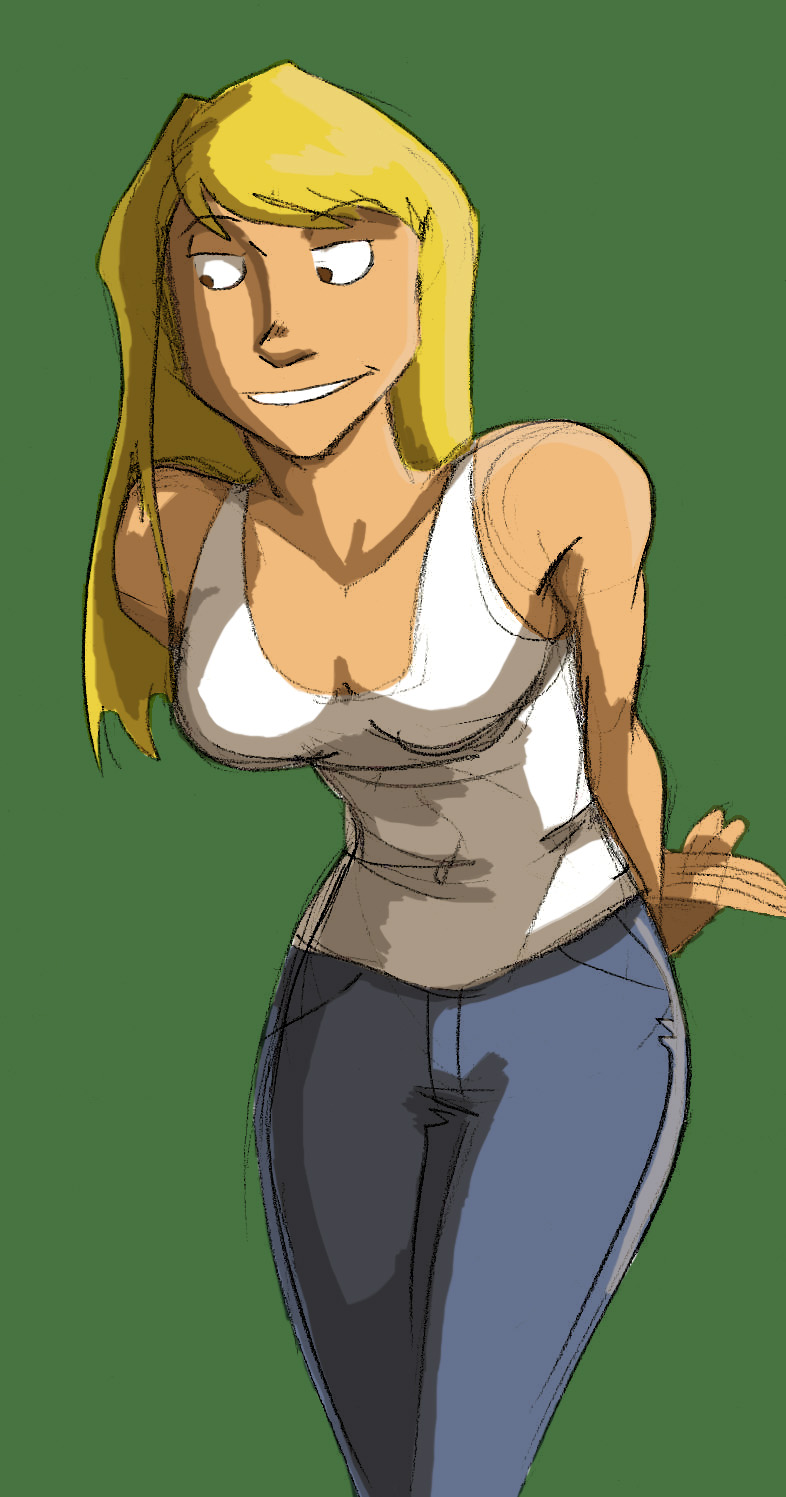
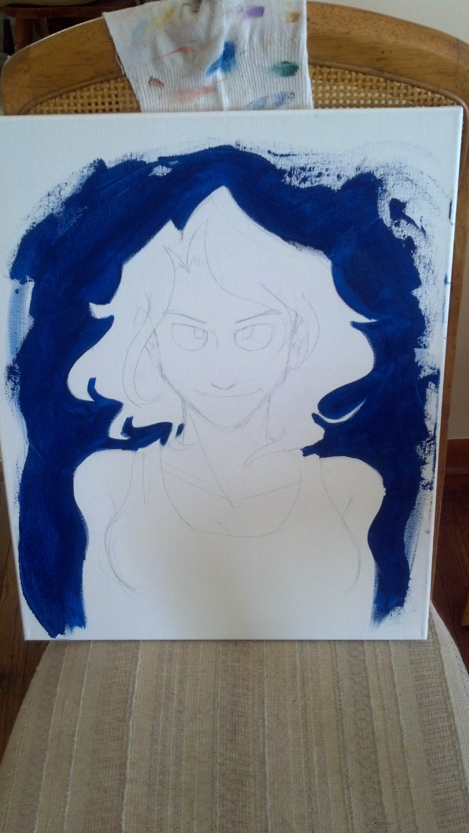
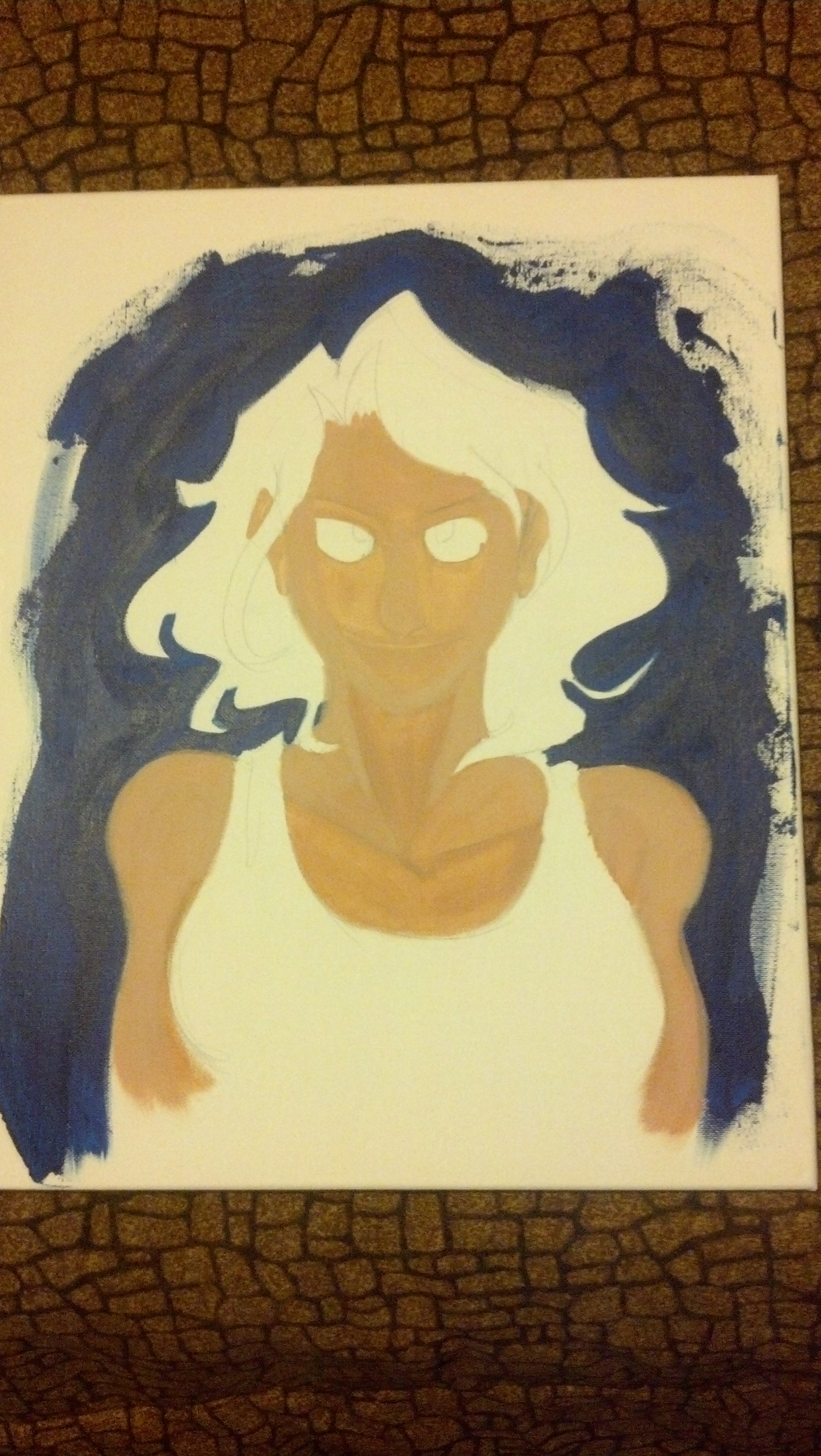
I drew the image above because I realized that Kate and Adam should be shown together, because they are adorable.
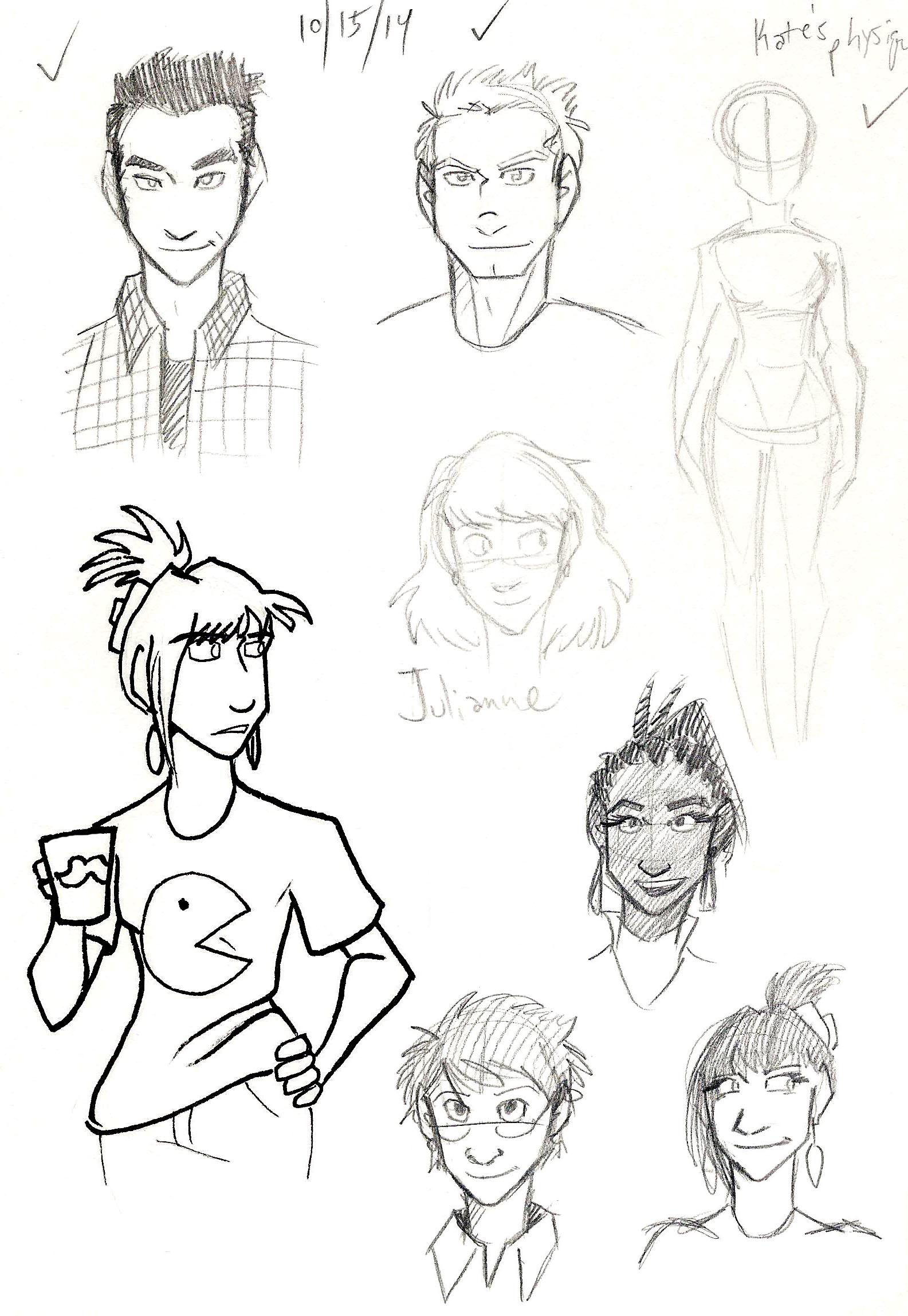
I’m planning out the sticker ideas, and hopefully you can see them soon.
Speaking of the stickers, that makes me think of rewards, which leads to…
PART 2: MORE REWARDS COMING SOON!
Kia and I realized that a lot of backers are going for rewards that are under $25, so we’re looking to include more options to choose from that are between $1 and $25.
Our current rewards include Thank Yous at $1, a desktop wallpaper at $5, and wallpaper and commemorative bookmark at $10.
If you have any ideas or suggestions, please leave them in comments!
PART 3: WE GOT A HOST!
Deven from Pink Dollar Comics has so graciously offered to host “Seeing Him” on the Pink Dollar Comics website!
That’s awesome news, because they are a lovely LGBT hub, and Kia and I feel like “Seeing Him” would fit right in with the work Pink Dollar Comics does.
That’s all for now!
Thank you for reading! Please contribute to the KickStarter and spread the word!
I’ll see you on Friday.