I Was a Librarian

librarian selfie with books art sketch
(Click to enlarge)

Yep.

My first ever paid job in high school was being a librarian. Technically, I was a page, so my job was to re-stack books, DVDs, CDs, and other stuff people checked out and returned.

The cool thing was I was a page at a time when libraries just caught on to the idea that graphic novels were cool. So the graphic novel section was growing and getting all kinds of cool additions. This was how I was exposed to works like Cairo by G. Willow Wilson and M.K. Perker (which I reviewed here), Paradise Kiss by Ai Yazawa, and (most importantly) Making Comics by Scott McCloud.

I, as a page, was also supposed to clean up small messes. I have found many strange things in my time as a page, from abandoned wallets to an ash tray that was ripped out of a truck. But that’s a story I’m going to get into…right now.

I was sorting in the large print section when I found this aforementioned ash tray. And I was really confused. So I took it to the sorting room and approached the other librarians, saying “I found this weird ashtray. What should I do with it?”

My manager in her corner office said “BURN IT!” But one of the other ladies said she would hold on to it until someone claimed it. After all, it was an ash tray that belonged in a car. Someone should get it, right?

Ten minutes later I’m back in the large print, moving onto Non Fiction next to it, when a greasy guy in a leather jacket approaches me, looking nervous, saying, “Uh…did you by chance see an ash tray around here? It’s for my truck.”

True Facts.

Anyway, I was a page for two years until I graduated high school and went to college.

For a semester I had a minor in Pop Culture (because Bowling Green State University, my alma mater, was one of the few schools that offered classes in Pop Culture studies).

While I was studying this oddball field, I worked at the Browne Popular Culture Library.

Yes, this was a thing.

It was a very cool thing, too. It carried all manner of comics and graphic novels, and they even had dime novels from as far back as 1910. There were movie scripts, posters, and a ton of Star Trek memorabilia (I heard the library has the largest private collection of Star Trek memorabilia carried by a library in the United States). There were also pulp magazines, though they were rarely, if ever, read… The pulp was so old they were kept in special boxes so the light would not damage them, and if they were ever handled, it was with gloves, so the oil on your fingers wouldn’t damage the pulp paper.

The library even carried copies of the original elvish dictionaries written by J.R.R. Tolkien himself.

So with all of this awesomeness within our walls, you would think we were slammed with people.

But there was a catch: The Browne Popular Culture Library is what librarians call a “closed-stack” library. That means everything was kept behind closed doors, and if you wanted to check out anything, you had to fill out a form and a librarian (like me) had to run back and fetch it.

We had our catalog online, which is how you can find books in the Pop Culture Library in the first place. But once you got the book, it wasn’t allowed to leave the floor.

So…no, there weren’t a lot of people clammoring for the books there.

My time there was short, but I enjoyed it. It was the job that got me into comics as a cultural force, rather than comics as throwaway entertainment.

Because the cool things was: I saw a ton of old AND new comics in that library. I saw the original pulp magazines and dime novels.

And yes, the popularity of mediums changes. Dime novels aren’t really a thing anymore, and digest comics like Archie, I’m sad to say, are starting to lag.

But though the popularity of storytelling modes might change, the constant thing is that there are stories, and they are there, waiting to be read.

It’s fascinating to see the arc of popular culture history, seeing what was popular and what faded in favor of the next fad, and why the next fad was so huge.

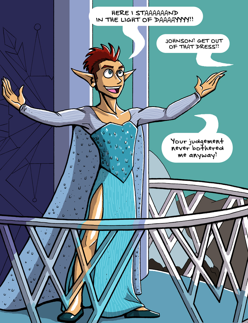
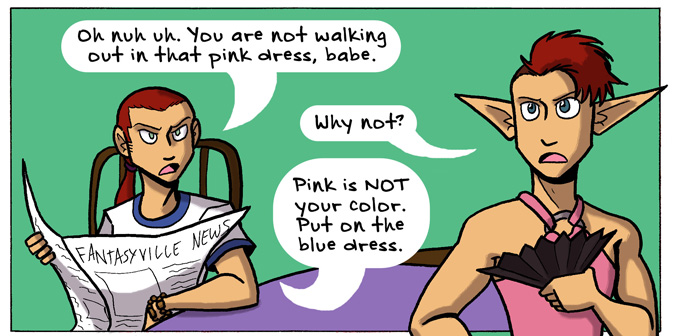
Comics are, I dare say, the new fad in storytelling, because their potential is being rediscovered. Back in the 1950s, comics in the U.S. took a giant leap backwards (that’s a VERY long story I’ll save for next time), and since then comics as a medium in the U.S. has been playing catch-up with the rest of the world.

Comics are reemerging as a fad, and I would say that’s a good thing. It’s an artistic medium that deserves to be created with, studied, and read.

How long will that fad last? I don’t know. Tell me what you think in comments.

Thank you for reading, and I’ll see you tomorrow.

The Character Designs for Johnson & Sir

So in Part 1, I talked about character design in comics, and what doesn’t tend to work. In Part 2, I talked about some character designs in practice in Validation and other personal works.

Today I would like to look at more character designs and how they can reflect or embody elements necessary to the story.

Let’s look at some characters from…Johnson & Sir.

johnson and sir clip from page 51
A scene from Page #51, “My Conscience is Rising”.

Johnson and Sir are two opposites: Sir is the busybody tough guy who plays by the rules and runs a tight ship. Johnson is a relaxed joker who figuratively pokes the bear (the bear being Sir) to make him lighten up and joke more.

Sir is well-kept and nicely groomed. His mustache is always perfect and he’s almost always standing up straight and in-charge.

Johnson…

He's not afraid to embrace his inner Elsa.
He’s not afraid to embrace his inner Elsa.

Johnson loves his dresses and is not afraid to wear them. He’s willing and able to break the expectations of society. He LOVES to do so. To match his flamboyance, he has wild hair and crazy facial expressions. While Sir is stoic, Johnson isn’t afraid to wear his heart on his sleeve.

johnson and sir johnson faces
Just a small sampling of Johnson’s faces.

Of course, in the Fantasyville Police Force, there are characters that match up with Johnson and Sir, serving as mirrors.

Mirror characters are not new or even rare. Mirror characters are those who have the same experiences or functions of the main characters, but can oppose them in some way.

For example, Ackles is a mirror for Johnson.

johnson and sir ackles
Here’s Ackles being reasonable with Johnson, from page #54, “The Elf and the Wardrobe.”

Ackles is the nice in-between of Johnson’s heart with Sir’s rationale. Ackles is reasonable but accepting of the absurdity in Johnson’s attitudes. He’s not as by-the-book as Sir is, but he still follows the rules that society has placed, for the most part. He’s not all-knowing – in fact, he’s still new to the job as a police officer, and asks a lot of questions. He’s the naive curiosity to Johnson’s experience. His naivete and curiosity are what drive him to go adventuring with Johnson and do silly, absurd things.

To reflect these characteristics in his design, he has a well-groomed image like Sir, hair that doesn’t meet societal expectations like Johnson’s, and wide, emotional and curious eyes.

So now we know about Johnson’s mirror character, Ackles. Who is Sir’s mirror character?

Pranesh.

johnson and sir pranesh and sissy page 49
Pranesh and his sister chat in #49, “What a Worrywart.”

Pranesh hardly ever speaks until the Haiku Flu arc. He’s a man of few words and somber actions. He doesn’t do exaggeration like Johnson or Ackles do. He’s a quiet, determined sort of man. That’s why he has the strong chin and jaw, the broad shoulders, the high cheek bones, and the tired eyes. He’s seen things, but he carries on in his quiet way. Like a superhero.

Pranesh is much like Sir in his stoic nature and ramrod-straight posture. He carries himself with dignity, like Sir (for the most part) does.

But Pranesh is a bit too stoic. We don’t see him smile. He hardly ever jokes, unless it’s in a deadpan, dry way.

pranesh from johnson and sir
Pranesh also has some mystical powers of some sort, man.

He serves as the mellow contrast to those rare moments when Sir unwittingly lets an emotion loose, like humor or fear.

johnson and sir page 61
Page #61. Sir is so horrified even his mustache flees in terror!

While Ackles is complimentary to Johnson, Pranesh is almost a caricatured personification of Sir’s dryness. He is what Sir COULD become, if it weren’t for Johnson poking him with the metaphorical silly stick.

So in designing these characters, everything plays a part – their facial expressions, their posture, their body language, their hair and clothes (when they’re not in police uniform). Keep these factors in mind when you create your own characters for comics and, hopefully, your characters will become much more real.

johnson and sir johnson elsa frozen caption
Let’s end this blog post on a high note.

So did you like this 3-part series? Would you like me to keep talking about character design for comics? What have you learned from my ramblings about character designs? Leave your thoughts in comments below!

Also! Did you like Johnson expressing his inner Elsa? Because you can get it as a print to hang on your wall! Or your friends’ wall. Or wherever people need to burst into motivational song.

This blog post was the last one in a week of daily updates. Thank you to everybody who read my posts everyday! I’ll see you on Monday.

Character Design for Comics, Part 2

So in yesterday’s post I talked about what I feel like makes bad character design for comics.

To be fair, creating unique designs for characters is hard, especially in comics. It’s too easy to fall into formulas and make your characters suffer Same Face Syndrome, or its cancerous cousin, Same Body Syndrome. (Don’t know what I’m talking about? You should have been here yesterday.)

So then, what DOES make a good character design?

This is a hard question to answer. It’s even talked about in one of my favorite episodes of the Chris Oatley ArtCast podcast, when he interviews character designer Brett 2D Bean.

It’s not an easy question to answer, even if you’ve been making comics and animated works for YEARS. What makes great characters tends to vary from artist to artist.

However, I try my best to keep these points in mind. Good character designs in comics (to me)…

  • express the full range of human emotions,
  • are visually individual from each other, and
  • embody necessary elements in your story.

Let’s take a look at some of my own character designs.

nada character design sheet sketches
Character sheet for Nada.

Nada is a character I created for a work-in-progress, where she and several children are trying to escape a haunted house. Nada loves the wilderness, exploring, and practicing her survivalist skills. So in her design, I gave her sturdy hiking boots and a pair of pants that wouldn’t snag on anything from long sleeves, but still protect her legs from ticks and burrs. She’s still feminine in that she keeps her hair long, but she’s low maintenance and would rather keep her tangle of hair pulled back.

Let’s look at another story, which has the working title The Hoard.

claire the zombie hunter lady
Claire.

Claire is a tough cookie. She’s also sharp and abrasive, which is why I drew her with sharper angles, especially in her face. She’s also muscular, having fought against the zombie hoard for a few years. Her clothes fit her snugly – she has no time for loose things to snag onto obstacles. She needs to do her thing quickly and get it done.

Let’s compare her to Tracy.

tracy character design sheet of sketches
Tracy’s character sheet.

Tracy has softer edges and curves, including a round face. That’s because she’s much more innocent and timid than Claire is. Compared to Claire’s hardness, Tracy is squishy. She also has more introverted body language – she keeps her arms in and her mouth shut. Compared to Claire’s open and fierce body language, Tracy is quiet. She compliments Claire nicely for the story.

Ok, so what about in something like Validation?

Let’s look at the progression of Ally.

validation ally art progression comparison
Ally in the first strip, compared to strip #151.

This isn’t just a comparison to see how my art improved over time. There’s some subtlety going on in Ally’s design.

When she first appears, her hair is much straighter, she’s quiet in her demeanor, and she keeps to herself for the most part.

As time goes on, she gets more outgoing, more outspoken, and that gets reflected in her appearance. Her hair is much looser and wilder, and she’s not afraid to wear a shirt that says “Boss.”

We can also see a change in Roxie, especially in one particular arc.

validation roxie character progression
It’s almost like Roxie is two different people.

Roxie is a punk. She is loud, she is funny, she is energy personified. Even her hair is electric!

However, in a rather dramatic story arc, she hits a slump. She retreats inward and loses a little of her spark. Usually, her mohawk has vibrant color, but in her slump, her hair is apathetically white and lifelessly blank. Her hair is limp, her energy just sucked out of her. And instead of standing straight and proud and emphatic, she slumps over, drawing herself in, away from the world.

Thankfully the downturn doesn’t last long, but it’s still dramatic enough that her appearance changes to match her character.

There are even more character designs I want to show and discuss, but that will have to wait for tomorrow – I don’t want this post to get too long!

Thanks for reading and I’ll see you soon.

Character Design for Comics, Part 1

alien character design sketches concepts
Sketches of an alien race, the Uthers (Click to enlarge).

“Character Design” is generally something you hear more in the animation industry than the comics industry. However, the two industries often overlap, especially whether you talk about camera angles, lighting and moods, or, in today’s post, character design.

Character design is especially important in comics. You need characters that…

  • express the full range of human emotions,
  • are visually individual from each other, and
  • embody necessary elements in your story.

On top of all of this, the character design should be simple enough that you can draw it repeatedly and NOT want to stab your eyes out with a mechanical pencil.

So before I show my own character designs and what elements I think work, I’m going to show some things that…don’t.

While there are no hard and steady rules for character design, I have this one personal rule of my own. It’s the only one I need, but it’s no less important.

If it makes a gorgeous illustration, it’s a terrible choice for a comics character design.

This is something mentioned briefly in an Aaron Diaz blog post about costumes in character design, under a section called “Simplicity.” He says…

Above all else, keep it simple.  Comic characters are not pin-ups or other illustrations; you have to draw them over and over again, from various angles.  If you pile on too much detail, you’ll wear yourself out slogging through all the bits every time you have to draw them.

Let’s look at an example…

final fantasy belt dress lulu
THE BELTS.

THAT is a beautiful illustration. It would be a total pain in the ass to draw repeatedly for a comics story.

Now, I know what you’re thinking: A Bride’s Story.

a bride's story manga
A scene from A Bride’s Story (Click to enlarge)

Yes, it is insanely detailed and gorgeous. The artist also has assistants to help her meet her deadlines.

Most comics artists I know don’t have the luxury of an assistant to help them make art. They are, 99% of the time, making everything on their own.

To that end, I still stand by my personal rule.

If it makes a gorgeous illustration, it’s a terrible choice for a comics character design.

Remember that simplicity is key.

So, what else doesn’t work?

Same Face Syndrome.

disney frozen same face syndrome character design
The most notorious example of “Same Face Syndrome” to appear in recent years. (Click to enlarge)

Same Face Syndrome is when you use the same face in your character design. The most cancerous of Same Face Syndrome symptoms spread into the physique, when you draw all of your characters with the same general body shape.

I used to suffer from this HARD when I started out. It’s a common mistake because Same Face Syndrome is so formulaic, and formulas help make new work faster…even if it’s not necessarily better.

The thing about character design is it should not be formulaic. Your characters should not fit a mold.

They should be individuals, with their own physiques and faces and personalities.

Each character you draw is their own person. They should serve a unique but specific purpose in your story. That’s why you draw them into your comics, after all.

Have you noticed any Same Face Syndrome elsewhere? Have any tips for character designs? Leave them in the comments!

Thank you for reading and I’ll see you tomorrow, when I show some of my own character designs and the creative decisions behind their looks.

Lessons Learned from a KickStarter Project

seeing him webcomic logo work in progress
Click to enlarge.

My sister Kia and I were running a KickStarter to help fund the beginning of our new webcomic, Seeing Him.

AND…

It did not meet the goal.

To be honest, Kia and I weren’t really sure whether this project would get funded or not. We were hoping for the best, whatever the best may be.

Now that the KickStarter is over, I think, for now, it DID turned out for the best.

I am sad our comic cannot be made right away.

However, we did learn the following things from this KickStarter:

  • People WANT to support indie comic creators (we did, after all, raise a little over $500. We didn’t get any of that money because KickStarter is an all-or-nothing fundraising system, but people were still willing to contribute money towards our project!)
  • People WANT to see more positive trans representation, especially for trans men.
  • People are more altruistic than we are lead to believe.
  • And digital rewards are way more popular than I thought they would be.

Kia and I are going to take these lessons in and plan our next move.

We are hoping to fund raise for the project again sometime after New Years, and perhaps…

  • Lower the asking goal.
  • Offer more/only digital rewards (so we don’t spend our funds on making rewards for the backers, therefore justifying our lower goal amount and getting the comic made faster and sooner)
  • Offer more ways backers can be included into the comic, because MY GOODNESS during the campaign the $100 reward to be drawn as a recurring character got sold out FAST.

As soon as Kia and I have a plan, I will let you fabulous readers know so we can try again and, hopefully, succeed.

Thank you to everyone who shared Seeing Him on Facebook, Twitter, Tumblr, and elsewhere on the internet.

Thank you to Pink Dollar Comics and Women Write About Comics who wrote about the KickStarter project as it was going.

Thank you to all of the backers who contributed (sorry we didn’t make the goal).

And a very special thank you to my friends and family who were eager and supportive for our project. You know who you are.

Again, stay tuned for further developments for Seeing Him!

Thank you for reading (and for all of your support), and I will see you tomorrow.