So, in between my webcomics and my day jobs, I’ve still managed to make some new sketches to develop some comics I have in the works.
I have them posted below. They’re not in color (yet) but I wanted to show you the (dare I say, gorgeous) line-work I used to draw them.
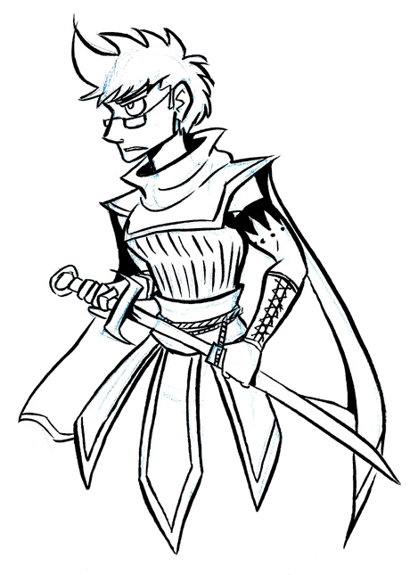
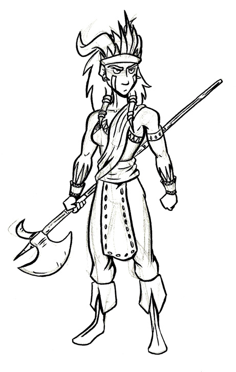
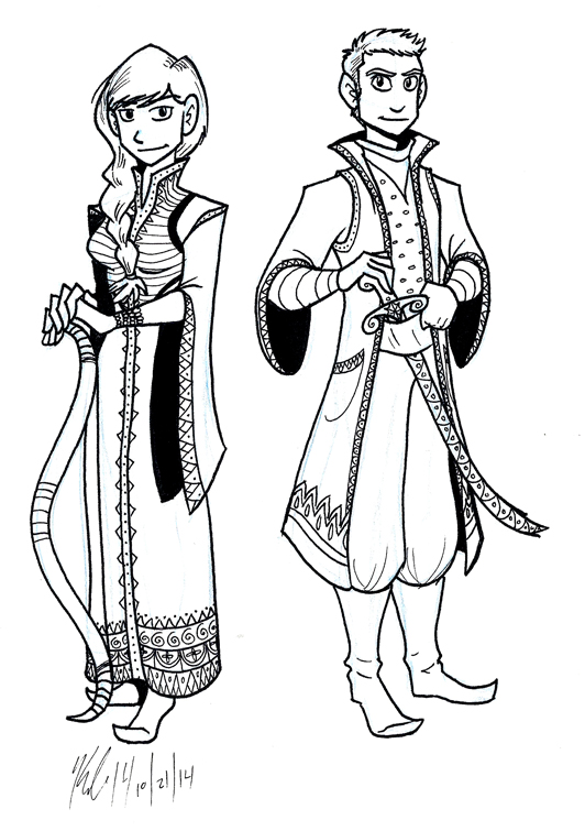
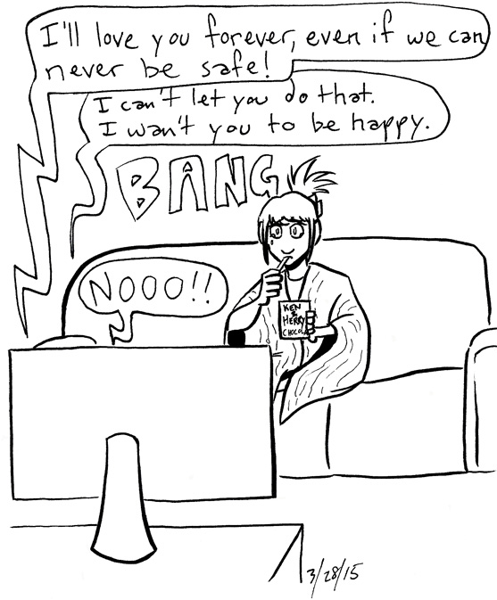
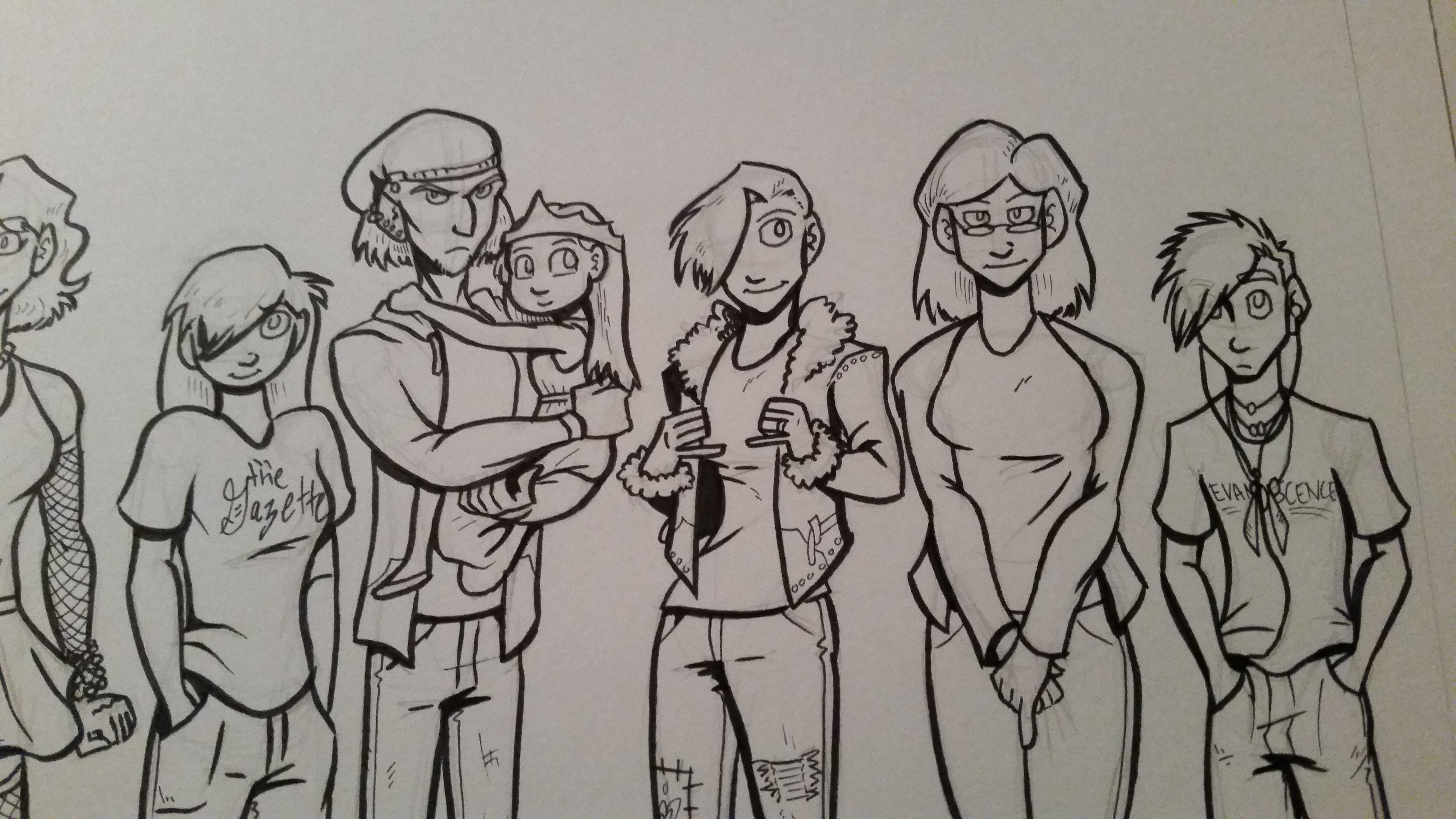
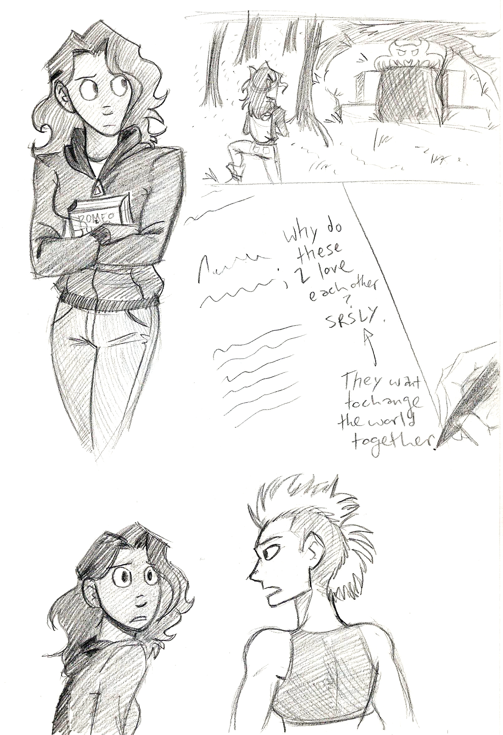
Jamie Roberts, Genderqueer Pirate.The Woman of the Woods, Sorceress and Warrior.Princess Rosetta and Amal AhmadA sample panel from the upcoming webcomic Seeing Him.
This last sketch is from a webcomic my sister Kia and I are hoping to get on KickStarter, called “Seeing Him.”
The story is about a young lady named Kate who wants to find Mr. Right. She finds him in Adam, a devilishly handsome OB/GYN who is also a trans man.
We both felt like there weren’t enough stories with trans men in them, and what few there are don’t necessarily portray them as, like, people. We hope that “Seeing Him” can help change that.
We tried running a KickStarter previously, but we didn’t meet our goal.
But this time, we learned: we’re going to lower the fundraising goal, and offer more digital rewards and custom commissions for backers.
The plan is to get the KickStarter up online on Saturday, but with my two day jobs deciding they want me to work full-time hours, I don’t know if that’ll happen.
However, if the project gets fully funded, I can actually QUIT one day job for a while. And that would be super cool to just make more comics more often, yo.
So one of my New Years Goals was to write 1000 words a day. Which sounds pretty lofty, but really I can accomplish that in about an hour. Sometimes less.
In writing 1000 words a day, I’m actually getting a LOT of writing done.
It’s not just blog posts either.
Thanks to my 1000 words written a day goal, I’ve revisited an old script of mine, and am now in the process of writing it and continuing off of it.
I’m talking about my post apocalyptic lesbian love story with zombie-killing, starring Claire and Tracy.
I finished editing Chapter 1, and I powered through Chapter 2. It’s a GREAT feeling knowing there’s progress finally being made on a project that’s been on hold for months.
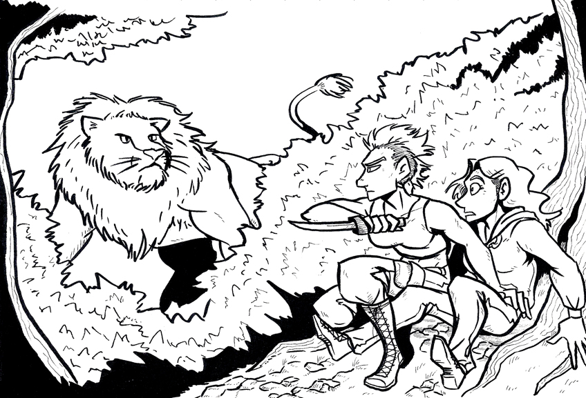
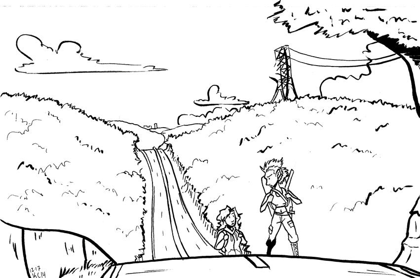
I’ve been revisiting this project in my sketchbook, as well.
A Work in Progress (click to enlarge)Sketching out an idea of the world they explore. (Click to enlarge).
And I’ve been doing some sketching to flesh out their world bit by bit.
I’ve also been looking at this list of post-apocalyptic tropes to avoid and what hasn’t been done yet. I’m hoping to add elements of things rarely done in post-apocalyptic stories, pulling inspiration from this list.
Like bike-riding. Oh my shit there need to be more bike riders after cars become useless hunks of metal.
What are some tropes of the post apocalyptic genre you can think of? What hasn’t been done in a zombie story yet that you can think of? Leave them in the comments below. I would love to hear about them!
I have been working my butt off the last two weeks, and it’s not on comics.
While I’ve been taking this month off making comics, I’ve been working two part time jobs and making commissions for folks. And while it’s good to keep busy, it’s starting to take a toll.
All of this extra work is making me wonder,
“What can I do next year to go a little easier on myself?”
I admit, many of my goals for next year are work-related, and deal with making more comics, more books, more blog posts, more, more, more.
Part of that is my brain rationalizing that making more, better work will improve my art, thereby giving me more pieces for my portfolios, therefore more pieces to show off to people to say, “Look what I can do now give me work please!”
But where do you put the cap?
I’m hesitant to leave the day job I have currently because the alternative – freelancing full-time – is something I tried last year when I lived in Arizona. It didn’t really work. It’s one of the big reasons that I moved back to Ohio.
While freelancing seems to make more sense in the Midwest, where the cost of living is easier to manage, I’m still hesitant to switch to full-time freelancing because it’s a LOT of work.
The nice thing about my day job is it gets me out of the house; plus, a steady income stream is not a bad thing, either. It’s draining sometimes, yes – especially now that it’s the few days before Christmas –
Completely tangential paragraph: everyone says Black Friday is the day people shop the most but that is FALSE. This is a nation of procrastinators. The biggest shopping days of the year are the weekend before Christmas, and Christmas Eve. Bunch of Liar McCheaterTrousers.
Anyway, day jobs are nice and all, but it would be nice to make a living full-time on my art. My goal next year is to be able to leave my day job and just make art. But that implies freelancing full-time. I don’t know if I’m ready for that again.
The thing that weighs heavy on my head right now is the answer to the question, “How do I decide what’s worth pursuing for making a living on my art?”
Most art blogs I’ve come across don’t talk about how to tackle that question. All they do is talk about inspiration and works-in-progress and other artists.
They don’t talk numbers. They don’t talk business.
I took business classes in college. My parents owned a small business. I think about working independently and earning financial success A LOT.
So how do I decide what to pursue to grow my business – of making art?
I don’t know how to answer that question. At least not yet.
I have a few ideas.
And a beautifully hilarious notepad from Knock Knock I got when I stopped for a day trip in Ann Arbor with a college buddy. It’s called “Make a Decision.”
I’ve been consulting this thing constantly lately.
I get the feeling I’ll be using this little device an awful lot in the coming weeks.
If you have any ideas or advice for me, I would love to read them in the comments below. At this point I would love to hear outside opinions and experiences.
Thank you for reading, and I’ll see you again on Friday, the day after Christmas.
So in yesterday’s post I talked about what I feel like makes bad character design for comics.
To be fair, creating unique designs for characters is hard, especially in comics. It’s too easy to fall into formulas and make your characters suffer Same Face Syndrome, or its cancerous cousin, Same Body Syndrome. (Don’t know what I’m talking about? You should have been here yesterday.)
It’s not an easy question to answer, even if you’ve been making comics and animated works for YEARS. What makes great characters tends to vary from artist to artist.
However, I try my best to keep these points in mind. Good character designs in comics (to me)…
express the full range of human emotions,
are visually individual from each other, and
embody necessary elements in your story.
Let’s take a look at some of my own character designs.
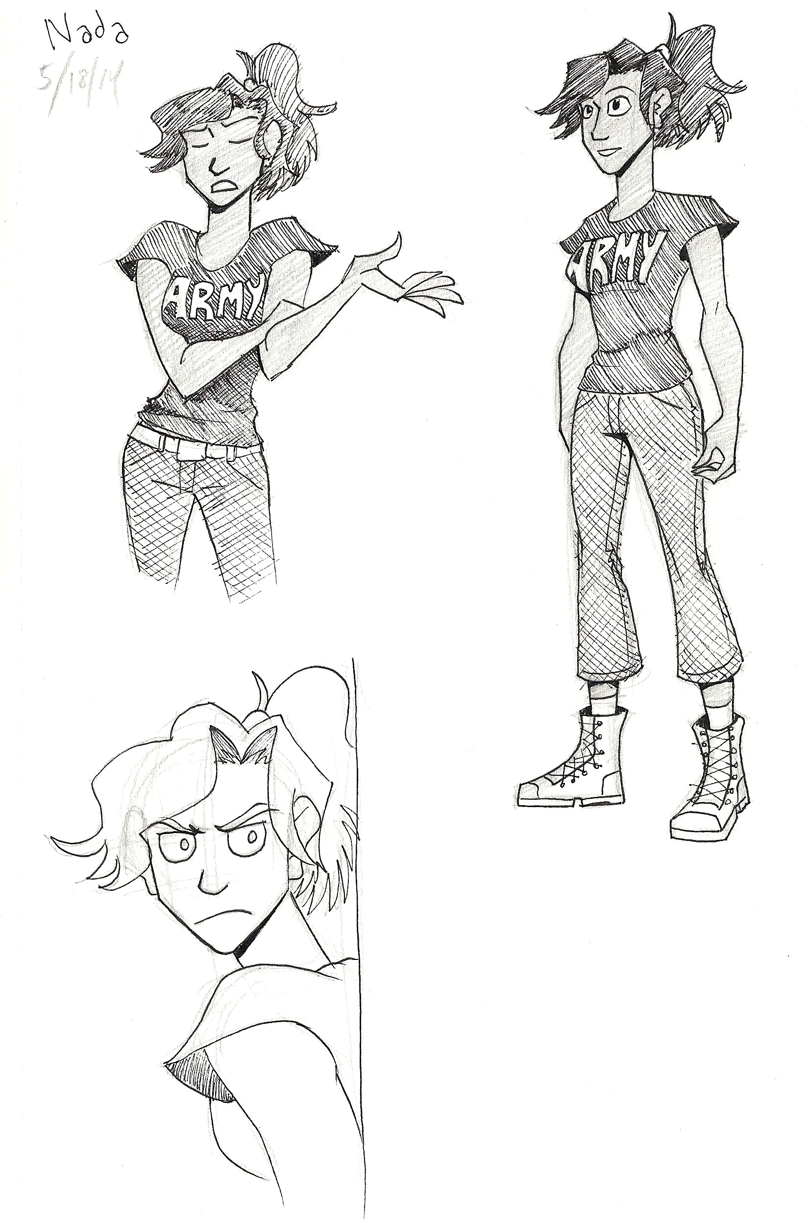
Character sheet for Nada.
Nada is a character I created for a work-in-progress, where she and several children are trying to escape a haunted house. Nada loves the wilderness, exploring, and practicing her survivalist skills. So in her design, I gave her sturdy hiking boots and a pair of pants that wouldn’t snag on anything from long sleeves, but still protect her legs from ticks and burrs. She’s still feminine in that she keeps her hair long, but she’s low maintenance and would rather keep her tangle of hair pulled back.
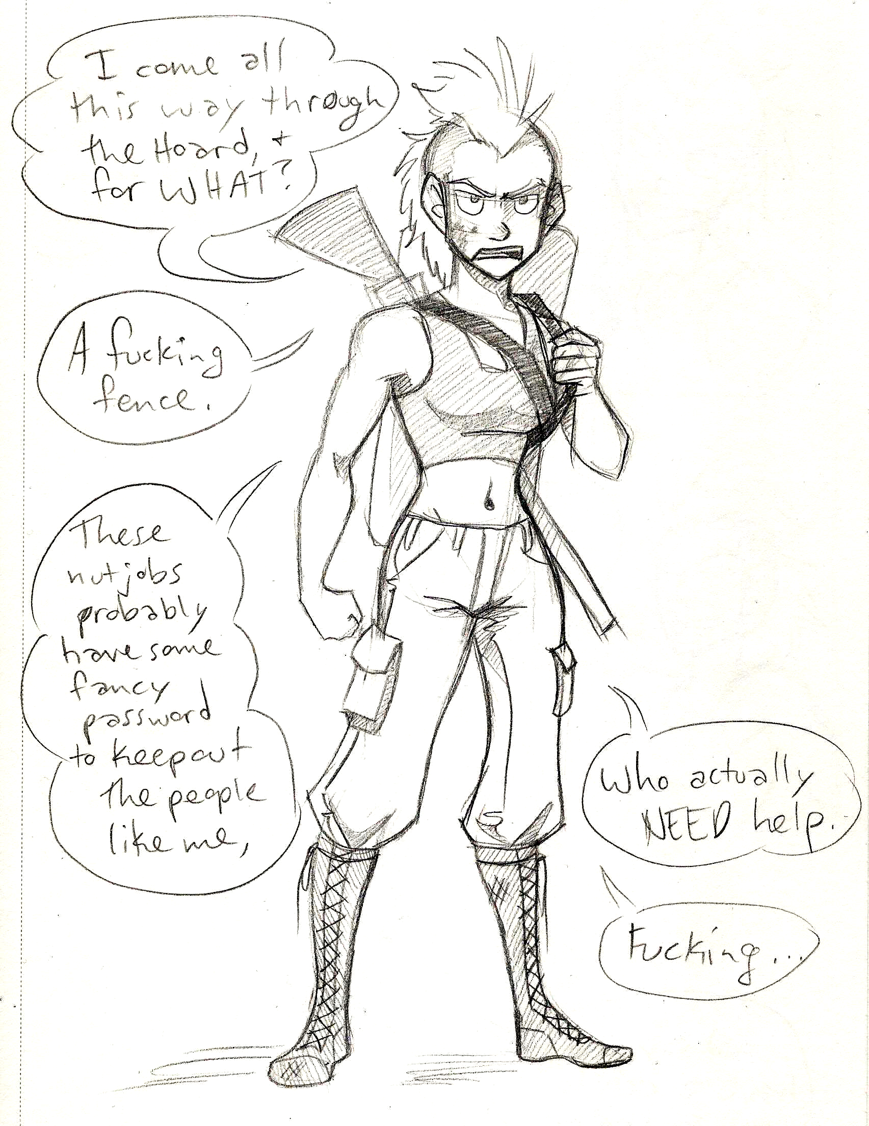
Let’s look at another story, which has the working title The Hoard.
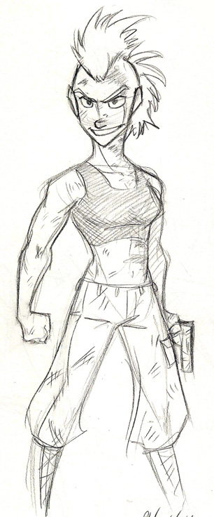
Claire.
Claire is a tough cookie. She’s also sharp and abrasive, which is why I drew her with sharper angles, especially in her face. She’s also muscular, having fought against the zombie hoard for a few years. Her clothes fit her snugly – she has no time for loose things to snag onto obstacles. She needs to do her thing quickly and get it done.
Let’s compare her to Tracy.
Tracy’s character sheet.
Tracy has softer edges and curves, including a round face. That’s because she’s much more innocent and timid than Claire is. Compared to Claire’s hardness, Tracy is squishy. She also has more introverted body language – she keeps her arms in and her mouth shut. Compared to Claire’s open and fierce body language, Tracy is quiet. She compliments Claire nicely for the story.
Ok, so what about in something like Validation?
Let’s look at the progression of Ally.
Ally in the first strip, compared to strip #151.
This isn’t just a comparison to see how my art improved over time. There’s some subtlety going on in Ally’s design.
When she first appears, her hair is much straighter, she’s quiet in her demeanor, and she keeps to herself for the most part.
As time goes on, she gets more outgoing, more outspoken, and that gets reflected in her appearance. Her hair is much looser and wilder, and she’s not afraid to wear a shirt that says “Boss.”
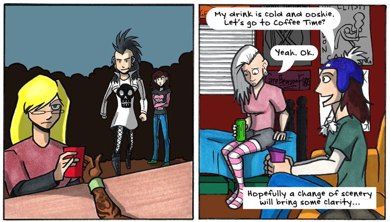
We can also see a change in Roxie, especially in one particular arc.
It’s almost like Roxie is two different people.
Roxie is a punk. She is loud, she is funny, she is energy personified. Even her hair is electric!
However, in a rather dramatic story arc, she hits a slump. She retreats inward and loses a little of her spark. Usually, her mohawk has vibrant color, but in her slump, her hair is apathetically white and lifelessly blank. Her hair is limp, her energy just sucked out of her. And instead of standing straight and proud and emphatic, she slumps over, drawing herself in, away from the world.
Thankfully the downturn doesn’t last long, but it’s still dramatic enough that her appearance changes to match her character.
There are even more character designs I want to show and discuss, but that will have to wait for tomorrow – I don’t want this post to get too long!
This post is the first in a week-long blog post update extravaganza! (It’s when I update my blog everyday, Monday through Friday, just for this week).
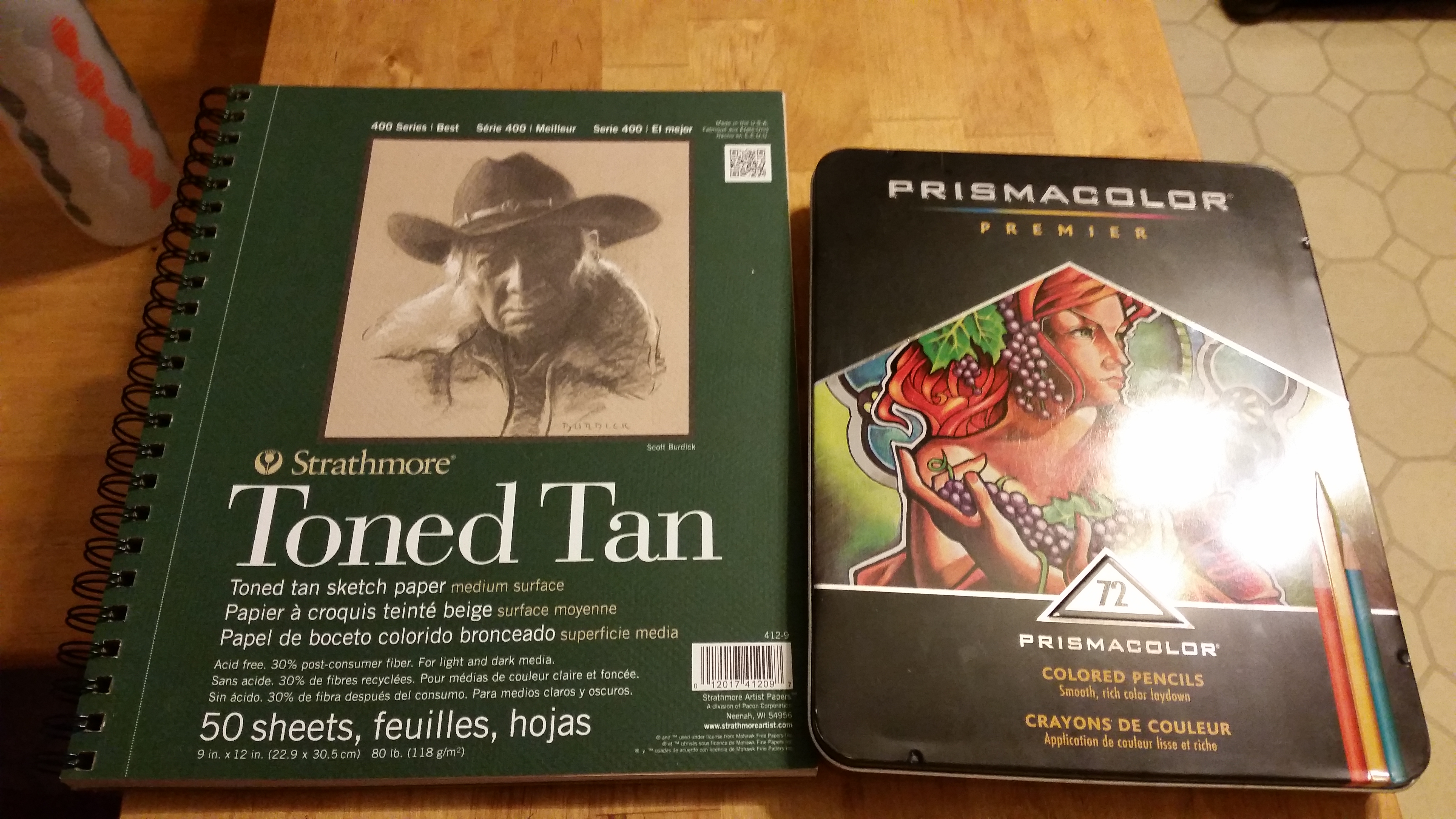
I just finished a new illustration in colored pencil! So to celebrate, I wanted to show the progression of how I made it and the tools I used. And at the end of the blog post, you can see the finished piece.
To start, I grabbed my Prismacolor 72 piece colored pencil set (which I had left over from my first ever art class in college. Hold on to your supplies, students!) and an 9 wide inch by 12 inch pad of Strathmore Toned Tan paper.
Once I got those, I drew the black and white version of what I wanted to color. I sketched in (lightly) where the shadows would lie with my trusty F hardness sketch pencil. I use that pencil for all of my drawing and sketching.
Then I go over those lines with my mechanical pencil, which I believe is a B hardness in lead, so it’s darker than the F.
Next, I color over the whole sketch with a white colored pencil. I do this so that…
I don’t lose my shadows
I have a layer of colored pencil between my pencil lines and my actual colors, thus
making my art much cleaner and less muddy.
Once the white is laid down, I lay down the brightest colors I’m going to use, and color from light to dark.
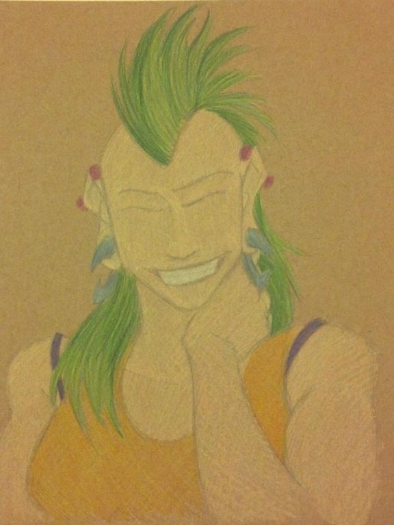
The first layer of colors end up looking a little like this:
Click to enlarge.
It’s not the prettiest…yet.
Also, I did not use light peach straightaway for the skin tone. I laid down the highlight color, which is a mix of Cream and Beige.
Alright, so I drew the light colors first. What next?
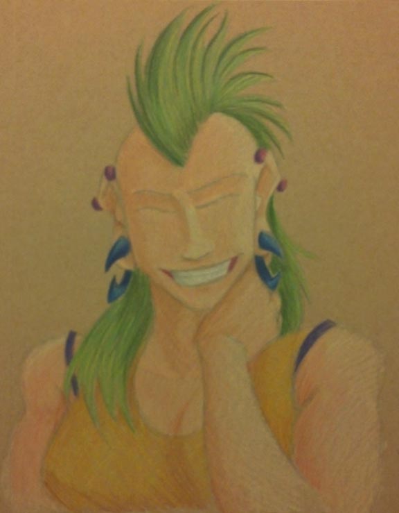
The shadows!
Click to enlarge.
I really wanted to try and find colors that would compliment Roxie’s hair, which is why I went with fuchsia industrial piercings, dark blue gauges, a purple camisole, and an orange-yellow tank top.
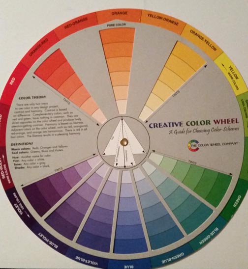
Also, use the color wheel. It is your friend.
I got this sucker for around 6 or 7 US Dollars at a craft store in college. (Click to enlarge). One side is tints and the other is shades.
I used this to help me find the complimentary colors mentioned above, and it also helped me find what colors to use for shading.
So at this point, I have colored the highlights and the shades. There’s just one layer missing…
Oh I know! The mid tones!
I took the colors I wanted for the mid tones in each area, which went a little like this:
Mohawk: Spring Green
Shirt: Canary Yellow
Gauges: Cloud Blue
Camisole: Violet
Piercings: Magenta
Skin: Light Peach
Teeth: Cool Grey 20%
But after I colored the mid tones and finished out a few minor details (like the teeth), I noticed that the shade tones got lifted up a little.
So I went back over the mid tone layer with the shades again. Which went like this:
Mohawk: Dark Green
Shirt: Dark Brown
Gauges: Ultramarine
Camisole: layers of Violet Blue, Ultramarine, and Indigo Blue
Piercings: Mulberry
Skin: Sienna Brown
Teeth: French Grey 60%
Then I added some neutral tones like brown in the linings of the mouth.
The last step was VERY LIGHTLY adding Black on the edges to help delineate shadow.
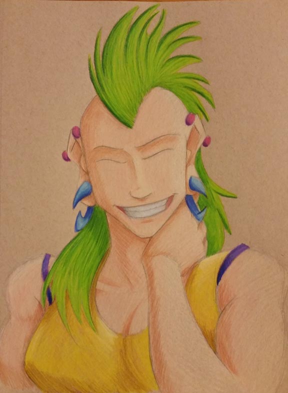
Finally, at long last…
FINISHED! Click to enlarge.
This portrait is finished!
Looking at it, there are still some errors that I notice (like her nose), but I have to say…
This is the first colored pencil piece of art I have made in a little over five years. I think I did alright. It’s not the best, but it’s not the worst. With practice, I’ll get better.
So what do you think? Should I do more portraits in colored pencil? Let me know your thoughts in the comments below!
In other news, the KickStarter for Seeing Him is wrapping up, and, to be honest, I don’t think we’ll make the goal.
But that’s ok! Kia and I have been talking behind-the-scenes and we have a few ideas for what to do next. I’ll be able to share them with you soon.