I was asked recently by a fan to showcase how I make comics. I’ve been meaning to do a post showing my work process for a while now, so today’s as good of a day as any!
Today I’m going to show how I make a page of Johnson & Sir.
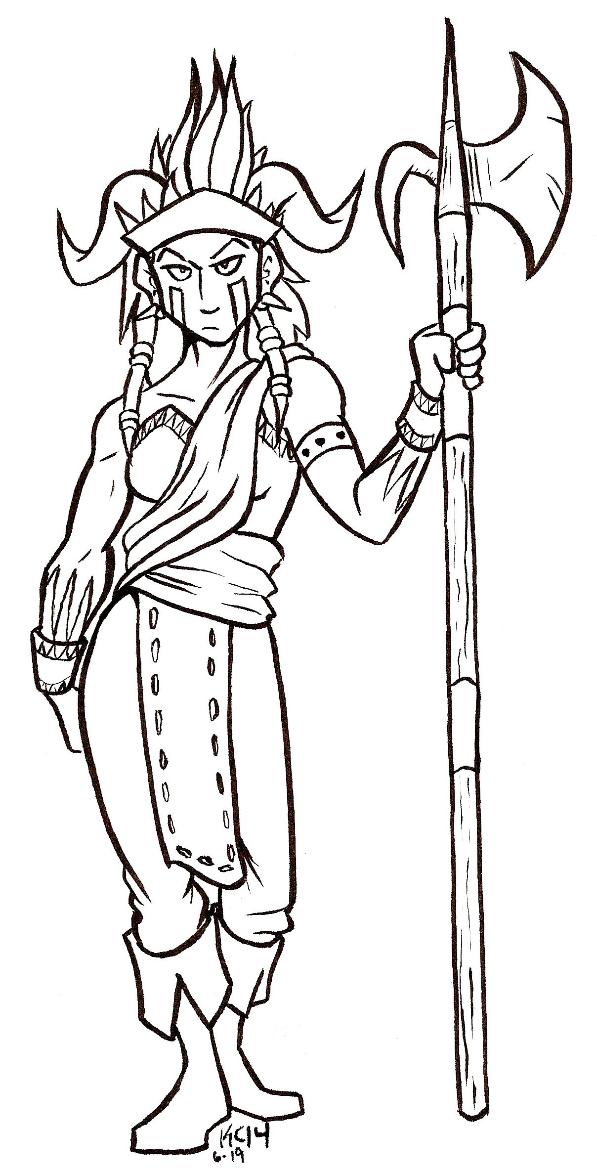
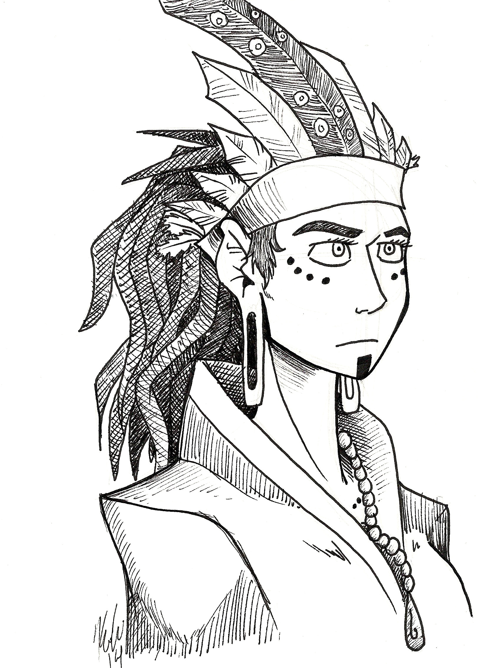
In particular, I’ll show you how I made page 42. This page is a little different from how I make my pages now, but more on that in a minute.
Let’s begin!
Step 1: Script the Page

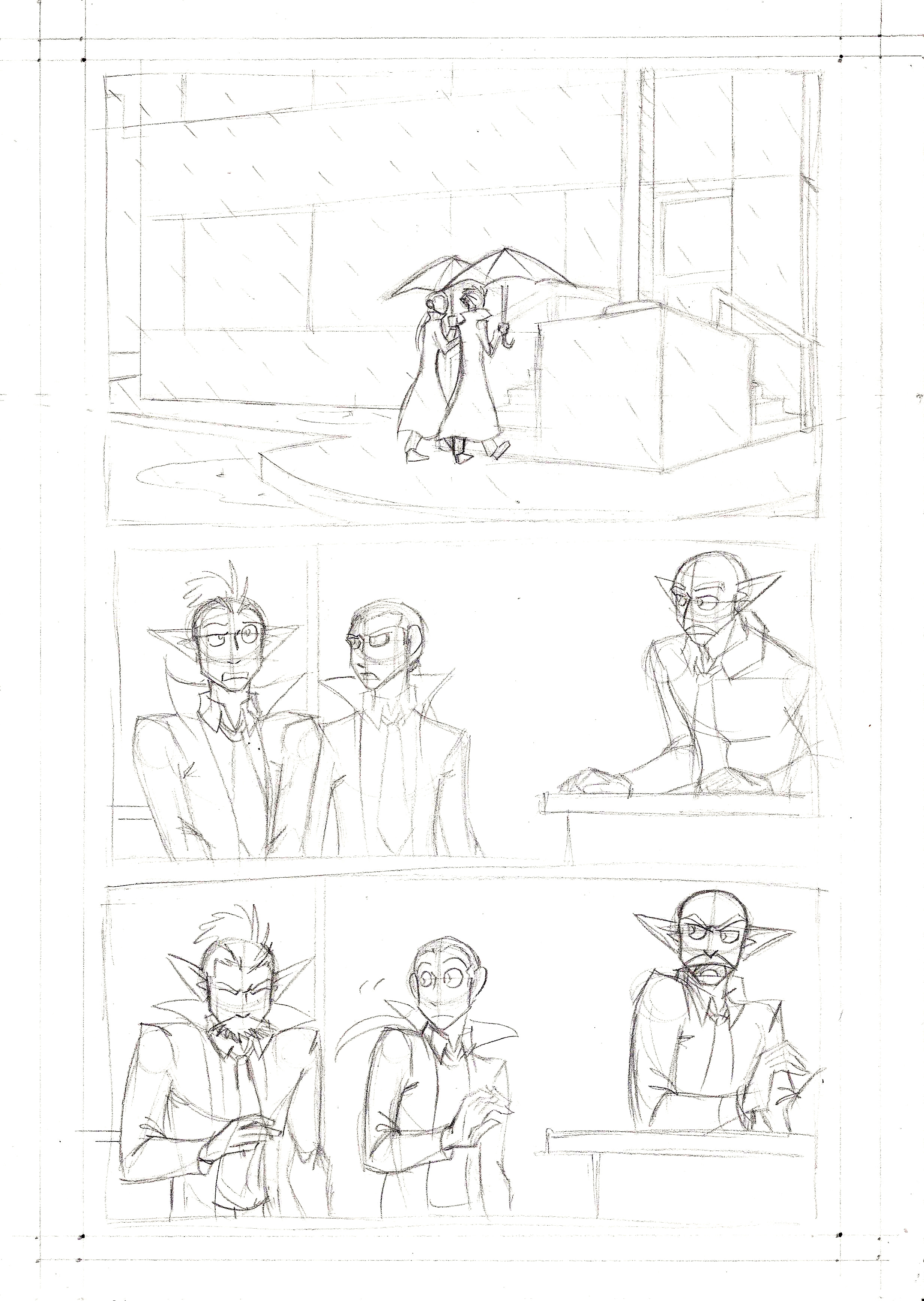
I do all of my scripting for this comic in a Strathmore sketchbook about 5.5″ x 8.5″. Since I’m the only writer for this project, I can script this comic however I like.
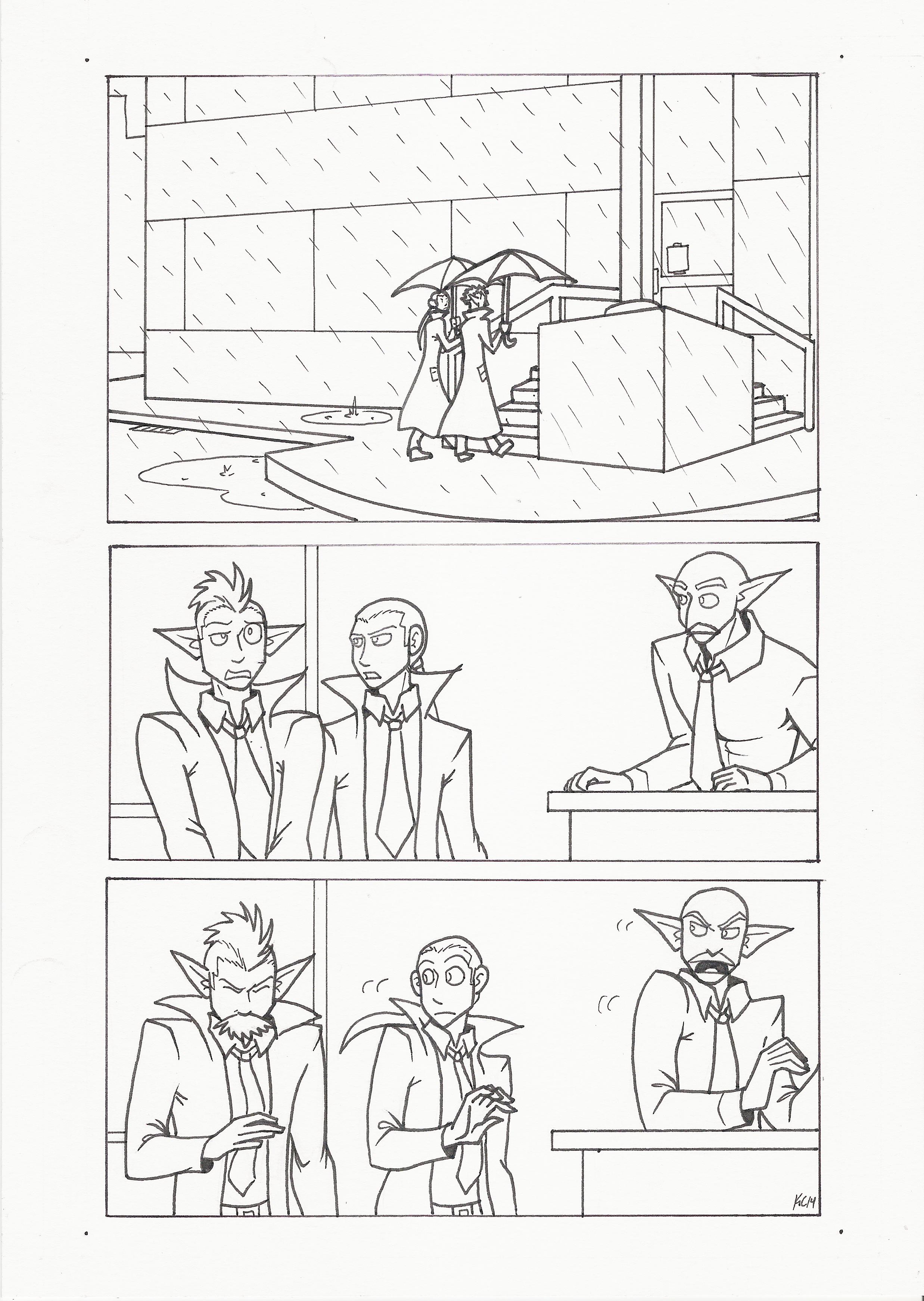
Most of the time, my script for a comic page looks like the one above. It’s just a rough idea of what I want the page to look like. This lets me figure out what’s said, where the figures are, and where the speech balloons need to be.
Sometimes my scripts don’t look like this. Sometimes they’re written like a movie script, or sometimes I’ll only have the dialogue written. My sketchbook is a mess to the outside eye.
So I script the page, and then I move to…
Step 2: Pencils
For this step, I take to the drafting table.
I use Strathmore Mixed Media paper with a vellum surface. Sometimes if I run out of paper I’ll dip into my stash of Strathmore Bristol Vellum (which I used for Validation). Either paper works fine, because they’re a smooth surface perfect for my rough pencils, for inking, and for heavy erasing.
If you look closely, you’ll notice the edges of the paper have guidelines drawn in. These guidelines help me keep the comic within the live area (which is the center of the page). It also tells me where I can draw bleeds, so if I want to draw something that extends outside of the borders, the guidelines tell me where the comic printer will cut the page off.
I cheated with the guidelines. I have a separate sheet of Bristol paper with the guidelines already inked in. Then what I do is I take the comic page, place it on top of the guideline sheet, and trace the lines. This saves me from doing a lot of calculations.
When I pencil a page, I tend to not use a ruler for the borders. I will, however, use a ruler for perspective, especially for that first panel. I like my drawings to be loose and organic for the most part. Gestures are important to me when I draw.
Once pencils are done, I go on to…
Step 3: Inking
I start with the panel edges and make dots where the live area ends (that’ll be explained later).
Because I’m right handed, I ink from left to right so my hand won’t smear the ink too much.
I also ink in some solid black shadows where I feel it’s appropriate. Like, along the collars of their shirts and coats, or the inside of their shirt cuffs. It helps keep the piece from being so flat.
After that I let the ink dry (usually for an hour), and then I erase the pencil marks.
Then there’s…
Step 4: Scan it in.
My scanner is old and prone to gathering dust on the scanner bed. No matter how much I clean it, there’s always some chink in it.
But that’s ok. I can fix that in a minute.
I scan the page in at 300 dpi (dots per inch). This is the standard size for book printing. Not only that, but that 300 dpi the work is much easier to do in Photoshop.
Speaking of which, right after the page is scanned in and placed in the proper folder on my external hard drive, I open it in Photoshop.
I use Photoshop CS2 for my digital work.
For those who don’t know how Photoshop layers work, I like to imagine them as layers of tracing paper stacked on top of the image. The original image is the bottom layer, usually listed as “BACKGROUND.”
Step 5: Make Edits to the Art.
What I do next is get another layer on top and name it “EDITS”. You can name layers by putting your mouse over the layer, right clicking it, and then clicking on “LAYER PROPERTIES”. A window will pop up that lets you name the layer.
I name my layers because not doing that gets messy and hard to keep track.
Anyway, in the EDITS layer, I paint over and correct any mistakes I spot. Mistakes will range from correcting over-extended lines to eliminating any spots my dirty scanner bed made on the page. This is also the layer I use when I copy and paste any recurring figures. (See the Johnson & Sir Christmas page for an example.)
Once EDITS are done, I move on to…
Step 6: The Background Colors
I make another layer on top and call it “BACKGROUNDS.” This will have my background colors.
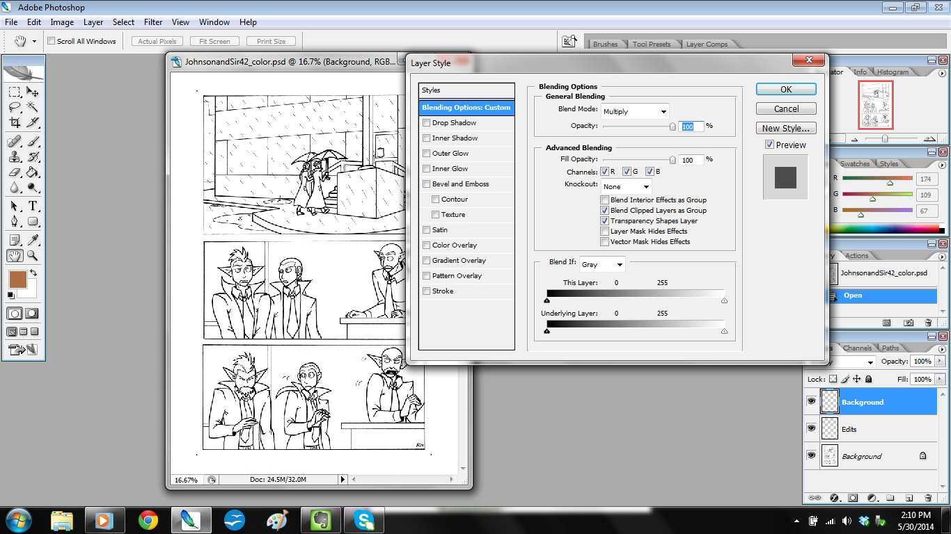
This layer is different from EDITS because of one thing. While EDITS is in Normal Mode, BACKGROUNDS is set to Multiply Mode.
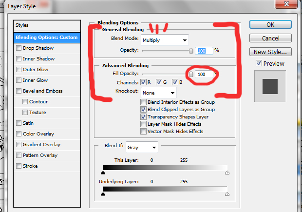
You change modes by putting your mouse over the desired layer, right click it, then select “BLENDING OPTIONS.” The above window should appear.
Set Blend mode to Multiply, and keep the fill opacity at 100%. The fill opacity keeps the colors vibrant, which is what I want. Putting this to Multiply Mode makes it so I can paint and the paint won’t color over the original lines.
Once that’s done, I color the background!
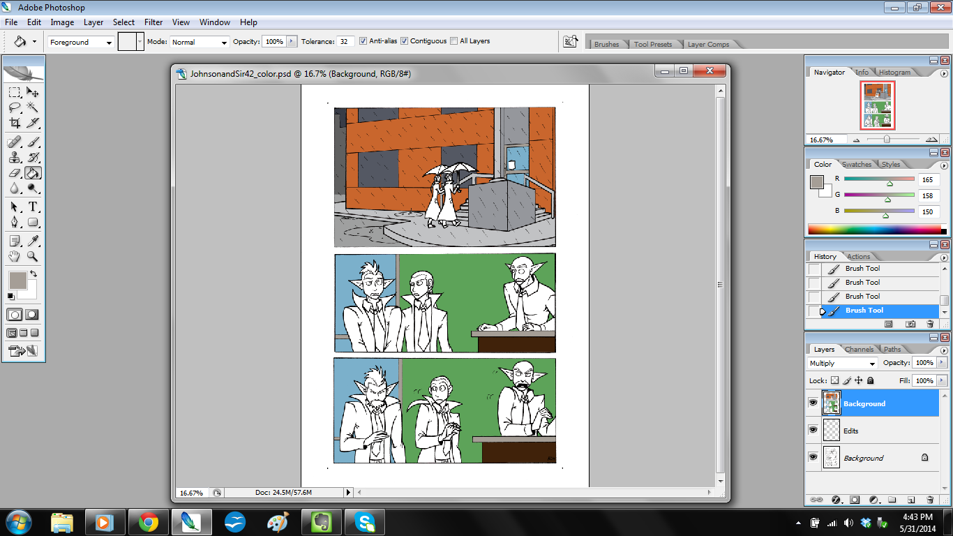
I use the paint brush or paint bucket tools mostly. Sometimes I use the lasso tool to trace a particular area, then I use the paint bucket tool to fill in with my desired color.
Then on to…
Step 7: Color the Figures!
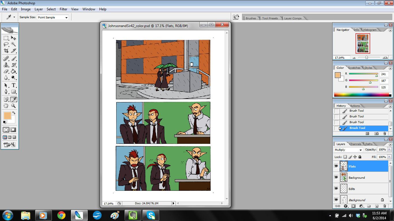
I make another layer on top and call it “FLATS.” I set the color mode to MULTIPLY with fill opacity at 100%.
Then I color in the rest of the comic on this layer. Usually it’s just the people in this layer, but that’s ok.
Recently I started including another step after this one. Which I’ll call…
Surprise Step! Shadows.
I’ll make another layer on top and call it “SHADES.” Then, I set color mode to MULTIPLY, but here’s the new part!
I set the fill opacity to 35%.
The reason? There are a few.
- 35% sets the color so it’s somewhat see-through (opaque), which is perfect for the shadow effect I need without it being overpowering.
- This layer set up lets me color solidly and not worry about weird layering effects of paint.
- The shadows are easier to modify this way.
Once the layer particulars are set up, I then color in the shadows.
And then…
Step 8: Lettering.
This is crucial.
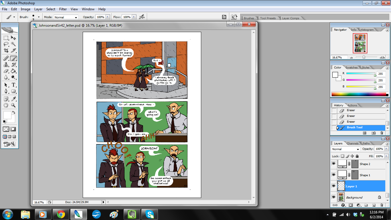
I say it’s crucial because it’s often a step other artists can ignore. But it’s important to know how to set up your speech balloons and sound effects so it’s easy for the reader to read along.
That’s often why I pencil in speech balloons during the scripting phase – that way I can plan the art so the speech balloons can be easily readable.
Anyway, in this step I write out the dialogue in separate layers. Photoshop as a program automatically separates the dialogue in the speech balloons into separate layers. I want to keep them separate so that if I have to move dialogue around, it’s easier.
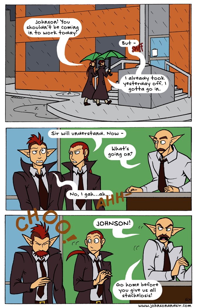
The font I use for Johnson & Sir (as well as Validation) is called “Distinctly Dan,” and I got it from FontPanda.com.
Once the dialogue is written, I get down to the bottom layer, make a new layer, and then use the rectangle tool. I choose the rounded-edged rectangles, set the edge to 150 pt, and make the balloons.
Once balloons are done, I go back down to the bottom layer, make a new layer, and draw the tails in.
Since this page uses onomatopoeia, I use different fonts, depending on the effect I’m looking for. Thankfully, Photoshop lets me rotate the dialogue to whatever angle I want it to sit, so yay!
At last, I get to…
The Final Step: Flatten and Post Online!
I flatten the layers in Photoshop, and do two things.
Thing 1: I leave the image be and save it for print format. Then,
Thing 2: I crop the image to the live area (remember the dots from Step 3: Inking? Those come in handy right now), then shrink the page to 100 dpi so it’s web-friendly, and post it online.
And that’s it!
Next time, I’ll show how I do a strip in Validation. The process is different in a few ways from making Johnson & Sir, so I can’t wait to show you!