RathaCon 2019 In Review

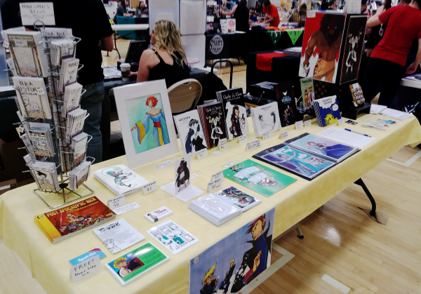
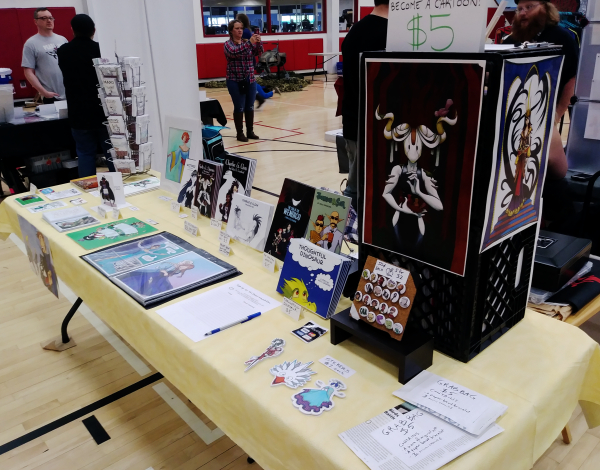
I’ve been to RathaCon many a year before. It was one of my first shows as a vendor, and has since become one of my anchor shows. Because of that, I do my best to go every year. I even turned down the offer to go to Awesome Con in Washington, DC again to get to RathaCon instead.

(Mostly because both shows were happening on the same weekend… but RathaCon is physically closer to me and lasts only one day. So I could just drive down, show off, and drive back home without paying for a hotel. Very nice.)

However, this year, RathaCon had a couple of things working against it.

See, Awesome Con wasn’t the only other show happening the same weekend: there was also Gem City Comic Con, and two other shows in West Virginia that I can’t remember the names of. So RathaCon had to work extra hard to get folks to come in.

To my understanding, they ran radio ads, because there were a few attendees who mentioned, “I didn’t know this show was a thing until I heard about it on the radio yesterday! So I HAD to check it out!” So, kudos to the RathaCon staff for getting the word out.

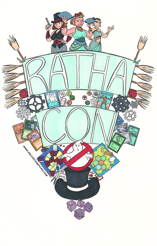
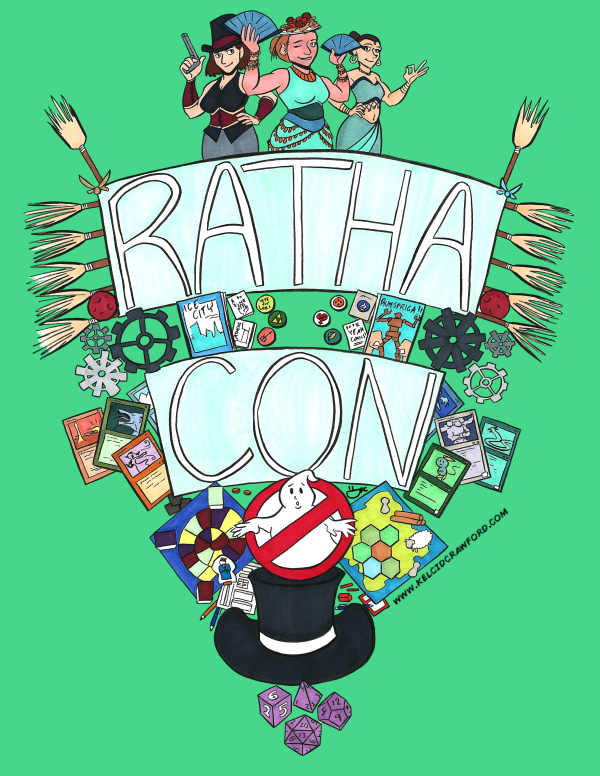
And I’ll humble-brag a bit: I think the print I made for RathaCon helped to draw eyeballs to the show on social media. Especially on Facebook.

That said, the crowd this year was about the same size as last year’s audience, but they thinned out WAY sooner towards the end of the day. Partly because of the rain, I think.

I’m not sure how many attendees were current students of Ohio University, though.

One of the reasons the convention staff picked the day they did was to try and entice the local college crowd to come and attend.

But here is where another factor worked against them: April 27, the day of RathaCon, was a week before finals. No sane college student is leaving campus the day before finals week hits, unless they are Sherlock Holmes’-level of confident about their work.

When I talked about it with the staff, we mentioned the idea of offering discounted attendance to people who brought a valid OU ID. Hopefully they do that next year.

Another thing I hope they do next year: get volunteers who check in with the artists more often throughout the day. I was the only person at my table and, aside from the one or two times I could see another neighbor’s table, I could not leave my spot. I’m glad I packed a lunch.

This is a grievance I’ve already discussed with the staff, and they’re working to resolve the issue for next year. I’m confident they’ll fix it, because RathaCon is VERY good at accepting constructive criticism and working to improve year after year. That is one of the reasons they are my anchor show.

In conclusion: was this the best ever RathaCon so far? No. It wasn’t awful or even bad. But there will be changes next year. Hopefully for the better.

And hey! I booked another appearance before 3 Rivers Comicon!

If you’re in the Saint Clairsville, OH area on May 4, stop at New Dimension Comics in the Ohio Valley Mall. They’re running Free Comic Book Day, and they gave the OK for me to showcase and sell my work. Also, there will be a GhostBusters division there. (I talked to some GhostBusters at RathaCon and they mentioned they were appearing at FCBD at the comic shop.)

That’s all for now. Thank you for reading!

You. Are. Awesome.
How I Made the RathaCon Limited Edition Print Art

This post does contain affiliate links. Bear with me.

So this started, initially, as a multi-part blog post series.

Then it got complicated.

Specifically, the art got complicated, and I wasn’t able to make a new blog post each week to detail the process of making this thing.

Let’s go into the details, though, so I can show you WHY this art took so long. And also how I make big illustrations like this one.

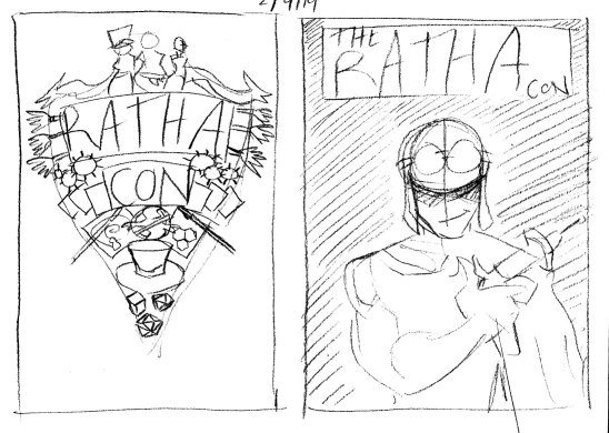
STEP 1: THUMBNAILS

Thumbnails are what I like to call the really rough sketches of an idea. It’s something I borrowed from animation film language.

I already wrote a post about this step, which you can read here.

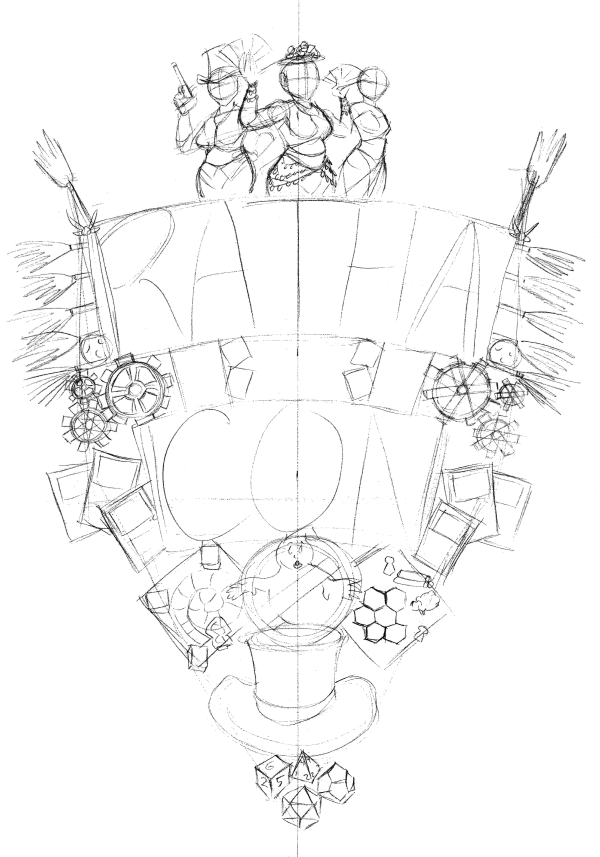
STEP 2: PENCILS

I wrote about why I choose this design, as well as the details of it, in the second part of the blog series. Now I’m going to get into the how.

It took a little while for the email chain with the convention staff to start (another reason that the weekly blog post idea had to get pushed). But once it got going, I was able to get feedback and get to work.

Pencils – or, the sketched the version of a thing – is something I do with just one pencil in one go.

When I first started in comics, I USED to do the undersketch with one pencil (usually a 2H), then the top layer in a darker tone (like B).

Now, I do all of my pencilling with just one pencil. Usually a mechanical one. I believe the RathaCon art was drawn with my Tombow monograph mechanical pencil, but right now I am in LOVE with the Zebra DelGuard mechanical pencil.

STEP 3: INKS

This step takes a deceptively long time.

It takes a long time for me because I try to control the line weight as much as possible: making some areas dark with a bolder line, but light with a lighter line.

Inking is also the stage where I have to squint at my pencil drawing and determine what lines will look the best when inked.

Because pencils are when I get real loose. Inks are where things get tight and snappy.

STEP 4: COLORS

Depending on the piece, I’ll make it either traditional-only (usually with Copic markers). Or I make it a combination of traditional and digital. Or I have all the colors be digital.

For the RathaCon print art, I opted to combine the traditional and digital modes. So I colored with my Copics first, then scanned the art, to start the next step…

STEP 6: DIGITAL EDITS

At this stage I go back over the art in Clip Studio Paint and erase any stray marks, fix any color bleeds, and generally just clean the piece up.

I also like to adjust how much the colors pop at this stage. So I play with the levels a little.

STEP 7: DIGITAL COLORS

With the RathaCon art, the only digital color I needed to add was the background tint.

In almost any other piece, I’ll add a layer over the art in Clip Studio Paint in order to add shadows. These make the art pop even more.

STEP 8: FORMATTING

I originally made the art for this print at 11 x 17 inches.

About a week ago, the RathaCon staff asked if I could make the piece an 8.5 x 11 inch one instead.

Pro tip: it’s WAY EASIER to shrink an illustration than to enlarge it.

It took a little wiggling to keep the scale of the piece consistent and not accidentally cut off bits of it. But a new scale was figured out.

And there you have it!

As I mentioned, this art will be available as a limited edition 8.5 x 11 inch print at RathaCon, for $10 a piece.

So if you’re in Athens, OH on April 27, I hope you get it! This is a limited print run, so once it’s gone – it’s gone.

I’ll have these beauties for sale at my table, and they’ll also be available at the RathaCon official table.

Thank you for reading!

You. Are. Awesome.