What’s Inspiring Me Right Now

A long while ago I wrote a post about my inspirations. Some of those still hold true (looking at you, Paprika). Some, however, have moved to the shelf so I can focus on some new inspirations.

Here’s what been getting my creative juices flowing recently:
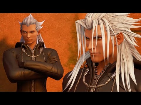
KINGDOM HEARTS 3

I loved this series as a teenager. Then I hated it. Now I’m back to enjoying it.

This series is NOT flawless. But it’s like a cup of tea with a bar of chocolate: the best self-indulgence you can get without thinking too hard about it.

Really, the series is at its best when you’re not thinking about the plot. Though, as SuperButterBuns put it, the plot isn’t that confusing: it’s just a lot to remember.

(I also do the Crash Bandicoot logic of boss fights, in that the bosses in the previous games didn’t “die.” They were just defeated once and then came back for Kingdom Hearts 3.)

So what about Kingdom Hearts 3 has been getting me inspired? Well, I’d be lying if I said anything other than “The Organization.”

Or seeing Woody from Toy Story tell one of the Organization members to piss off. That scene gave me SO MUCH LIFE.

Also, Kingdom Hearts fans will get this reference: Yeetas Vanitas.

There’s tons of silly, charming character moments in Kingdom Hearts 3 in particular. Is the voice acting as good as the Union Cross: Back Cover movie? Nope. But the character banter is on point, more so in this game than in any other Kingdom Hearts installment.

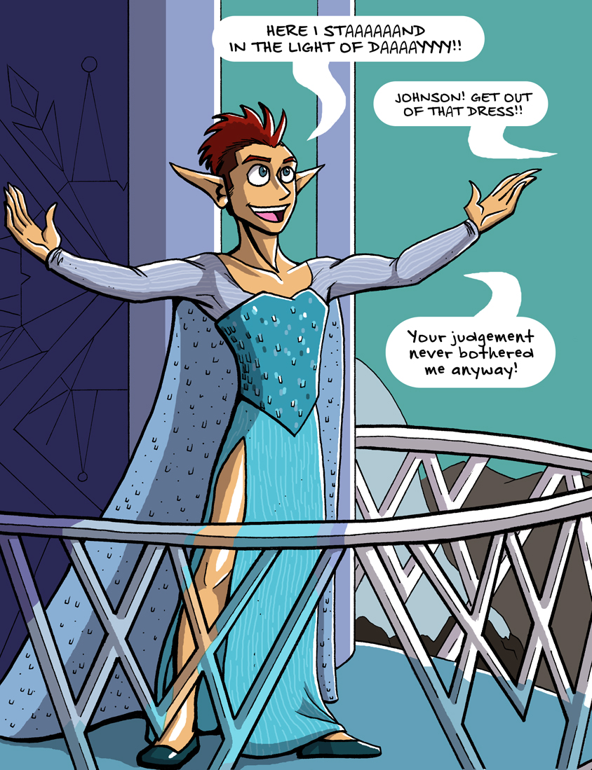
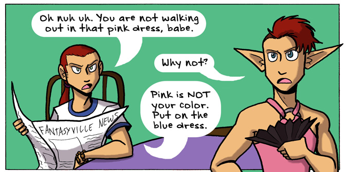
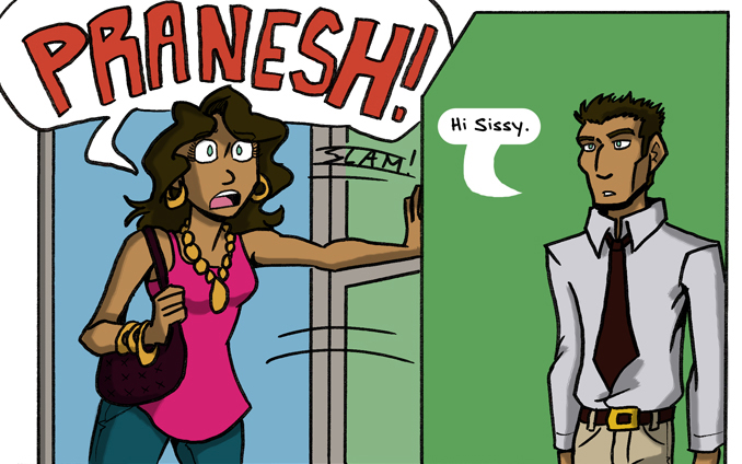
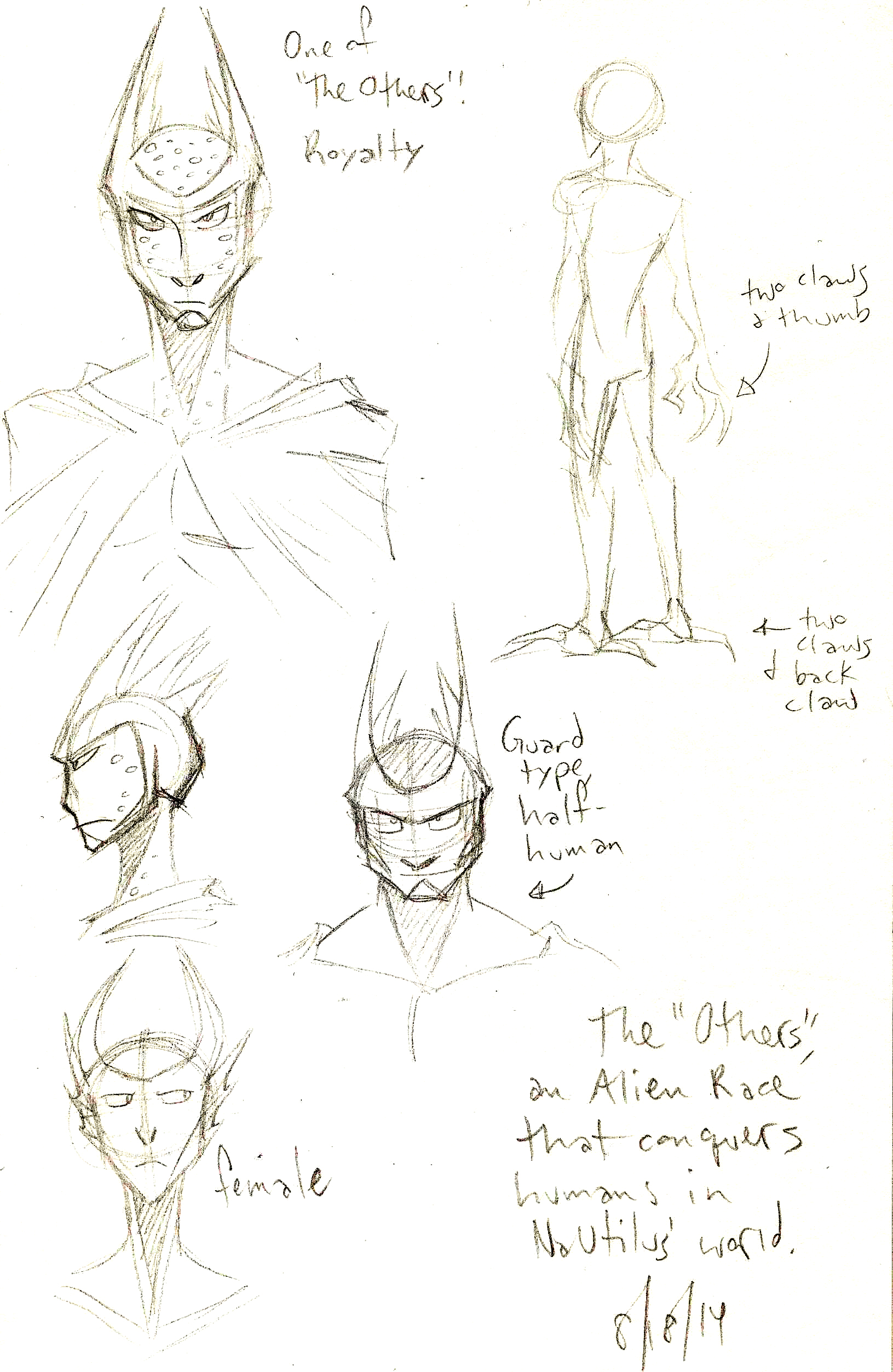
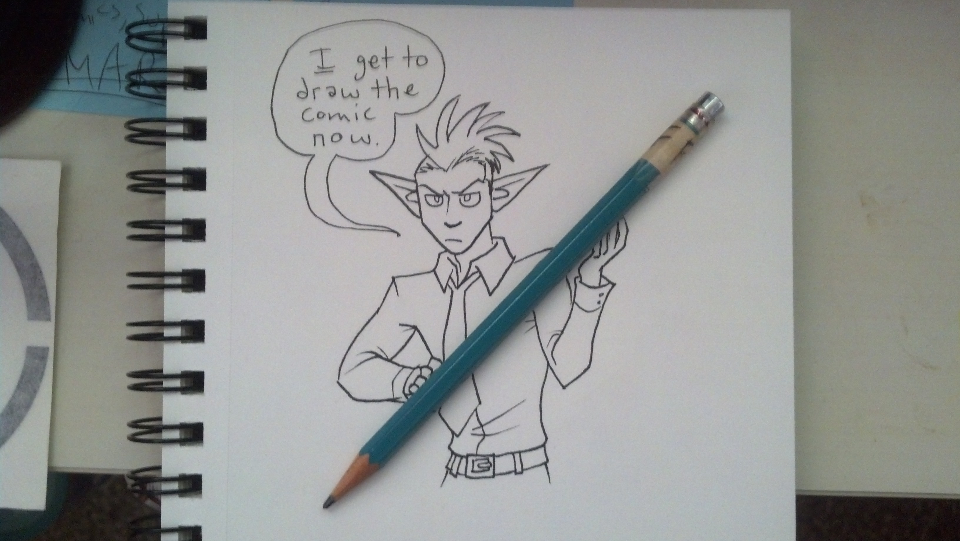
And, well, the Organization and the mystery behind each member just intrigues the hell out of me. Not to mention that the characters themselves make good warm-up sketching material. Every character looks and acts differently. And I appreciate that.

Ok, I’ll move on to the next piece of inspiration before I gush anymore:

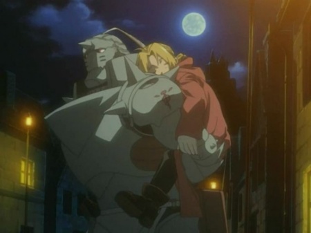
FULLMETAL ALCHEMIST: BROTHERHOOD

From Kingdom Hearts’ absolutely bonkers plot to a story with a damn-near flawless plot. Yes, FullMetal Alchemist: Brotherhood’s story is so expertly woven that it’s really McFreaking Hard for me to find a fault with it anyplace.

Every character has a purpose. Every motivation makes sense. And the action of this series is driven by the motives of the characters, not some invisible hand dragging them by the nose under plot contrivance.

Also, much like Kingdom Hearts, the character designs for FullMetal are just superb.

Really, though, it’s the writing and how the story moves forward that’s been inspiring me the most. It makes me want to write.

I doubt I will ever write anything like Brotherhood. But it gives me something to aspire to, and a benchmark to look at whenever I lose focus.
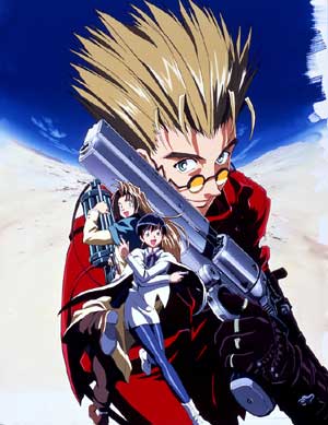
TRIGUN

Above anything else, the humor (and one other thing) of this series has been inspiring me the most lately.

The other day I was marathoning this show in the background while I was doing studio work. And yet the show still makes me laugh, even when I’m not watching it directly.

There’s a soft spot in my heart for any character who fulfills the Crouching Moron, Hidden Badass trope well, and Vash the Stampede is the best embodiment of this trope.

Also, the very first episode of this show is the best introductory episode of any anime I have seen thus far. Period. Don’t believe me? Watch it for yourself. You’re welcome.

Did you know Studio Ghibli (yes, THAT Studio Ghibli) did the animation of some episodes of Trigun? When I learned that, it blew my damn mind.

This is also another series with some damn good writing to it. But for a different reason: FullMetal’s focus was on the characters and motivation. Trigun’s focus in the writing is on the world-building, and Vash’s connection to it.

Once you see the conclusion of Trigun, you will realize there’s no other story like it. And that’s what inspires me.

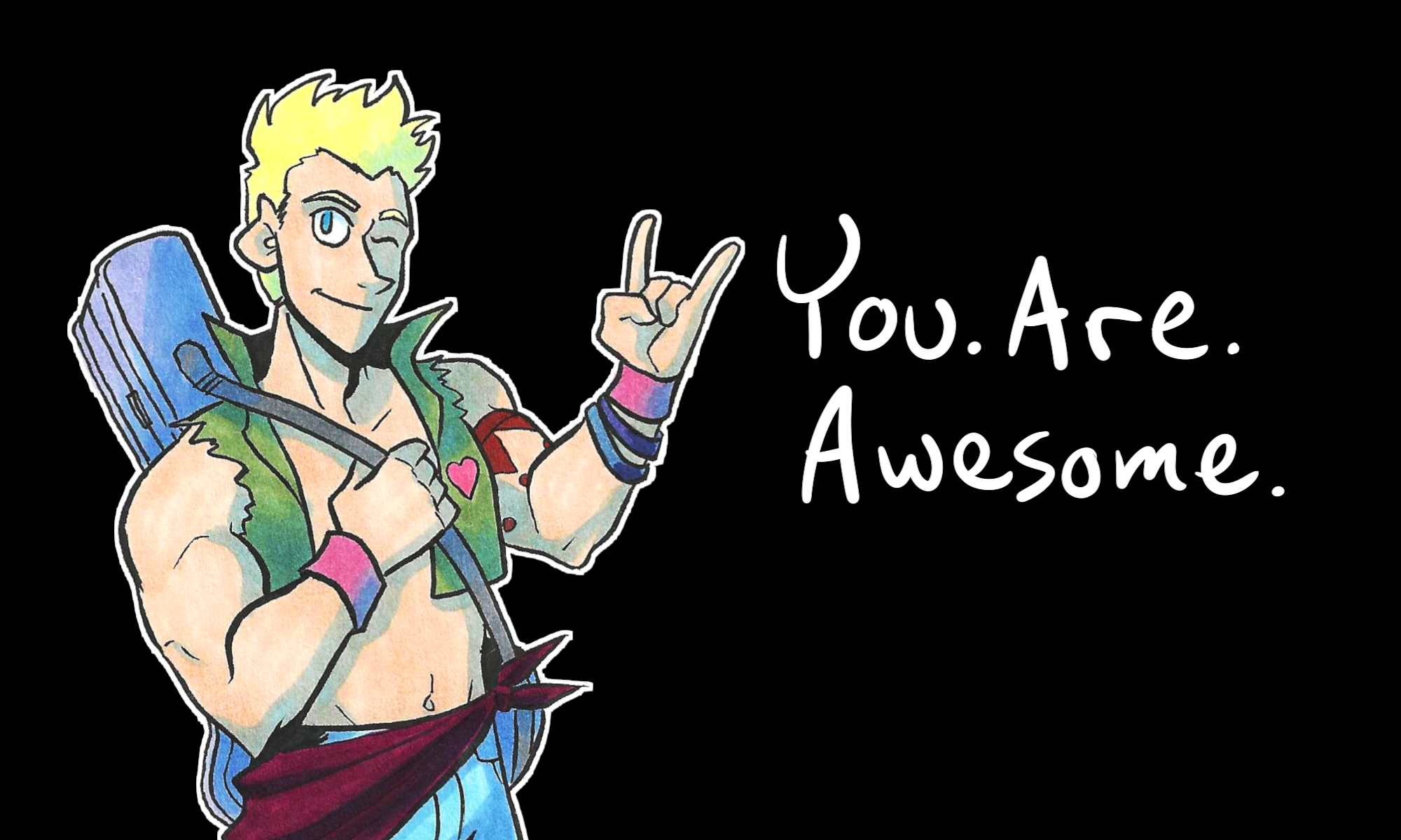
That’s all for now. I’m gonna’ get back to drawing.

Thank you for reading!

You. Are. Awesome.

P.S. Another fun fact that blew my mind: the English voice actor for Xemnas in Kingdom Hearts also did the voice of Detective Konakawa in Paprika. Now I can’t look at Xemnas half the time without thinking about Konakawa’s dream antics.

The Character Designs for Johnson & Sir

So in Part 1, I talked about character design in comics, and what doesn’t tend to work. In Part 2, I talked about some character designs in practice in Validation and other personal works.

Today I would like to look at more character designs and how they can reflect or embody elements necessary to the story.

Let’s look at some characters from…Johnson & Sir.

johnson and sir clip from page 51
A scene from Page #51, “My Conscience is Rising”.

Johnson and Sir are two opposites: Sir is the busybody tough guy who plays by the rules and runs a tight ship. Johnson is a relaxed joker who figuratively pokes the bear (the bear being Sir) to make him lighten up and joke more.

Sir is well-kept and nicely groomed. His mustache is always perfect and he’s almost always standing up straight and in-charge.

Johnson…

He's not afraid to embrace his inner Elsa.
He’s not afraid to embrace his inner Elsa.

Johnson loves his dresses and is not afraid to wear them. He’s willing and able to break the expectations of society. He LOVES to do so. To match his flamboyance, he has wild hair and crazy facial expressions. While Sir is stoic, Johnson isn’t afraid to wear his heart on his sleeve.

johnson and sir johnson faces
Just a small sampling of Johnson’s faces.

Of course, in the Fantasyville Police Force, there are characters that match up with Johnson and Sir, serving as mirrors.

Mirror characters are not new or even rare. Mirror characters are those who have the same experiences or functions of the main characters, but can oppose them in some way.

For example, Ackles is a mirror for Johnson.

johnson and sir ackles
Here’s Ackles being reasonable with Johnson, from page #54, “The Elf and the Wardrobe.”

Ackles is the nice in-between of Johnson’s heart with Sir’s rationale. Ackles is reasonable but accepting of the absurdity in Johnson’s attitudes. He’s not as by-the-book as Sir is, but he still follows the rules that society has placed, for the most part. He’s not all-knowing – in fact, he’s still new to the job as a police officer, and asks a lot of questions. He’s the naive curiosity to Johnson’s experience. His naivete and curiosity are what drive him to go adventuring with Johnson and do silly, absurd things.

To reflect these characteristics in his design, he has a well-groomed image like Sir, hair that doesn’t meet societal expectations like Johnson’s, and wide, emotional and curious eyes.

So now we know about Johnson’s mirror character, Ackles. Who is Sir’s mirror character?

Pranesh.

johnson and sir pranesh and sissy page 49
Pranesh and his sister chat in #49, “What a Worrywart.”

Pranesh hardly ever speaks until the Haiku Flu arc. He’s a man of few words and somber actions. He doesn’t do exaggeration like Johnson or Ackles do. He’s a quiet, determined sort of man. That’s why he has the strong chin and jaw, the broad shoulders, the high cheek bones, and the tired eyes. He’s seen things, but he carries on in his quiet way. Like a superhero.

Pranesh is much like Sir in his stoic nature and ramrod-straight posture. He carries himself with dignity, like Sir (for the most part) does.

But Pranesh is a bit too stoic. We don’t see him smile. He hardly ever jokes, unless it’s in a deadpan, dry way.

pranesh from johnson and sir
Pranesh also has some mystical powers of some sort, man.

He serves as the mellow contrast to those rare moments when Sir unwittingly lets an emotion loose, like humor or fear.

johnson and sir page 61
Page #61. Sir is so horrified even his mustache flees in terror!

While Ackles is complimentary to Johnson, Pranesh is almost a caricatured personification of Sir’s dryness. He is what Sir COULD become, if it weren’t for Johnson poking him with the metaphorical silly stick.

So in designing these characters, everything plays a part – their facial expressions, their posture, their body language, their hair and clothes (when they’re not in police uniform). Keep these factors in mind when you create your own characters for comics and, hopefully, your characters will become much more real.

johnson and sir johnson elsa frozen caption
Let’s end this blog post on a high note.

So did you like this 3-part series? Would you like me to keep talking about character design for comics? What have you learned from my ramblings about character designs? Leave your thoughts in comments below!

Also! Did you like Johnson expressing his inner Elsa? Because you can get it as a print to hang on your wall! Or your friends’ wall. Or wherever people need to burst into motivational song.

This blog post was the last one in a week of daily updates. Thank you to everybody who read my posts everyday! I’ll see you on Monday.

Character Design for Comics, Part 2

So in yesterday’s post I talked about what I feel like makes bad character design for comics.

To be fair, creating unique designs for characters is hard, especially in comics. It’s too easy to fall into formulas and make your characters suffer Same Face Syndrome, or its cancerous cousin, Same Body Syndrome. (Don’t know what I’m talking about? You should have been here yesterday.)

So then, what DOES make a good character design?

This is a hard question to answer. It’s even talked about in one of my favorite episodes of the Chris Oatley ArtCast podcast, when he interviews character designer Brett 2D Bean.

It’s not an easy question to answer, even if you’ve been making comics and animated works for YEARS. What makes great characters tends to vary from artist to artist.

However, I try my best to keep these points in mind. Good character designs in comics (to me)…

  • express the full range of human emotions,
  • are visually individual from each other, and
  • embody necessary elements in your story.

Let’s take a look at some of my own character designs.

nada character design sheet sketches
Character sheet for Nada.

Nada is a character I created for a work-in-progress, where she and several children are trying to escape a haunted house. Nada loves the wilderness, exploring, and practicing her survivalist skills. So in her design, I gave her sturdy hiking boots and a pair of pants that wouldn’t snag on anything from long sleeves, but still protect her legs from ticks and burrs. She’s still feminine in that she keeps her hair long, but she’s low maintenance and would rather keep her tangle of hair pulled back.

Let’s look at another story, which has the working title The Hoard.

claire the zombie hunter lady
Claire.

Claire is a tough cookie. She’s also sharp and abrasive, which is why I drew her with sharper angles, especially in her face. She’s also muscular, having fought against the zombie hoard for a few years. Her clothes fit her snugly – she has no time for loose things to snag onto obstacles. She needs to do her thing quickly and get it done.

Let’s compare her to Tracy.

tracy character design sheet of sketches
Tracy’s character sheet.

Tracy has softer edges and curves, including a round face. That’s because she’s much more innocent and timid than Claire is. Compared to Claire’s hardness, Tracy is squishy. She also has more introverted body language – she keeps her arms in and her mouth shut. Compared to Claire’s open and fierce body language, Tracy is quiet. She compliments Claire nicely for the story.

Ok, so what about in something like Validation?

Let’s look at the progression of Ally.

validation ally art progression comparison
Ally in the first strip, compared to strip #151.

This isn’t just a comparison to see how my art improved over time. There’s some subtlety going on in Ally’s design.

When she first appears, her hair is much straighter, she’s quiet in her demeanor, and she keeps to herself for the most part.

As time goes on, she gets more outgoing, more outspoken, and that gets reflected in her appearance. Her hair is much looser and wilder, and she’s not afraid to wear a shirt that says “Boss.”

We can also see a change in Roxie, especially in one particular arc.

validation roxie character progression
It’s almost like Roxie is two different people.

Roxie is a punk. She is loud, she is funny, she is energy personified. Even her hair is electric!

However, in a rather dramatic story arc, she hits a slump. She retreats inward and loses a little of her spark. Usually, her mohawk has vibrant color, but in her slump, her hair is apathetically white and lifelessly blank. Her hair is limp, her energy just sucked out of her. And instead of standing straight and proud and emphatic, she slumps over, drawing herself in, away from the world.

Thankfully the downturn doesn’t last long, but it’s still dramatic enough that her appearance changes to match her character.

There are even more character designs I want to show and discuss, but that will have to wait for tomorrow – I don’t want this post to get too long!

Thanks for reading and I’ll see you soon.

Character Design for Comics, Part 1

alien character design sketches concepts
Sketches of an alien race, the Uthers (Click to enlarge).

“Character Design” is generally something you hear more in the animation industry than the comics industry. However, the two industries often overlap, especially whether you talk about camera angles, lighting and moods, or, in today’s post, character design.

Character design is especially important in comics. You need characters that…

  • express the full range of human emotions,
  • are visually individual from each other, and
  • embody necessary elements in your story.

On top of all of this, the character design should be simple enough that you can draw it repeatedly and NOT want to stab your eyes out with a mechanical pencil.

So before I show my own character designs and what elements I think work, I’m going to show some things that…don’t.

While there are no hard and steady rules for character design, I have this one personal rule of my own. It’s the only one I need, but it’s no less important.

If it makes a gorgeous illustration, it’s a terrible choice for a comics character design.

This is something mentioned briefly in an Aaron Diaz blog post about costumes in character design, under a section called “Simplicity.” He says…

Above all else, keep it simple.  Comic characters are not pin-ups or other illustrations; you have to draw them over and over again, from various angles.  If you pile on too much detail, you’ll wear yourself out slogging through all the bits every time you have to draw them.

Let’s look at an example…

final fantasy belt dress lulu
THE BELTS.

THAT is a beautiful illustration. It would be a total pain in the ass to draw repeatedly for a comics story.

Now, I know what you’re thinking: A Bride’s Story.

a bride's story manga
A scene from A Bride’s Story (Click to enlarge)

Yes, it is insanely detailed and gorgeous. The artist also has assistants to help her meet her deadlines.

Most comics artists I know don’t have the luxury of an assistant to help them make art. They are, 99% of the time, making everything on their own.

To that end, I still stand by my personal rule.

If it makes a gorgeous illustration, it’s a terrible choice for a comics character design.

Remember that simplicity is key.

So, what else doesn’t work?

Same Face Syndrome.

disney frozen same face syndrome character design
The most notorious example of “Same Face Syndrome” to appear in recent years. (Click to enlarge)

Same Face Syndrome is when you use the same face in your character design. The most cancerous of Same Face Syndrome symptoms spread into the physique, when you draw all of your characters with the same general body shape.

I used to suffer from this HARD when I started out. It’s a common mistake because Same Face Syndrome is so formulaic, and formulas help make new work faster…even if it’s not necessarily better.

The thing about character design is it should not be formulaic. Your characters should not fit a mold.

They should be individuals, with their own physiques and faces and personalities.

Each character you draw is their own person. They should serve a unique but specific purpose in your story. That’s why you draw them into your comics, after all.

Have you noticed any Same Face Syndrome elsewhere? Have any tips for character designs? Leave them in the comments!

Thank you for reading and I’ll see you tomorrow, when I show some of my own character designs and the creative decisions behind their looks.

So I’ve Been Sketching…

Well, looks like I need to surrender control of Johnson & Sir to Johnson…

JohnsonStealsTheShow

That’s ok. I have a new friend. Her name is Nada.

2014-05-18 21.50.48 Nada

She’s starring in a new comic I scripted yesterday (I bragged about it on Twitter).

She’s a fan of camping and survival tactics. Thankfully I found a few good resources about the subject, including the Army’s Survival Guide.

Have I ever mentioned how much I love creating characters? Because I do.

I need to expand into other physiques, though, like I did with THIS gentleman:

BogulNoz_Final2_web.jpg

That character actually is not mine, but one I drew for K. Ferrin a while ago.

Now I need to get back to reading and making comics. Be right back…