Notre Dame Cathedral, Chaco Canyon, and Historical Preservation

Notre Dame cathedral in France caught on fire. And that got me thinking.

Specifically, it got me thinking about the importance of cultural preservation, how we got to caring about Notre Dame cathedral so much, and how we can carry that attitude moving forward.

We as an American/European culture got to caring about Notre Dame cathedral mostly because of Victor Hugo’s The Hunchback of Notre Dame – or, in the original French, “Notre Dame de Paris.”

Believe it or not, that book has nothing to do with the love “triangle” of Quasimodo, Esmerelda, and Frollo. That dynamic was more due to later interpretations and adaptations of the novel to the movie screen. (For more on that, check out this video by Lindsay Ellis if you haven’t already.)

No, the original book is a lengthy essay about the importance of architecture to a culture and how architecture outlives and outlasts the people who live around it.

So, if you ever read the book and wondered, like teenage-me did, why the characters are so unlikeable and why there are entire pages devoted to the flying buttresses… well, now you know.

In short, Victor Hugo’s book was written in an attempt to preserve Notre Dame cathedral at a point in time and history when cultural preservation wasn’t even a concept. Keep in mind, too, that when Hugo wrote the book, Notre Dame cathedral was practically a shell, having been looted and torn apart multiple times until he wrote “Notre Dame de Paris.” This book was written with the intent of telling people why this cultural edifice was so important, and urging people to restore it and preserve it.

I’m glad we now live in a world where historical and cultural preservation is a thing. And I’m glad to live in a world where the burning of Notre Dame Cathedral is considered a tragic event because of the historic significance of the landmark.

That said, don’t worry too much about Notre Dame Cathedral. Now, I’m saying this as an American Pagan and not a French Catholic. I’ve never seen the cathedral in person, and my only visual memory of it is the Disney adaptation of The Hunchback of Notre Dame. However, Notre Dame Cathedral has the Catholic Church and the support of millions of Catholics around the world to restore it. Notre Dame cathedral will be fine.

My hope is that we remember the significance of cultural landmarks like Notre Dame Cathedral, and we carry that attitude with us towards monuments and landmarks that are at risk.

Like, here in the United States, we have a lot of cultural parks at risk at the hands of our current government administration, who are more focused on resource extraction than on cultural or historic preservation.

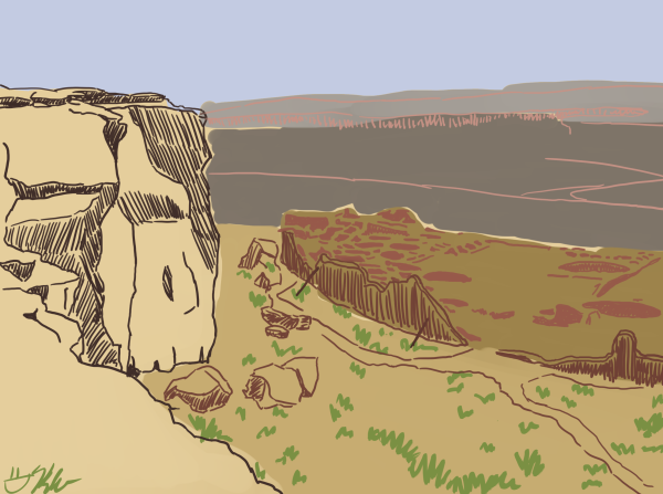
As an example, let’s take a look at Chaco Culture National Historical Park in New Mexico. This site is not only a culturally significant site to MANY Native American tribes. It’s also the home of the oldest Pueblo ruins in the United States.

And the problem? The largest of those ruins, Pueblo Bonito, was excavated, but nearly half of it was buried again under a landslide. All of that work, and all of the artifacts left to excavate, was lost.

And my concern? Right now there are fossil fuel companies looking to build mines, or god forbid, go fracking, in the lands in and around Chaco Canyon. The earthquakes that those operations cause could bury more ruins and make us lose more history.

My hope? I hope we remember the example of Notre Dame Cathedral and we carry that momentum forward, to protect the cultural landmarks that contain our history.

Chaco Canyon and Notre Dame Cathedral mean different things, depending on your religious outlook. But they are both significant landmarks that have outlasted and outlived the peoples who originally built them. My hope is that we remember the significance of places like Chaco Canyon and we treat it with the same care and respect as we do Notre Dame.

Thank you for reading.

You. Are. Awesome.

P.S. If you would like to find out more about Chaco Canyon, here’s their official website (if you have the means to, they also accept donations). And be sure to check out (and if you can, support) The National Park Service, the organization that protects sites like Chaco Canyon nationwide.

How I Made the RathaCon Limited Edition Print Art

This post does contain affiliate links. Bear with me.

So this started, initially, as a multi-part blog post series.

Then it got complicated.

Specifically, the art got complicated, and I wasn’t able to make a new blog post each week to detail the process of making this thing.

Let’s go into the details, though, so I can show you WHY this art took so long. And also how I make big illustrations like this one.

STEP 1: THUMBNAILS

Thumbnails are what I like to call the really rough sketches of an idea. It’s something I borrowed from animation film language.

I already wrote a post about this step, which you can read here.

STEP 2: PENCILS

I wrote about why I choose this design, as well as the details of it, in the second part of the blog series. Now I’m going to get into the how.

It took a little while for the email chain with the convention staff to start (another reason that the weekly blog post idea had to get pushed). But once it got going, I was able to get feedback and get to work.

Pencils – or, the sketched the version of a thing – is something I do with just one pencil in one go.

When I first started in comics, I USED to do the undersketch with one pencil (usually a 2H), then the top layer in a darker tone (like B).

Now, I do all of my pencilling with just one pencil. Usually a mechanical one. I believe the RathaCon art was drawn with my Tombow monograph mechanical pencil, but right now I am in LOVE with the Zebra DelGuard mechanical pencil.

STEP 3: INKS

This step takes a deceptively long time.

It takes a long time for me because I try to control the line weight as much as possible: making some areas dark with a bolder line, but light with a lighter line.

Inking is also the stage where I have to squint at my pencil drawing and determine what lines will look the best when inked.

Because pencils are when I get real loose. Inks are where things get tight and snappy.

STEP 4: COLORS

Depending on the piece, I’ll make it either traditional-only (usually with Copic markers). Or I make it a combination of traditional and digital. Or I have all the colors be digital.

For the RathaCon print art, I opted to combine the traditional and digital modes. So I colored with my Copics first, then scanned the art, to start the next step…

STEP 6: DIGITAL EDITS

At this stage I go back over the art in Clip Studio Paint and erase any stray marks, fix any color bleeds, and generally just clean the piece up.

I also like to adjust how much the colors pop at this stage. So I play with the levels a little.

STEP 7: DIGITAL COLORS

With the RathaCon art, the only digital color I needed to add was the background tint.

In almost any other piece, I’ll add a layer over the art in Clip Studio Paint in order to add shadows. These make the art pop even more.

STEP 8: FORMATTING

I originally made the art for this print at 11 x 17 inches.

About a week ago, the RathaCon staff asked if I could make the piece an 8.5 x 11 inch one instead.

Pro tip: it’s WAY EASIER to shrink an illustration than to enlarge it.

It took a little wiggling to keep the scale of the piece consistent and not accidentally cut off bits of it. But a new scale was figured out.

And there you have it!

As I mentioned, this art will be available as a limited edition 8.5 x 11 inch print at RathaCon, for $10 a piece.

So if you’re in Athens, OH on April 27, I hope you get it! This is a limited print run, so once it’s gone – it’s gone.

I’ll have these beauties for sale at my table, and they’ll also be available at the RathaCon official table.

Thank you for reading!

You. Are. Awesome.

Designing a Print for RathaCon, Step 2: Pencilling

After much discussion and user feedback via Instagram, the votes trended towards THIS design shown up top. So I drew it.

RathaCon is host to a LOT of nerdy events, from tabletop gaming rooms to belly dancers and Quidditch. I wanted this design to incorporate the many scenes that RathaCon has played host to.

I even squeezed in some gears for the steampunk elements, because there’s a steampunk contingent that appears every year. Magic: The Gathering cards and comic books will fill up some of the spaces around the edges. Plus the GhostBusters logo is to homage the local GhostBusting team.

There’s still some details to fit in, but so far it’s off to a great start. Don’t ya’ think?

The Silly Tale of the Smith Family Commission

I was first approached by Mr. Smith, at the Pittsburgh Witches Ball. He asked me if I was available to do commissions.

That made me ask, “What would you like me to draw for you?” And he said, “I was thinking of getting my family drawn as superheroes. But let me get back to you on that.”

About a month later I was approached by Mrs. Smith.

She asked, “Can you please draw my family and me as super heroes?” To which I said, “Absolutely!”

That resulted in this:

While I was drawing this, Mr. Smith contacted me again. He said, “Hey! Are you still available to do commissions? Because I would really like you to draw my family as superheroes.”

Before I could reply, I contacted Mrs. Smith and said, “Uh…your husband just asked me to make the same thing you asked for. What should I do?”

She laughed.

So I said to Mr. Smith, “Sure I can make the thing!”

And that’s how I drew this:

They were both surprised when the presents were unwrapped.

The Legend of Jamie Roberts’ Newest Print

Awwww yeah! This print got finished not too long ago to showcase my new upcoming webcomic, The Legend of Jamie Roberts. (Coming online mid- to late-November.)

Illustrated here, from foreground to background, is Jamie Roberts, Ragun Ranki (pronounced Rah-Goon Ra-N-key), and the dragon shape of Ragun Basho (pronounced Rah-Goon Bah-show).

This took a little while to illustrate, especially with the waves of The Way in the background. The Way is the spirit world, where souls rest after death and before birth, and where Ranki was banished after The War of the Leaders 500 years before the start of the Legend.

Here’s some clips of the progress of the piece:

The colors of the background and Ranki were done in Clip Studio Paint to save me some marker ink.

This image will do double-duty as both a print and as the cover art for Chapter 1’s online serialization.

That’s all for now. Thank you for reading!

You. Are. Awesome.