I’m a fan of mini things, like minicomics. That’s why I make so many of them – they’re small, fun, and easy to make.
Turns out, miniprints are easy to make, too.
What’s a miniprint? Well it’s a print (like a poster), but small – like 5 inches by 7 inches, or even as small as 4 inches by 6 inches. They’re not postcards, but they’re the size of one. Continue reading “Introducing the MiniPrint”
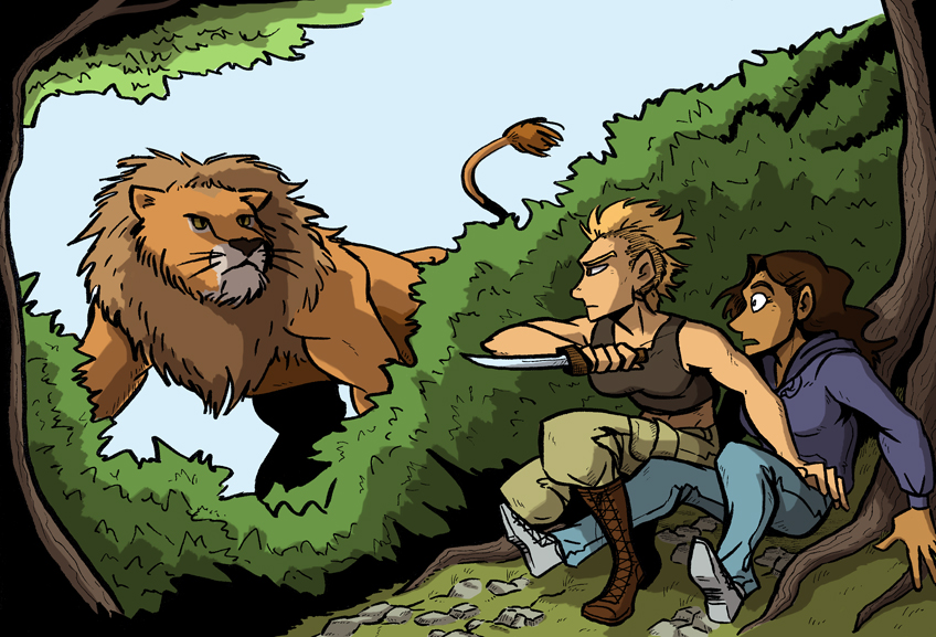
Today I review a new first-issue comic published by Action Lab Comics, called Action Lab: Dog of Wonder (yes, that title was intentional). I first saw this book when Action Lab Comics appeared at my local comic shop for a promotional event, and I spoke with Vito Delsante, the co-writer on Action Lab #1, who is a really cool guy. Anyway, the comic’s pretty fun and adorable and you should read it.
More book reviews are coming, so stay tuned!
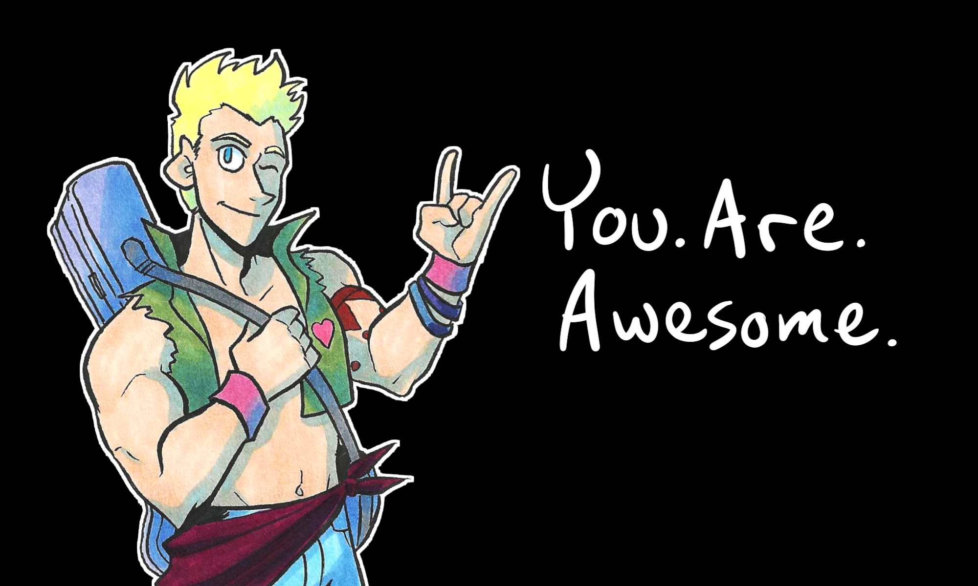
In not-book-review news, there’s a new sketchcomic just for patrons called, “Julia.” The version patrons are seeing now is actually the new and HEAVILY revised draft of this old story idea. So if you want to read it, go pledge on Patreon.
For people not in the know, Hourly Comic Day was something that started back in 2006 by John Campbell as a personal project – he drew a comic/cartoon for every hour he was awake in one day. Other artists caught on and started doing it until there finally came a designated day: February 1st.
…February 1st was yesterday, and I managed to get my hourly comics made! …I just… didn’t get to post them until today.
I’ve been updating the galleries on this site, starting with the Commissioned Works gallery. I FINALLY found a plugin that’ll work on the site that’ll show the art and not look like garbage.
The Illustrations section will be split into subsections so I can feature The Women Warriors, Subversive Girls, and a few other series’ of illustrations.
A gallery of Sketches is also slated to reappear…somehow…in some way…