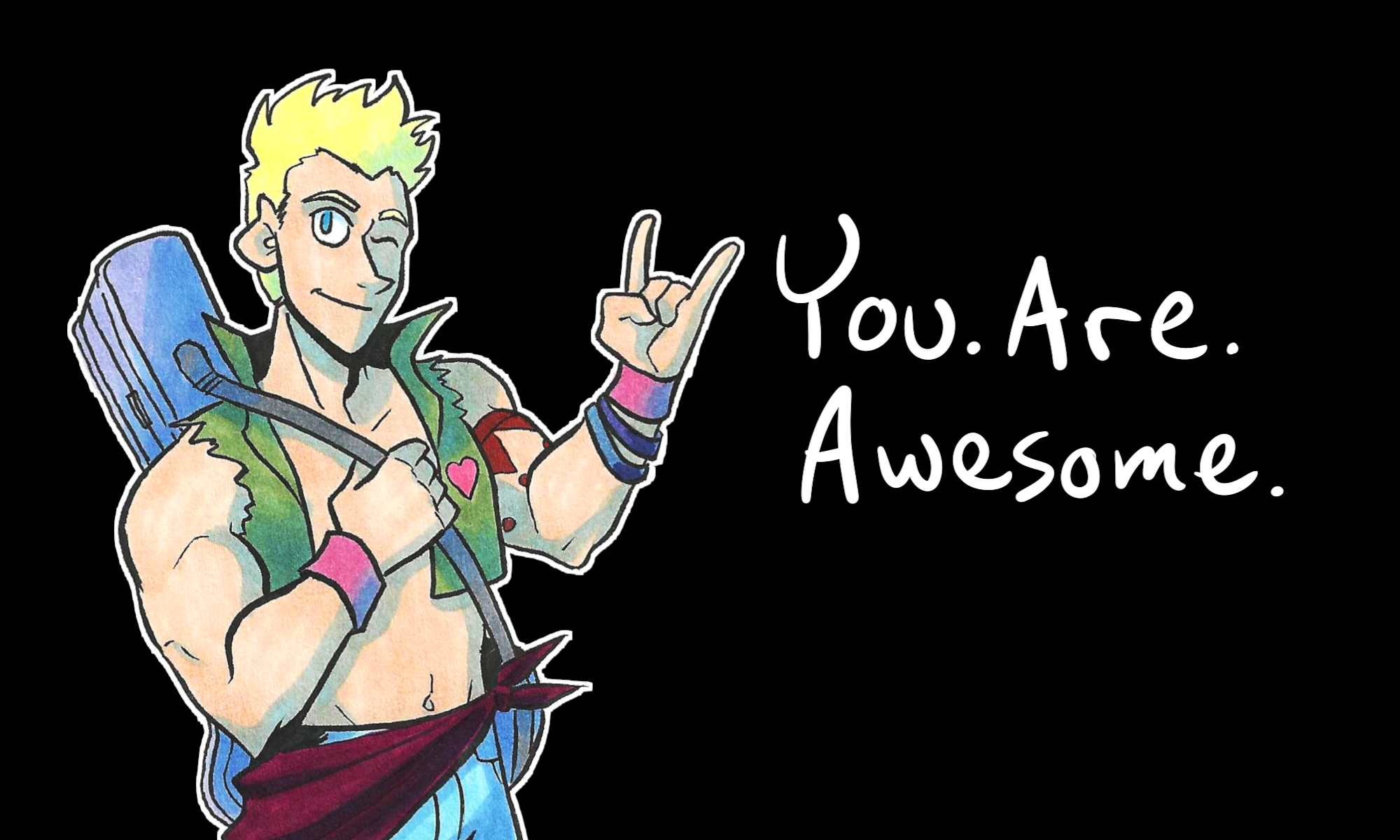
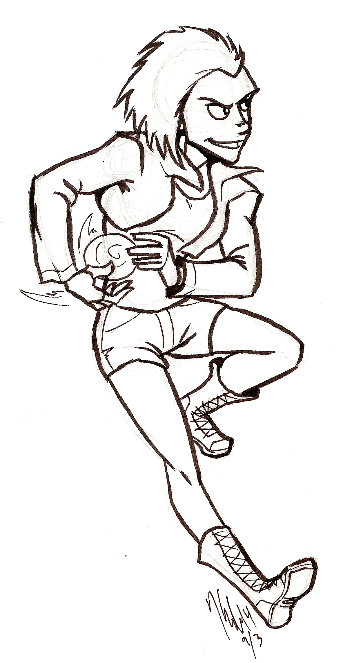
So in my hurry to get ready for Youmacon and also keep afloat on commissions I’ve been asked to do, I…lost track a little with Johnson & Sir. I missed an update last week. But rest assured! It’s back to a normal update schedule now! You can read the new page here.
Here’s a preview to further entice you:
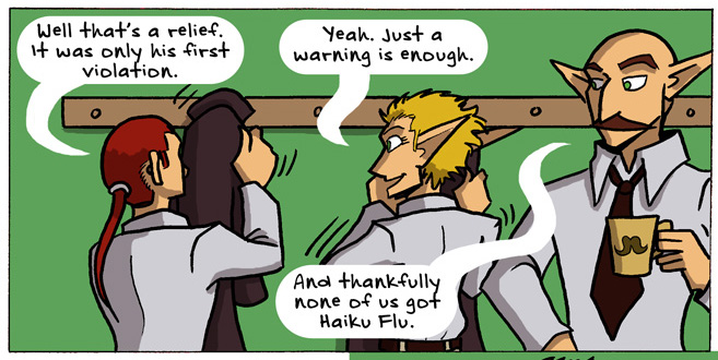
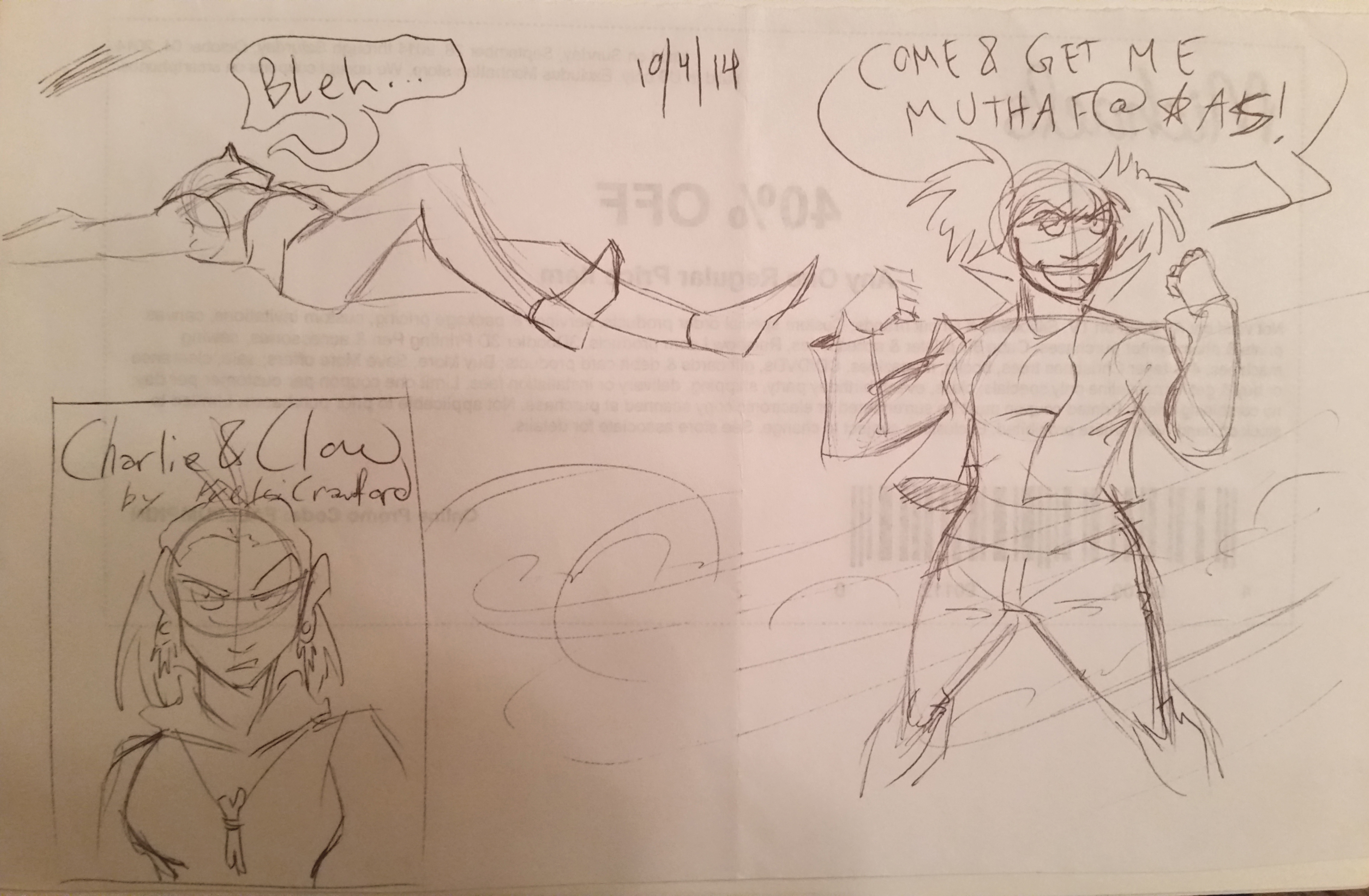
I’ve also been working really hard on my new webcomic Charlie & Clow…
And it launches tomorrow! Read it at its own website. It even comes with a surprise!
This is not the surprise I’m talking about. This is just to show off a taste of what’s to come.
In case you haven’t heard, Patreon is a voluntary subscription service where you can donate as little as $1 a month to your favorite creators. In exchange you get gratitude and really cool perks! Christian and I would really appreciate any support you can give over at Patreon (and if you’re broke, spread the word on social media! That helps, too).
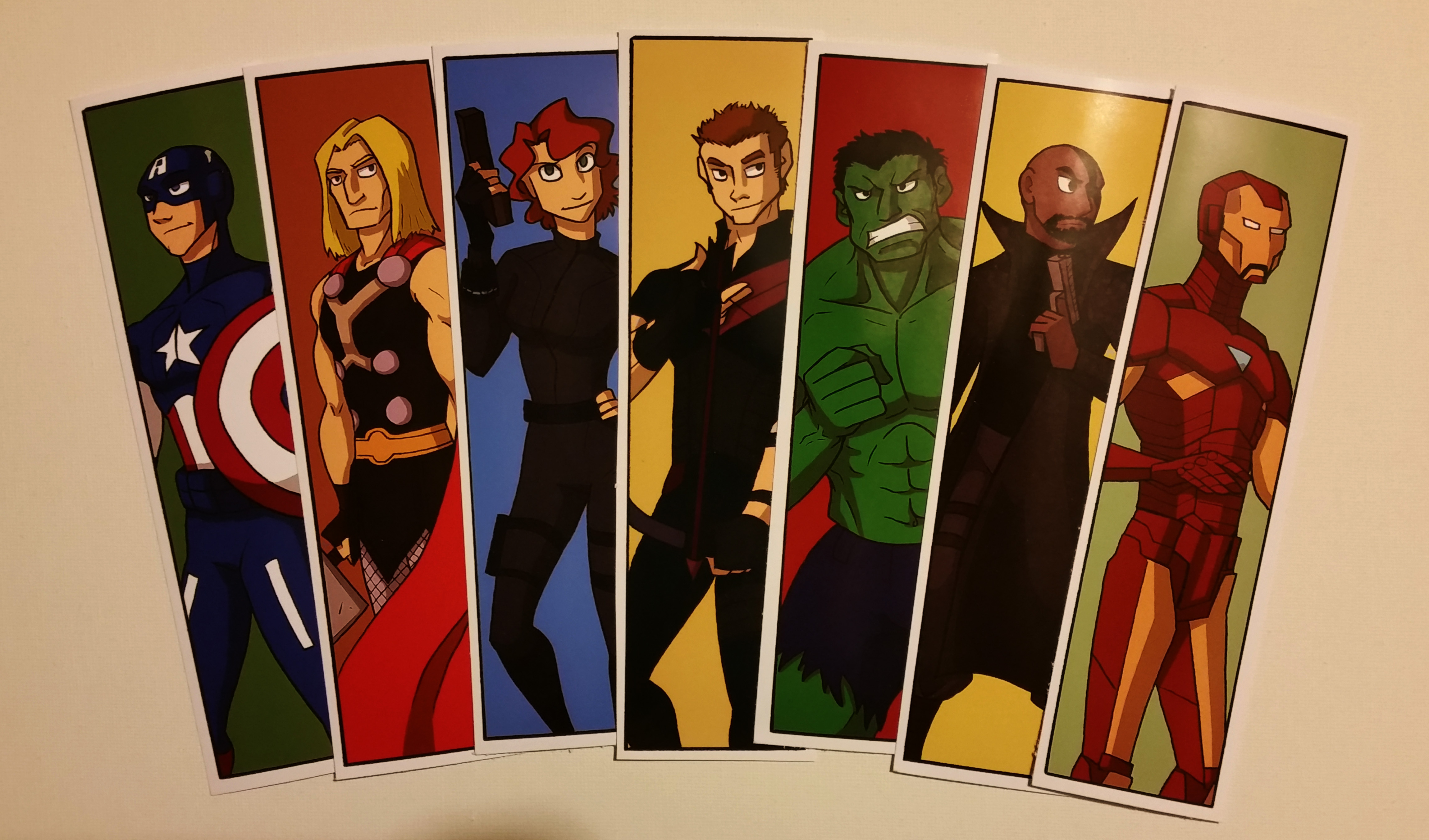
In even more product-launching news, I added a new listing at my store: Avengers Assemble! In bookmark form, of course:
Click for fuller view.
If you’re interested in ordering a set, click here.
The rest of this week, I will be MIA, as I’ll be with my family and then immediately going off to Youmacon. I won’t be a special guest there, but I’ll be attending (probably in costume). I hope you can find me!
As such, I won’t be updating on Friday like I usually do, because I’ll be either on the road or at the con. So you’ll see another update on this blog next Tuesday!
In the meantime, I’ve got comics for you to read: Validationon Mondays and Thursdays, Johnson & SirTuesdays, and now Charlie & Clow Wednesdays! So there you go.
Here’s hoping this gets posted properly, because for some strange reason my internet connection has become spotty in the last 24 hours.
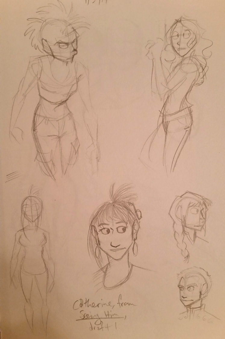
Anyway, I wanted to share some sketches I did this week!
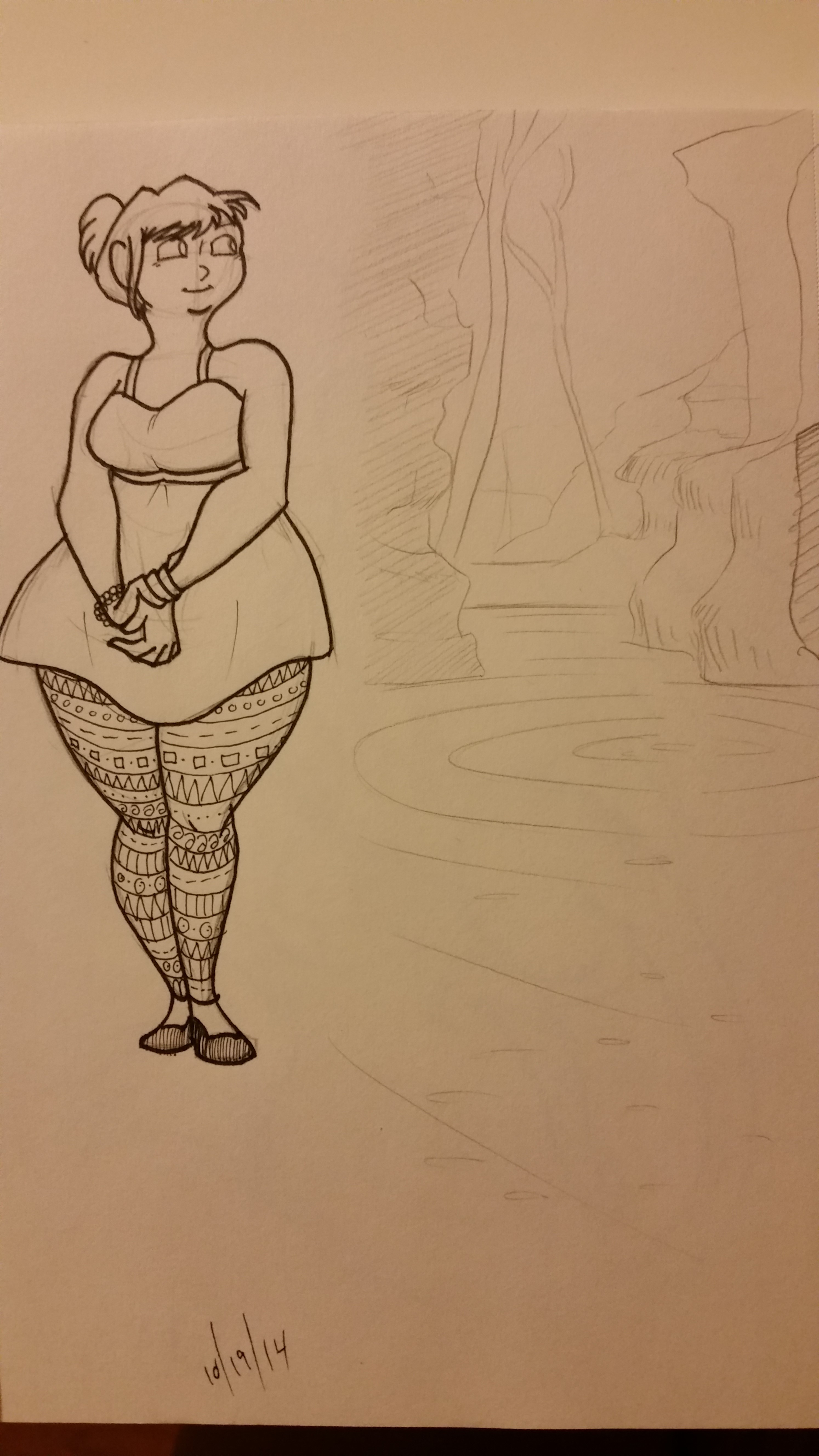
This is one I did to a) practice drawing chubby girls, and b) practice pencil sketching nature and showing depth.
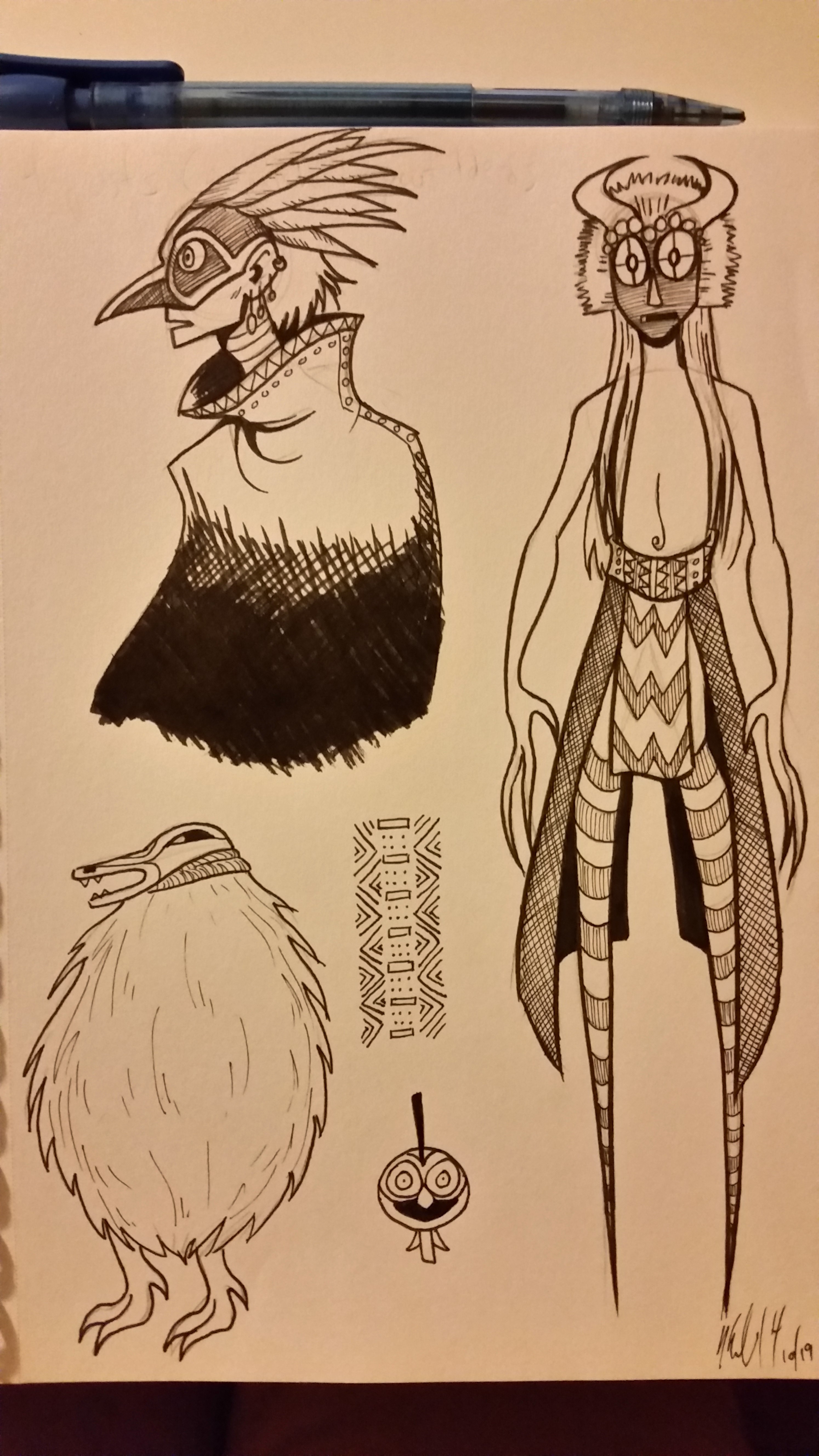
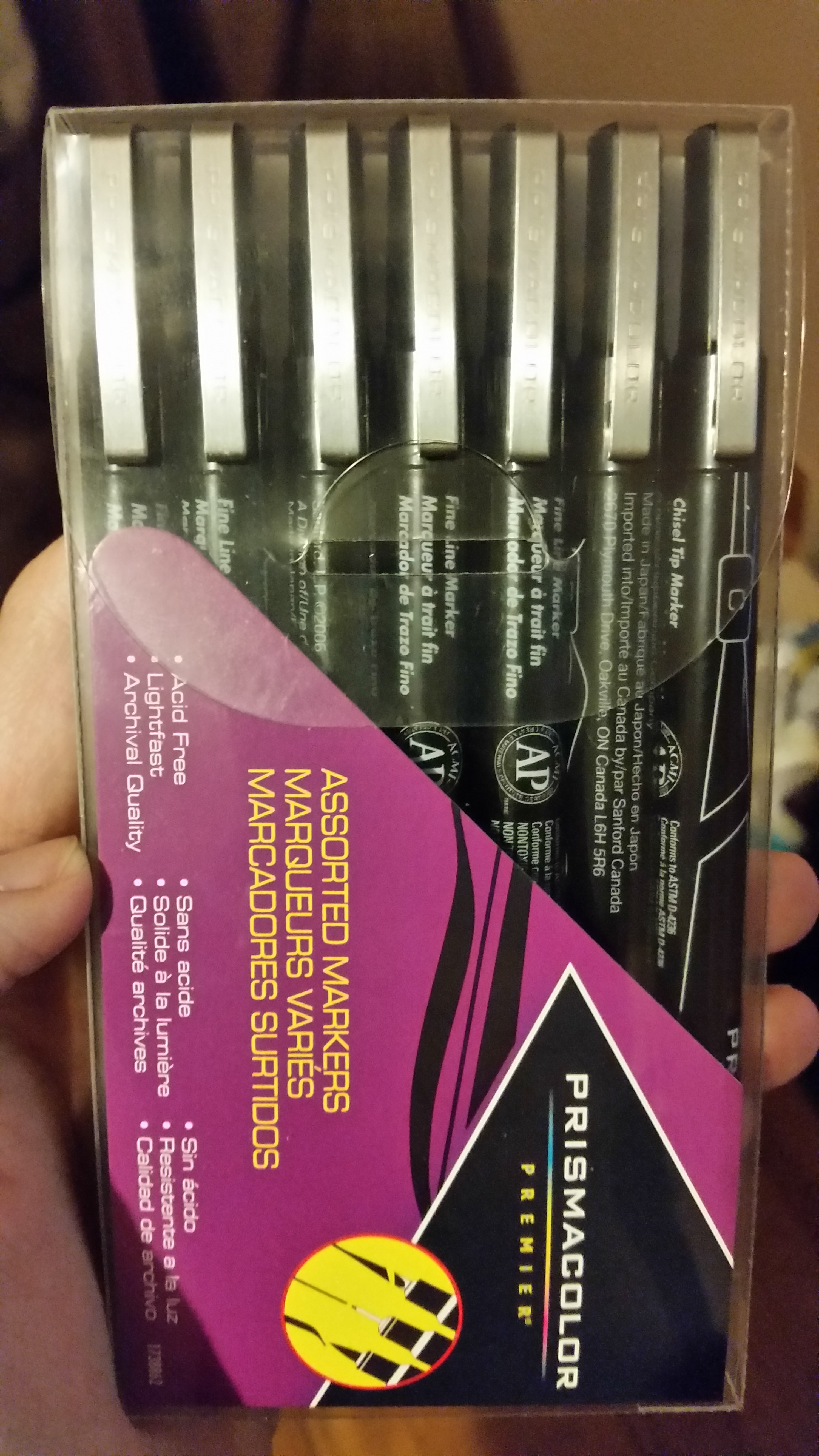
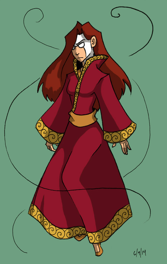
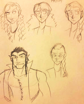
These are sketches I made to practice drawing masks and African/Native American-inspired nature spirits (they were also for visual development of aspects of The Legend of Jamie Roberts, a comic project I’m making). I also used my brand new Prismacolor pens on them and oh my god they are as smooth as butter to use!
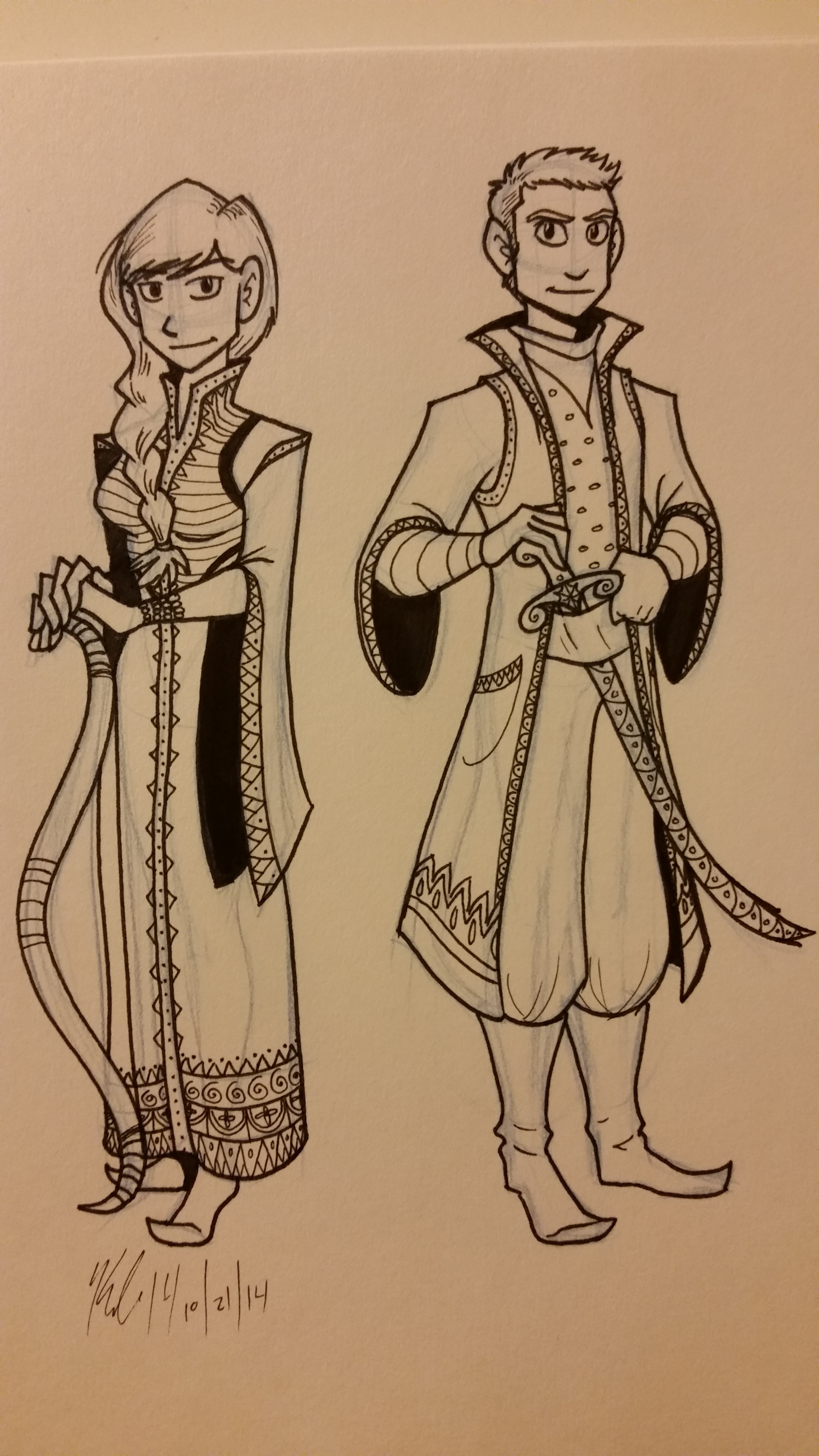
These ones I drew to use my Prismacolor pens again. But also I drew them to develop a style I want to use in The Swan Prince (working title, formerly “Rosetta and the White Swan.” I talk about the story and Jamie Roberts in this previous post).
I drew a lot of influence from the Ottoman Empire and Russian textiles. I love the patterns, the costumes, the characters…
I think I know what I’m going to write for National Novel Writing Month next month.
The young lady is Rosetta and the young man is Ahmad.
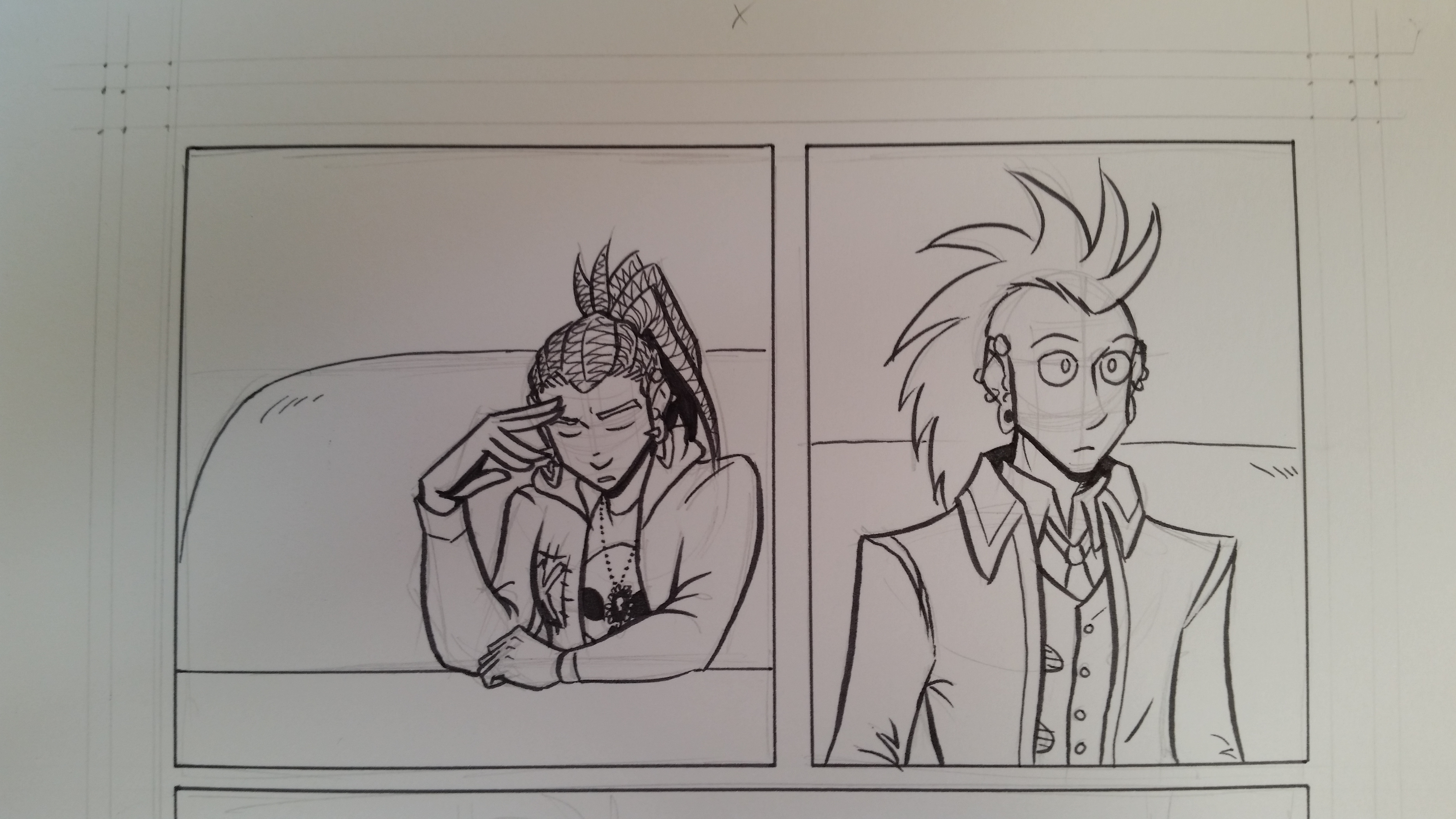
And this one is a peek into a page of my new webcomic, Charlie & Clow, in progress! Have I mentioned I love my Prismacolor Pens? This sketch uses the brush pen and it is the most beautiful tool I have ever used!
Just look at that line quality! It’s the kind of quality I have dreamed of having for the past two years!
Seriously, I have fallen in love with the Prismacolor pen set. I splurged and got a 7 pen set, and these things are going to permanently replace my crappy Pigma Sakura pens.
In other news, Charlie & Clow will be coming online October 29th! Next Wednesday! At www.charlieandclow.com! I’m polishing up the site now but soon you shall see the new webcomic I’ve been working on for one and a half years!
And also! There will be a KickStarter coming in November! I’ll be writing about that one soon.
So what do you think? Excited for Charlie & Clow? Or The Swan Prince? Or maybe giving the Prismacolor pens a try? Let me know in the comments!
Thank you for reading, and I’ll see you on Tuesday.
So a while ago, I saw the “debate” that happened when Marvel let loose the famous variant cover of SpiderWoman.
And a part of me was like, “You know, it would be great to see superhero ladies in clothes that are actually great for combat and/or aren’t form-fitting.”
Because I am aware that not every superhero lady is in charge of her sexuality or is entirely comfortable with a skin-tight outfit. Have you read the new Ms. Marvel? They talk about that in the first two issues!
Anyway, I decided to make an illustration series showing superhero ladies in outfits that weren’t sexually revealing and/or were best suited for lots of physical activity.
Right now it’s still a work in progress, but it’s been fun to create new heroes and create costumes and superpowers!
Here are some sketches of the ladies I’ve drawn so far:
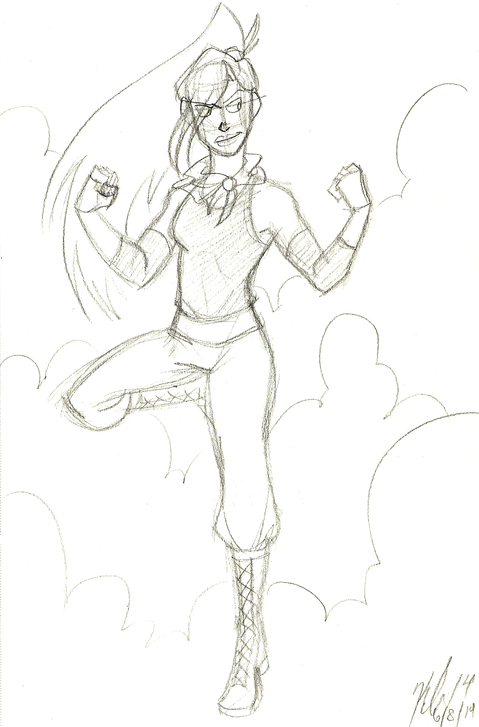
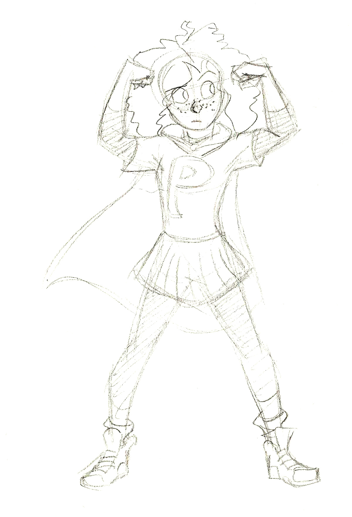
Number 1 in the series. Sojourner the Mage. She has powers over wind. (Click to enlarge.)Name unknown. Has superstrength, flight, and super speed. (Click to enlarge.)PowerPat. Age 10. Super strength. (Click to enlarge).Agent Sinclaire. Magic user that can manipulate the environment and trap opponents. (Click to enlarge).
I have enough projects on my plate to keep me busy, so right now this is on hold (just like my other illustration series, The Women Warriors Project).
I might include redesigns of Marvel/DC/etc superheroes, but I want to do more original characters in this series. If you have any ideas or suggestions, though, please leave them in comments!
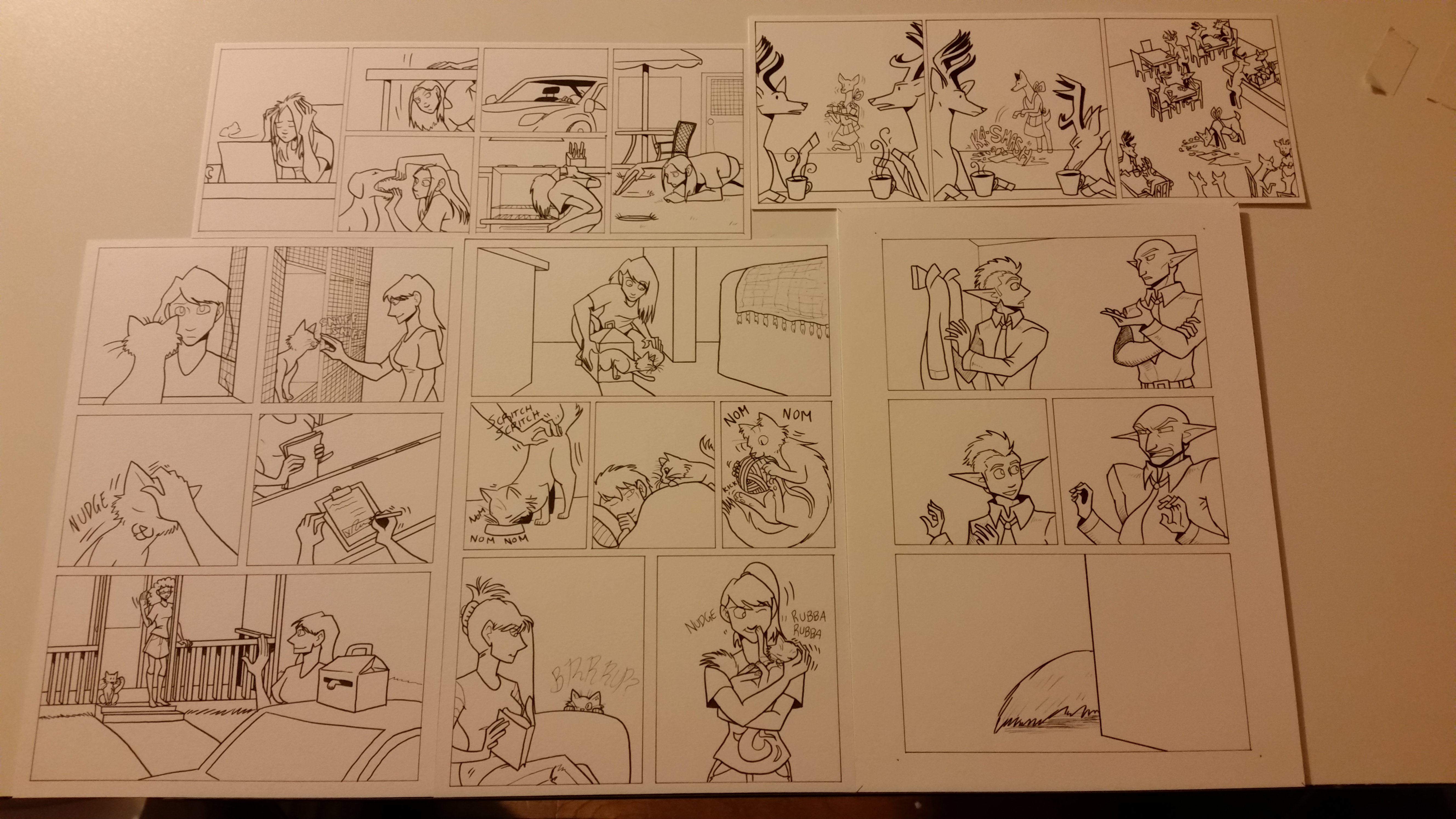
I had nothing planned to be written for today, so instead I’m going to share some of the sketches I’ve made and finished within the last few weeks. (Please click to enlarge them.)
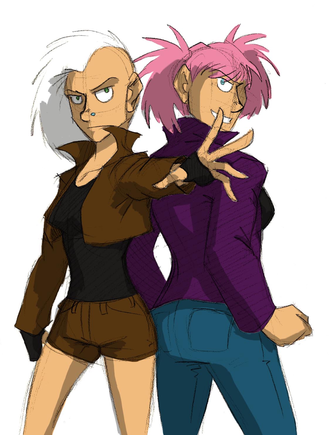
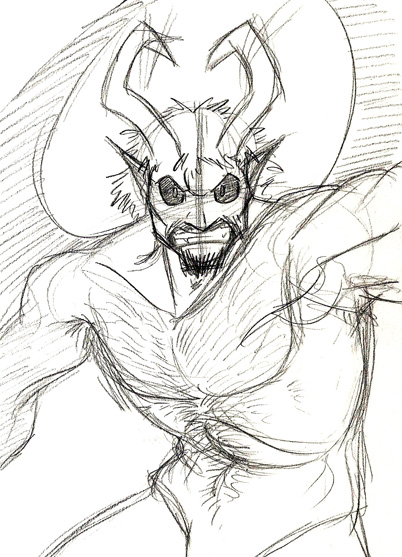
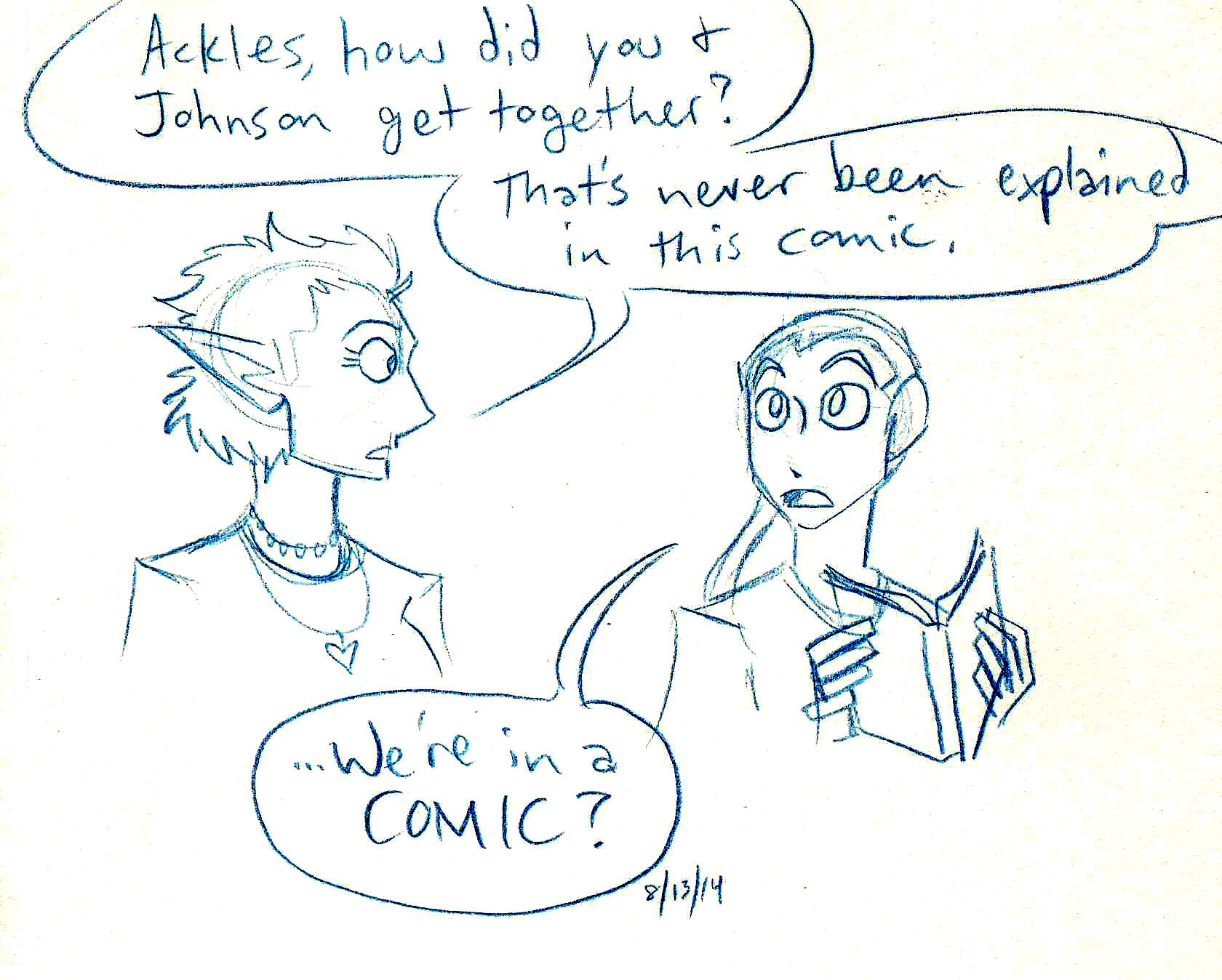
Agents Sinclair and GalileyaAcrudon the Demon LordJohnson & Sir extras have a chat.Gestures and character concepts for new projects.Sketches I made at work in my spare time. Yes, they are drawn on the back of a coupon.Character designs I drew today for a developing story.
Plus, I’ve included some snapshots of current works in progress.
The comics are inked. Now for the color!
Oh! And I forgot to mention an illustration series I have on hold, called “Superhero Ladies.” I have at least this one finished, but the rest are sketches.
Number 1 in the series.
I’ll talk more about the series next week.
Also! I took the time to update the Commissioned Work if you would like to see some comics and other art I made for really swell folks recently.
What do you think? Plus, what do you like to sketch? Let me know in the comments below!
Last time I spoke about How I Make Johnson & Sir. Today I want to show how I make a comic strip for Validation, the other webcomic I work on, because the process is a little different.
If you ever get lost in the technical bits (especially in the Photoshop section), I explain some of those steps in How I Make Johnson & Sir so hopefully the techno-lingo won’t be so confusing.
I don’t (really) write Validation. Christian does (though we often talk story ideas over). I wait for her to send the script over to me first, and then…
Step 2: Layouts
Sometimes I skip this step, depending on how simple or complex the strips are in the script. Since I work in three panels, it’s important to know where characters will be placed and where speech balloons will go, to make the strip as readable as possible. That way it won’t be so cluttered.
I did not do layouts for strip #105 because it was scripted in a pretty straightforward way, and I had an idea for how I wanted the strip to look.
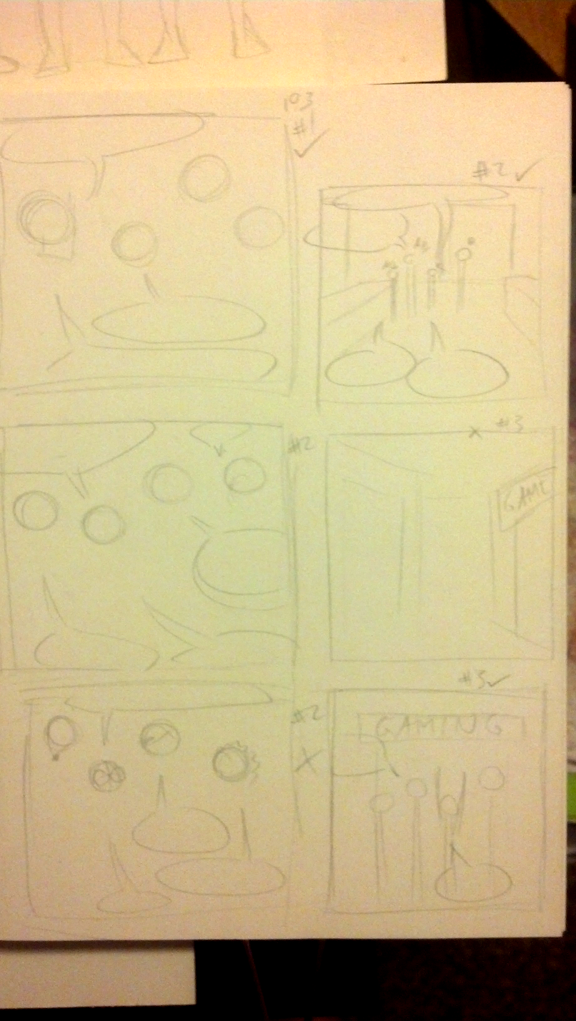
However, I’ll show the layouts I did for #103, which had some weird camera angles.
click to enlarge
Step 3: Ready the Paper
I tend to do this step ahead of time. Thankfully I can get two strips from a single sheet of 9 inch by 12 inch Strathmore Bristol Vellum, which is my paper of choice for Validation. I trim the paper (to make it easier to fit on my scanner) and I’m good to go.
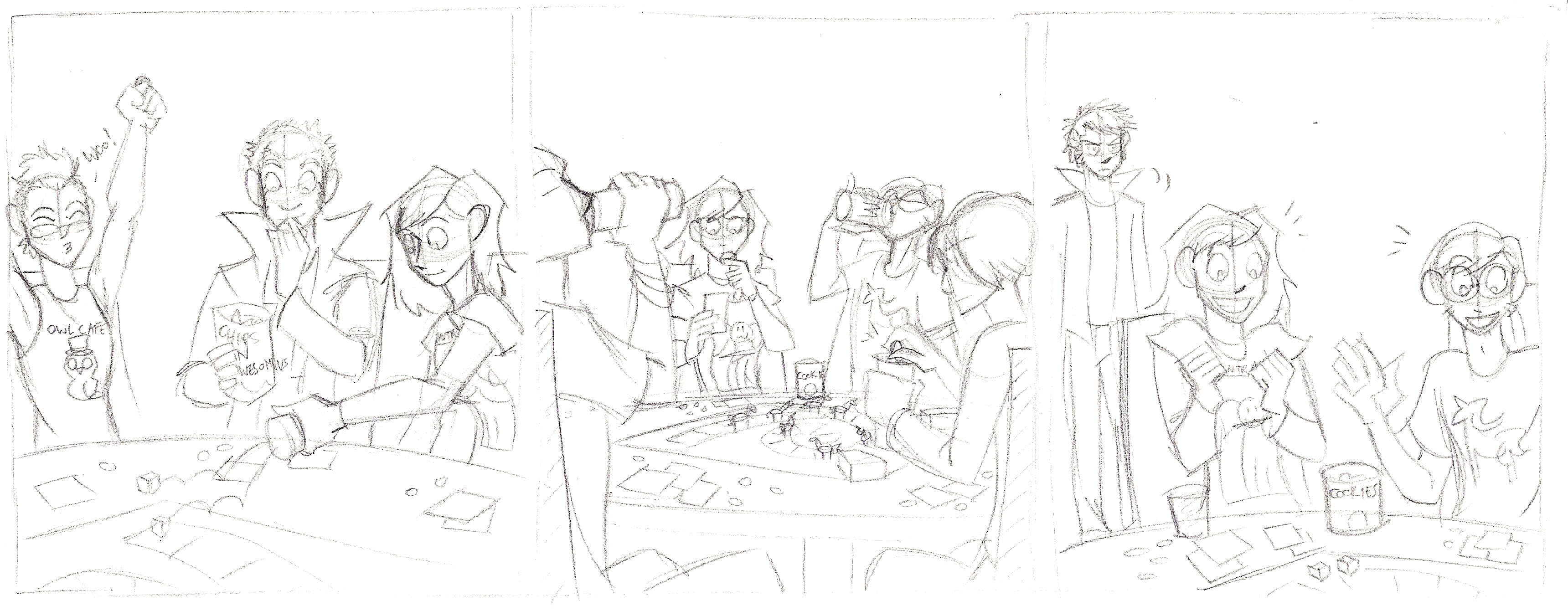
Step 4: Pencil the Strip
click to enlarge
Pretty straightforward. Although, if you notice two extra characters, one looks like me and one looks like my boyfriend. Fun fact!
When that’s done, I send the pencils to Christian (via DropBox) for approval. This is where any changes that need made can be done, though 99.9% of the time she gives the ok.
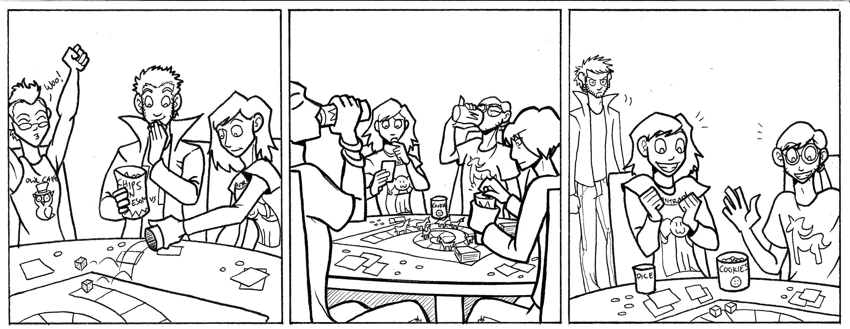
Step 5: Ink
click to enlarge
Once I get the ok, I ink!
To add a little depth, especially in panel 2, I made the foreground figures in thicker lines to make them pop more. I used a micron pen with a 1.0 width. The background figure in Panel 3 was drawn mostly with 0.5 and 0.3 width pens, with finer details in a 0.1 width micron pen.
Step 6: Color with Markers
My markers of choice are (from most preferred to least)…
Copic markers
Prismacolor markers
Sharpies
I used to do the entire comic in marker, but now I only do half. Sometimes it’s because a marker died, the markers will not blend well for the background, or I need a color I don’t have a marker for. So I just color what I can.
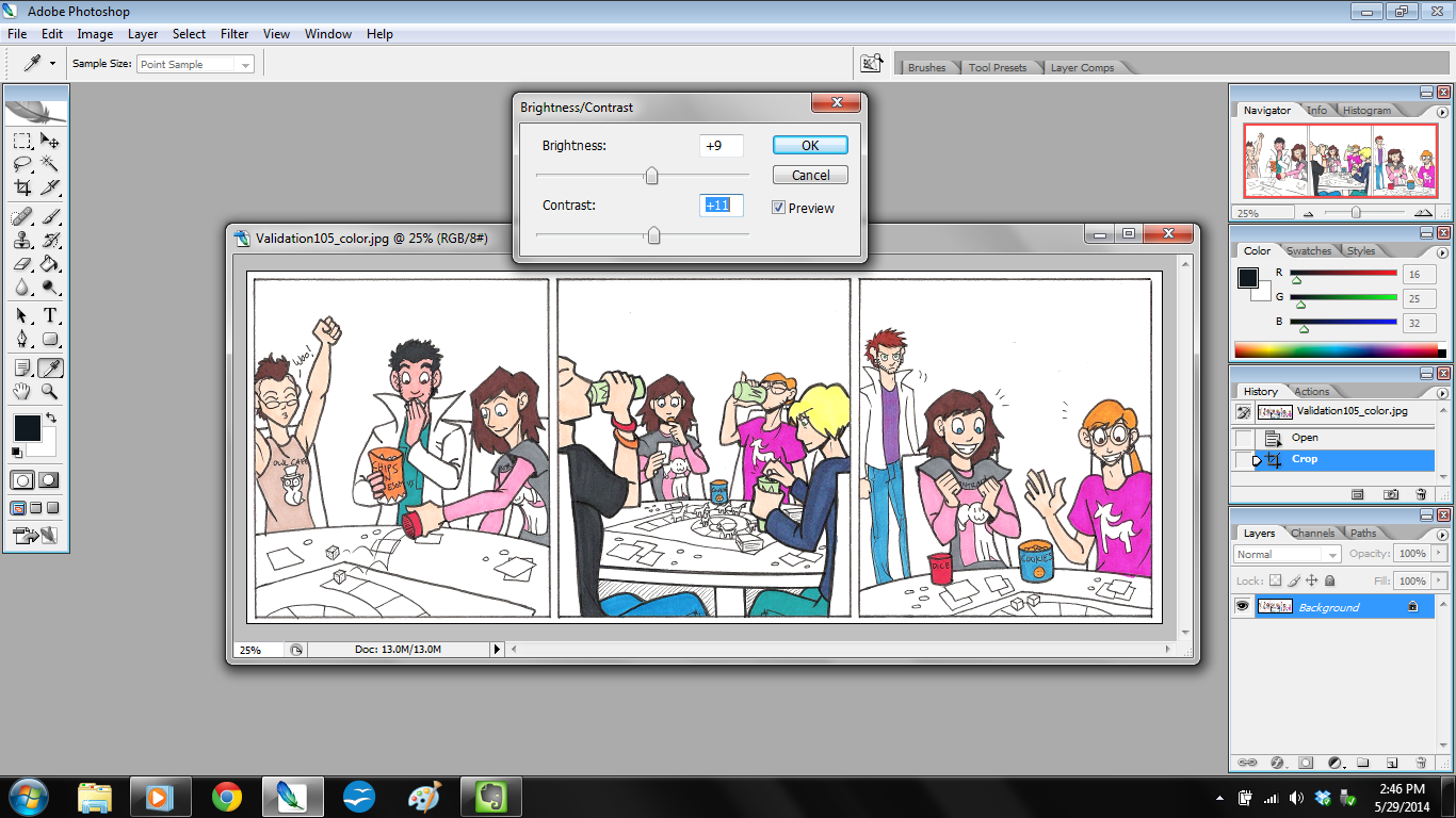
Step 7: Scan and Tweak in Photoshop
click to enlarge
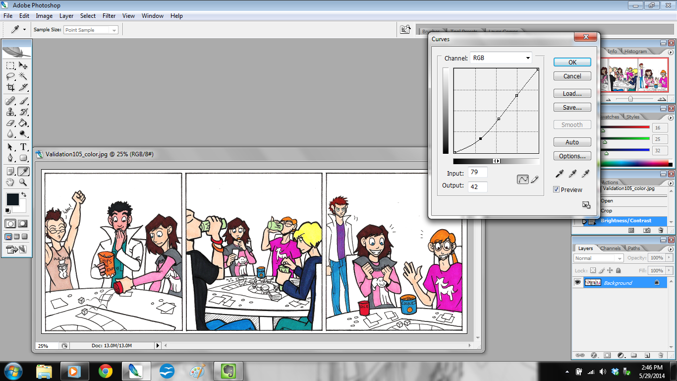
Once marker coloring is done, I scan the strip in at 300 dpi (dots per inch) and open it in Photoshop. The first thing I do is adjust the brightness and contrast (shown in the above picture). That way the strip isn’t so dim. Then I adjust the curves.
click to enlarge
Doing this will let the colors really pop.
Once those adjustments are done, I make a new layer in Photoshop and call it “EDITS”. This is the layer where I correct color errors I made with the markers, fix any wonky lines, and clean up smudges and spots.
Step 8: Color the Background
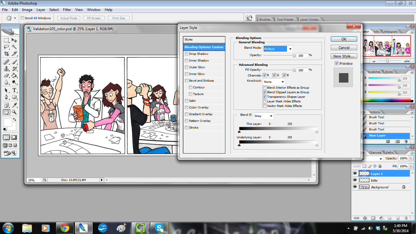
Then I make another new layer on top of that and call it “BACKGROUND”, because here’s where I add background color.
click to enlarge
If you notice, I adjusted the blending options for this layer. For “EDITS” I left those settings alone, but with “BACKGROUND” I set it to Color Mode: “Multiply” at a Fill Opacity of 100%.
The reason I do this is because Multiply mode actually keeps the lines clean while still coloring. It works like this:
Rather than it looking flat and gross like this:
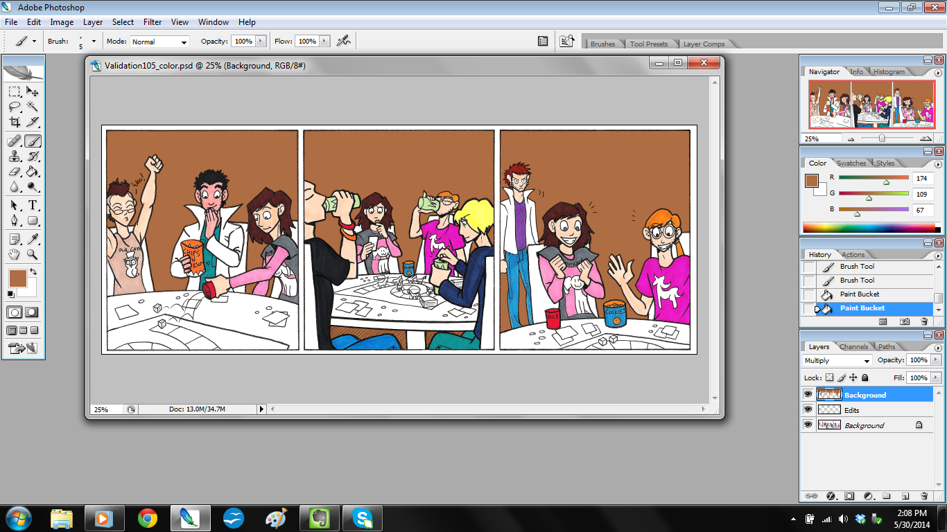
Then I just color in the background colors as needed.
click to enlarge
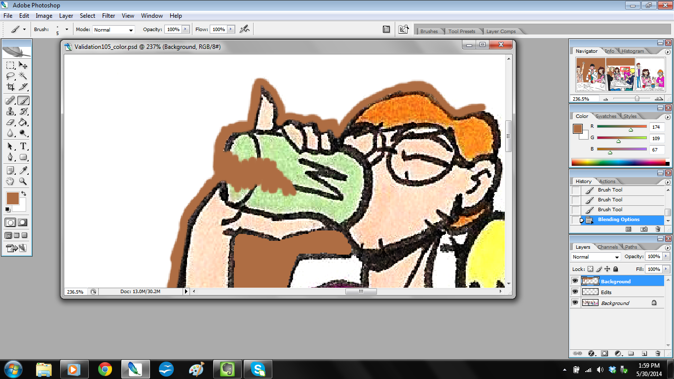
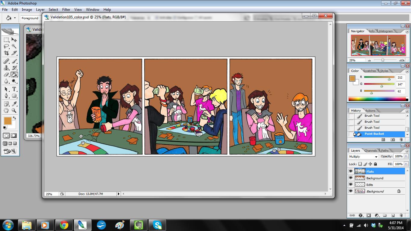
Step 9: Color the Rest.
Once backgrounds are done, I make yet another layer on top and call that “FLATS.” I also set this layer to Color Mode: Multiply and Fill Opacity at 100%. This is where I color in the things my markers missed, like Jim’s coat and the game table.
click to enlarge
…Sometimes I have another file open to reference for color.
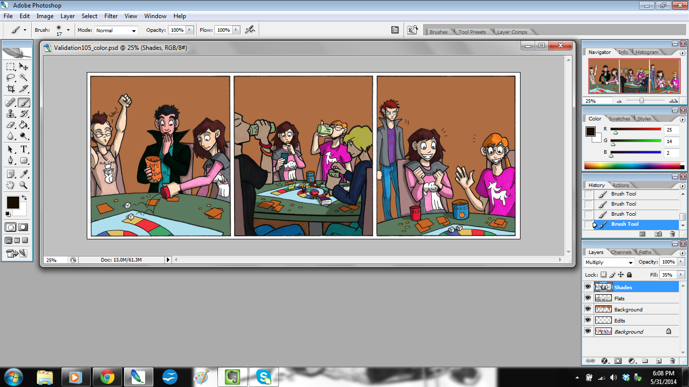
Step 10: Color the Shadows
This step is one I talked about a little bit in my previous tutorial, but here you’ll really see it in action.
I make a new layer on top, call it “SHADES,” and then set to Color Mode: Multiply and – here’s the surprise – Fill Opacity at 35%.
Notice it’s not at 100%? That’s because I don’t want the shadows to be overpowering. I also want the color of the shadows to blend, instead of getting any weird effects that would happen if I changed the paint brush opacity (yes, you can do that).
Once I do that, I color the shadows in, and it looks like this.
click to enlarge
I did something a bit unusual in Panel 2: I put the two figures closest to the reader in shadow. I did this to frame the picture and keep the focus on Ally and Kyle.
So now the colors are done! I save the file, and then flatten the image so all the layers merge. Then I make another new layer and save the file for lettering.
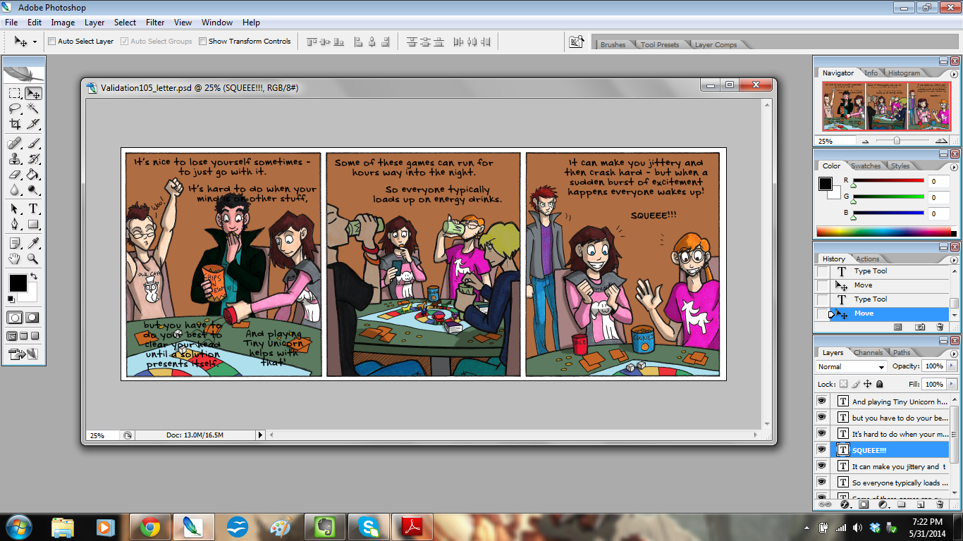
Step 11: Write the dialogue
For this step, I have the open file of the script handy so I can refer to it.
Then I write the dialogue and captions.
click to enlarge
I try to arrange them in such a way that they won’t block too much of the art, and to ensure it can be read easily.
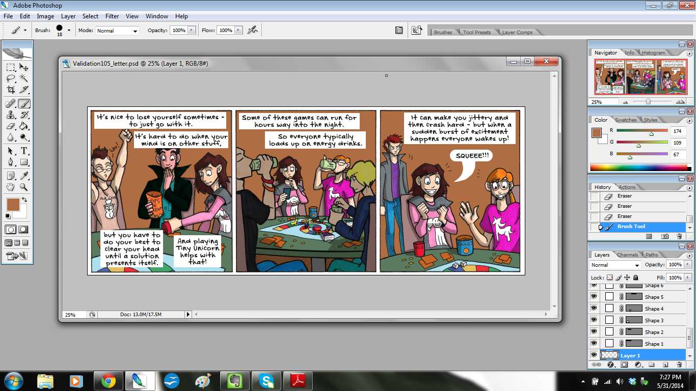
Then, once everything is written and checked for spelling, I get to the bottom layer, make a new layer, and start placing the balloons and boxes with the rectangle tool.
click to enlarge
I use the rounded rectangle for dialogue and the plain rectangle for narration.
To make the tail for that balloon, I got to the bottom layer again, made a new layer, and painted it in.
Once all of that is done, I merge the layers to flatten it out, and then…
Step 12: Save the File!
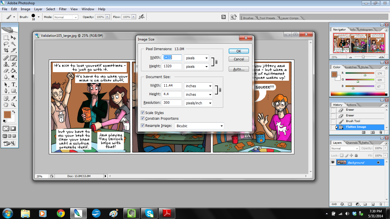
I save it first at its current size and call the file “Validation105_large.”
Then I adjust the image size.
click to enlarge
The large file is at 300 dpi, which is the right size for print, but it isn’t too web-friendly. So to make it nice and tidy for the website, I shrink it from 300 dpi to 100 dpi. And I save that file as “Validation105_small.”
I send the finished strips to Christian via DropBox, and shazam! I’m done!
I hope you enjoyed looking at my process, and I hope you found something useful from it!