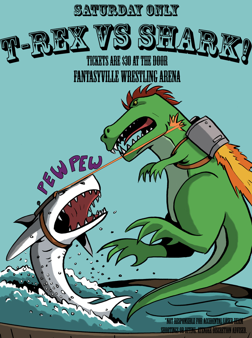
Strap into your seats, because there’s all kinds of awesome things on the horizon for Johnson & Sir.
First, there’s a new print coming! Here’s a look at what to expect…
IT’S T-REX VS. SHARK!!
I know I want THAT on my wall!
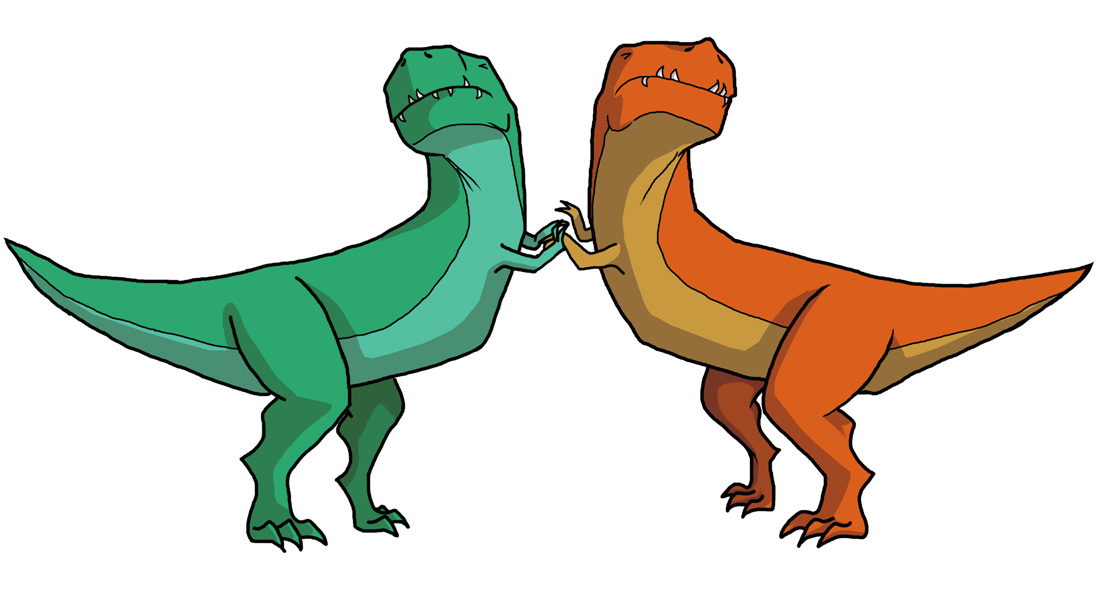
Second, I’m closer to getting an awesome T-shirt ready. Can you guess what design will be on it?
Oh, I’ll spoil it for you:
It’s the T-Rex Sissy Fight!
I’m shopping around for T-shirt printers at the moment. Until then, I’ll be getting prints ready soon. Keep an eye on Storenvy.
Third, and this is the most exciting thing for me. I have been working on this goal for over six months now.
Johnson & Sir‘s first book will be going to print!
Here’s what the book cover will look like.
Pre-orders are going right now for $10.
If you’re interested in pre-ordering a copy, just click the PayPal button below. The price covers the book plus shipping. Be sure to give your shipping address, too!
Books will be available by January 31st, 2015.
Thank you to everybody who reads Johnson & Sir every Tuesday!
Thank you for reading, and I’ll see you tomorrow with a new post.
So in Part 1, I talked about character design in comics, and what doesn’t tend to work. In Part 2, I talked about some character designs in practice in Validation and other personal works.
Today I would like to look at more character designs and how they can reflect or embody elements necessary to the story.
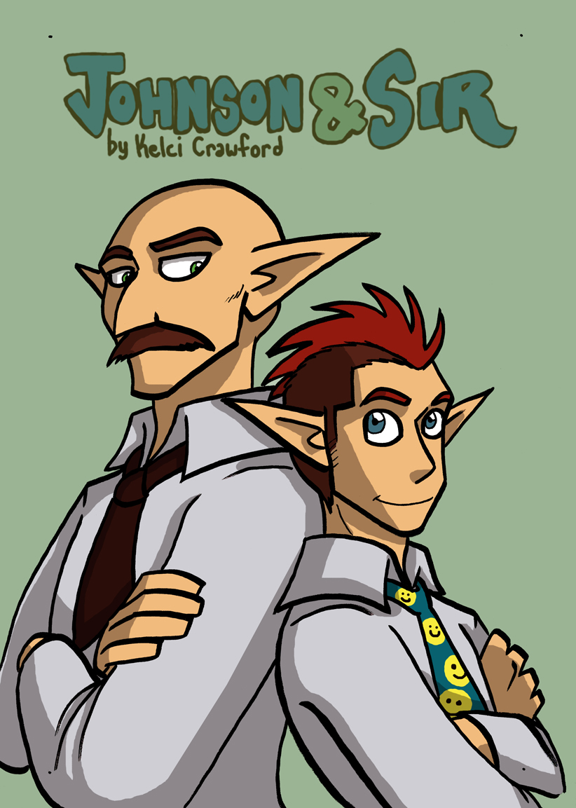
Johnson and Sir are two opposites: Sir is the busybody tough guy who plays by the rules and runs a tight ship. Johnson is a relaxed joker who figuratively pokes the bear (the bear being Sir) to make him lighten up and joke more.
Sir is well-kept and nicely groomed. His mustache is always perfect and he’s almost always standing up straight and in-charge.
Johnson…
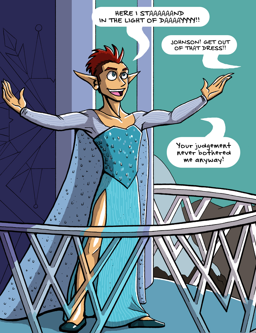
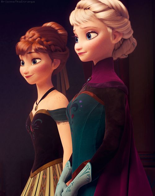
He’s not afraid to embrace his inner Elsa.
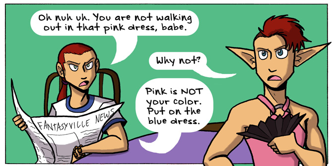
Johnson loves his dresses and is not afraid to wear them. He’s willing and able to break the expectations of society. He LOVES to do so. To match his flamboyance, he has wild hair and crazy facial expressions. While Sir is stoic, Johnson isn’t afraid to wear his heart on his sleeve.
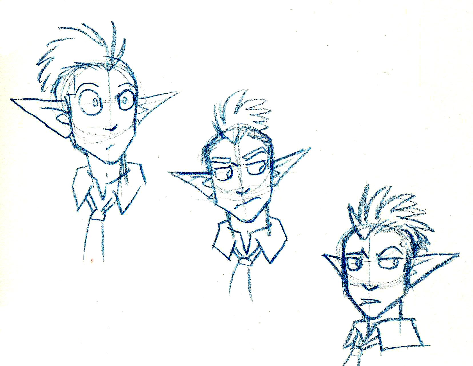
Just a small sampling of Johnson’s faces.
Of course, in the Fantasyville Police Force, there are characters that match up with Johnson and Sir, serving as mirrors.
Mirror characters are not new or even rare. Mirror characters are those who have the same experiences or functions of the main characters, but can oppose them in some way.
For example, Ackles is a mirror for Johnson.
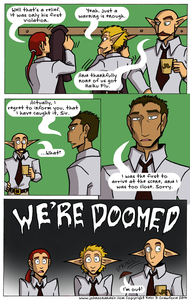
Here’s Ackles being reasonable with Johnson, from page #54, “The Elf and the Wardrobe.”
Ackles is the nice in-between of Johnson’s heart with Sir’s rationale. Ackles is reasonable but accepting of the absurdity in Johnson’s attitudes. He’s not as by-the-book as Sir is, but he still follows the rules that society has placed, for the most part. He’s not all-knowing – in fact, he’s still new to the job as a police officer, and asks a lot of questions. He’s the naive curiosity to Johnson’s experience. His naivete and curiosity are what drive him to go adventuring with Johnson and do silly, absurd things.
To reflect these characteristics in his design, he has a well-groomed image like Sir, hair that doesn’t meet societal expectations like Johnson’s, and wide, emotional and curious eyes.
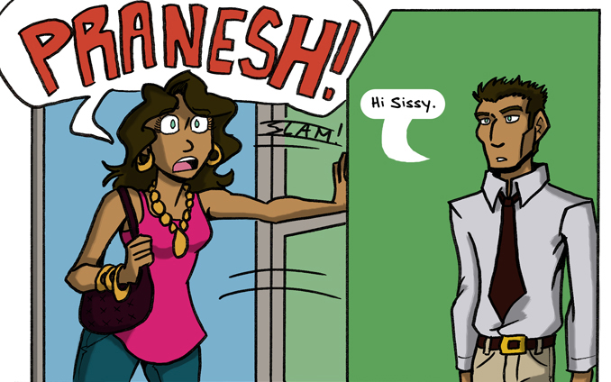
So now we know about Johnson’s mirror character, Ackles. Who is Sir’s mirror character?
Pranesh hardly ever speaks until the Haiku Flu arc. He’s a man of few words and somber actions. He doesn’t do exaggeration like Johnson or Ackles do. He’s a quiet, determined sort of man. That’s why he has the strong chin and jaw, the broad shoulders, the high cheek bones, and the tired eyes. He’s seen things, but he carries on in his quiet way. Like a superhero.
Pranesh is much like Sir in his stoic nature and ramrod-straight posture. He carries himself with dignity, like Sir (for the most part) does.
But Pranesh is a bit too stoic. We don’t see him smile. He hardly ever jokes, unless it’s in a deadpan, dry way.
Pranesh also has some mystical powers of some sort, man.
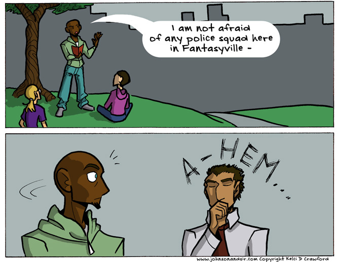
He serves as the mellow contrast to those rare moments when Sir unwittingly lets an emotion loose, like humor or fear.
Page #61. Sir is so horrified even his mustache flees in terror!
While Ackles is complimentary to Johnson, Pranesh is almost a caricatured personification of Sir’s dryness. He is what Sir COULD become, if it weren’t for Johnson poking him with the metaphorical silly stick.
So in designing these characters, everything plays a part – their facial expressions, their posture, their body language, their hair and clothes (when they’re not in police uniform). Keep these factors in mind when you create your own characters for comics and, hopefully, your characters will become much more real.
Let’s end this blog post on a high note.
So did you like this 3-part series? Would you like me to keep talking about character design for comics? What have you learned from my ramblings about character designs? Leave your thoughts in comments below!
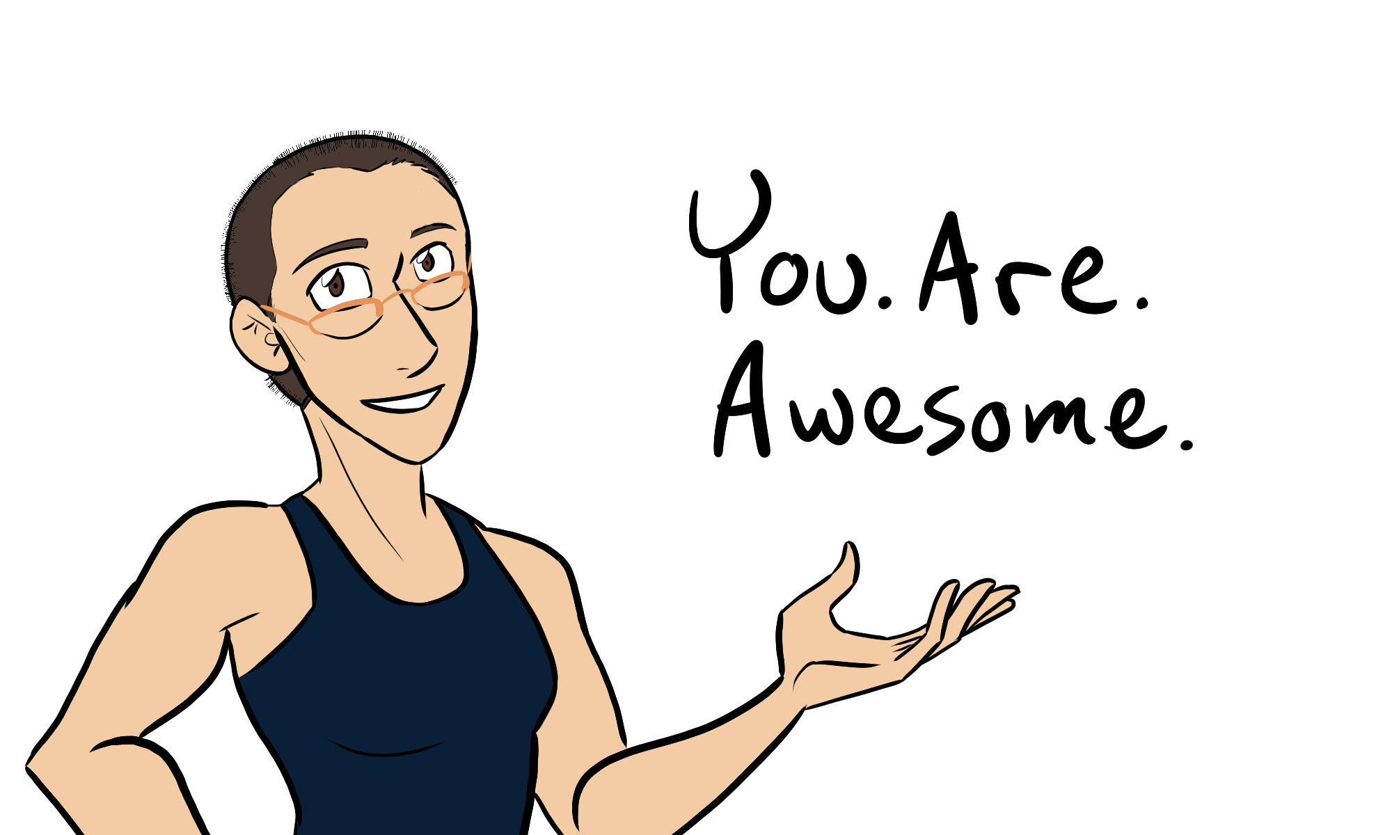
Also! Did you like Johnson expressing his inner Elsa? Because you can get it as a print to hang on your wall! Or your friends’ wall. Or wherever people need to burst into motivational song.
This blog post was the last one in a week of daily updates. Thank you to everybody who read my posts everyday! I’ll see you on Monday.
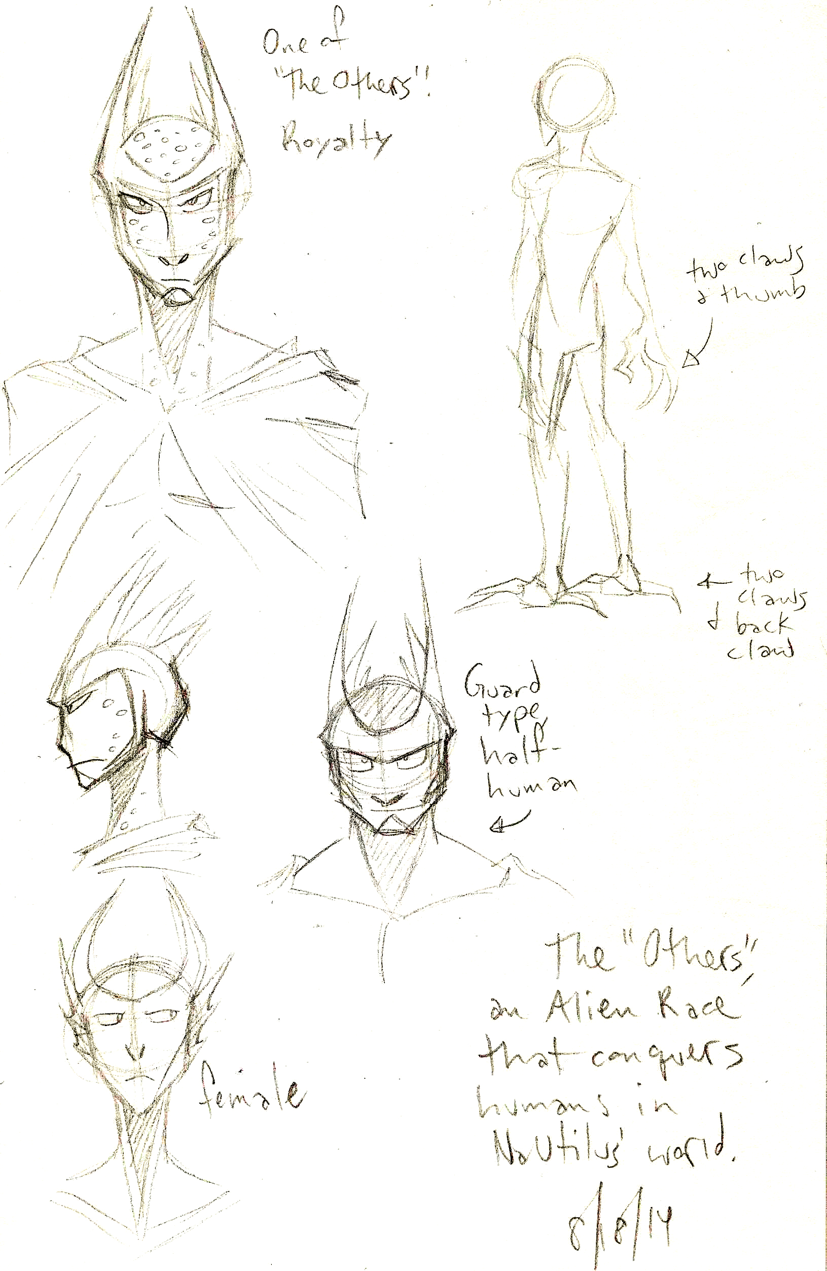
Sketches of an alien race, the Uthers (Click to enlarge).
“Character Design” is generally something you hear more in the animation industry than the comics industry. However, the two industries often overlap, especially whether you talk about camera angles, lighting and moods, or, in today’s post, character design.
Character design is especially important in comics. You need characters that…
express the full range of human emotions,
are visually individual from each other, and
embody necessary elements in your story.
On top of all of this, the character design should be simple enough that you can draw it repeatedly and NOT want to stab your eyes out with a mechanical pencil.
So before I show my own character designs and what elements I think work, I’m going to show some things that…don’t.
While there are no hard and steady rules for character design, I have this one personal rule of my own. It’s the only one I need, but it’s no less important.
If it makes a gorgeous illustration, it’s a terrible choice for a comics character design.
This is something mentioned briefly in an Aaron Diaz blog post about costumes in character design, under a section called “Simplicity.” He says…
Above all else, keep it simple. Comic characters are not pin-ups or other illustrations; you have to draw them over and over again, from various angles. If you pile on too much detail, you’ll wear yourself out slogging through all the bits every time you have to draw them.
Let’s look at an example…
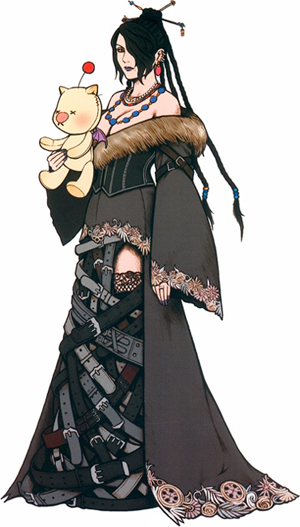
THE BELTS.
THAT is a beautiful illustration. It would be a total pain in the ass to draw repeatedly for a comics story.
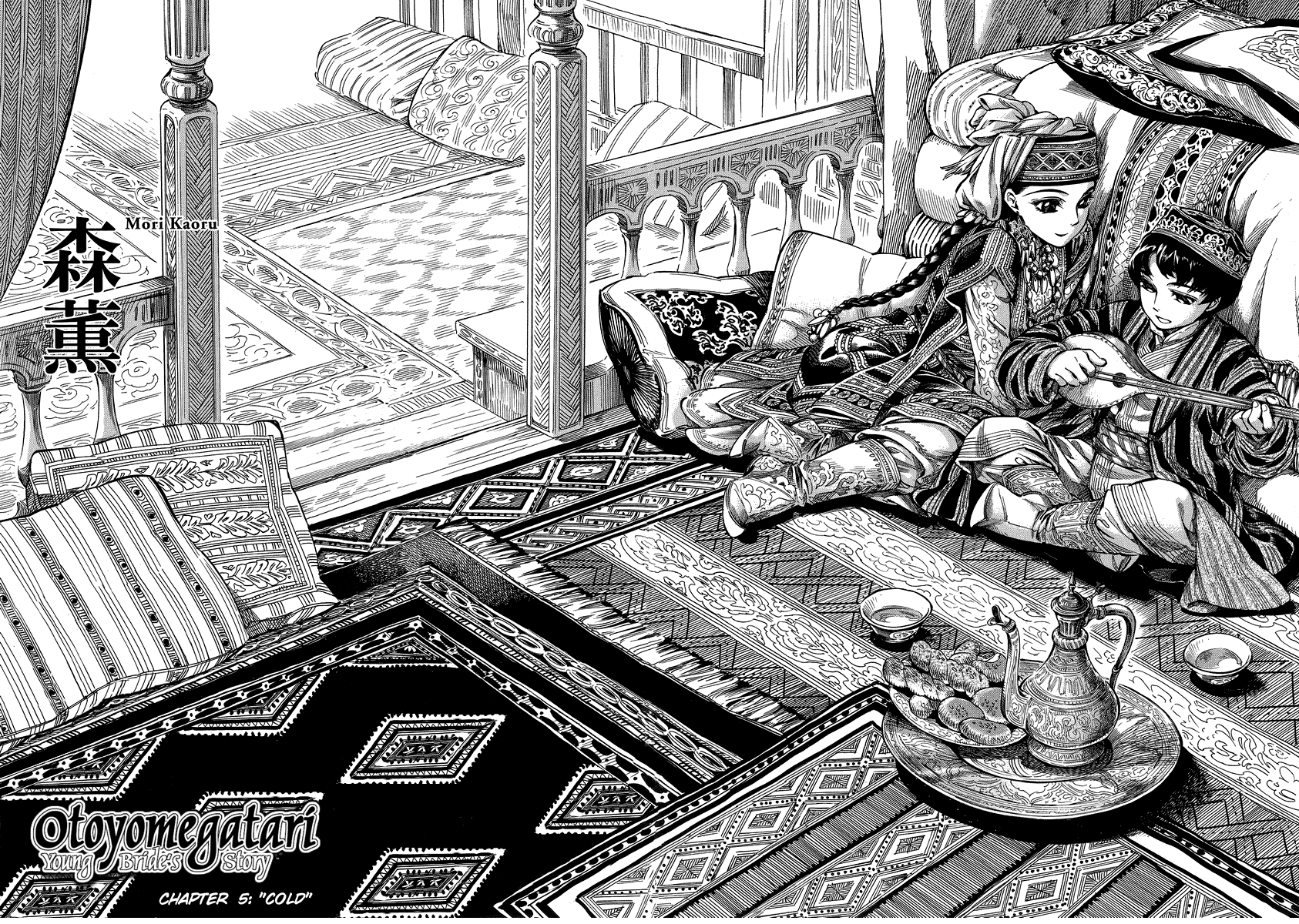
Now, I know what you’re thinking: A Bride’s Story.
A scene from A Bride’s Story (Click to enlarge)
Yes, it is insanely detailed and gorgeous. The artist also has assistants to help her meet her deadlines.
Most comics artists I know don’t have the luxury of an assistant to help them make art. They are, 99% of the time, making everything on their own.
To that end, I still stand by my personal rule.
If it makes a gorgeous illustration, it’s a terrible choice for a comics character design.
Remember that simplicity is key.
So, what else doesn’t work?
Same Face Syndrome.
The most notorious example of “Same Face Syndrome” to appear in recent years. (Click to enlarge)
Same Face Syndrome is when you use the same face in your character design. The most cancerous of Same Face Syndrome symptoms spread into the physique, when you draw all of your characters with the same general body shape.
I used to suffer from this HARD when I started out. It’s a common mistake because Same Face Syndrome is so formulaic, and formulas help make new work faster…even if it’s not necessarily better.
The thing about character design is it should not be formulaic. Your characters should not fit a mold.
They should be individuals, with their own physiques and faces and personalities.
Each character you draw is their own person. They should serve a unique but specific purpose in your story. That’s why you draw them into your comics, after all.
Have you noticed any Same Face Syndrome elsewhere? Have any tips for character designs? Leave them in the comments!
Thank you for reading and I’ll see you tomorrow, when I show some of my own character designs and the creative decisions behind their looks.
My sister Kia and I were running a KickStarter to help fund the beginning of our new webcomic, Seeing Him.
AND…
It did not meet the goal.
To be honest, Kia and I weren’t really sure whether this project would get funded or not. We were hoping for the best, whatever the best may be.
Now that the KickStarter is over, I think, for now, it DID turned out for the best.
I am sad our comic cannot be made right away.
However, we did learn the following things from this KickStarter:
People WANT to support indie comic creators (we did, after all, raise a little over $500. We didn’t get any of that money because KickStarter is an all-or-nothing fundraising system, but people were still willing to contribute money towards our project!)
People WANT to see more positive trans representation, especially for trans men.
People are more altruistic than we are lead to believe.
And digital rewards are way more popular than I thought they would be.
Kia and I are going to take these lessons in and plan our next move.
We are hoping to fund raise for the project again sometime after New Years, and perhaps…
Lower the asking goal.
Offer more/only digital rewards (so we don’t spend our funds on making rewards for the backers, therefore justifying our lower goal amount and getting the comic made faster and sooner)
Offer more ways backers can be included into the comic, because MY GOODNESS during the campaign the $100 reward to be drawn as a recurring character got sold out FAST.
As soon as Kia and I have a plan, I will let you fabulous readers know so we can try again and, hopefully, succeed.
Thank you to everyone who shared Seeing Him on Facebook, Twitter, Tumblr, and elsewhere on the internet.
This post is the first in a week-long blog post update extravaganza! (It’s when I update my blog everyday, Monday through Friday, just for this week).
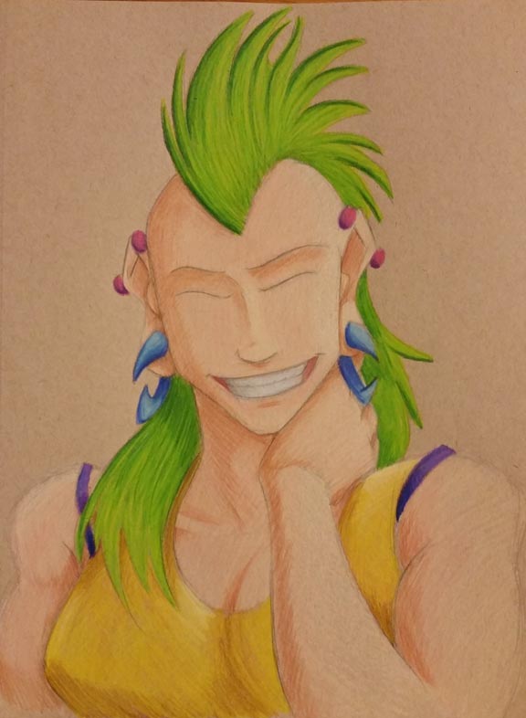
I just finished a new illustration in colored pencil! So to celebrate, I wanted to show the progression of how I made it and the tools I used. And at the end of the blog post, you can see the finished piece.
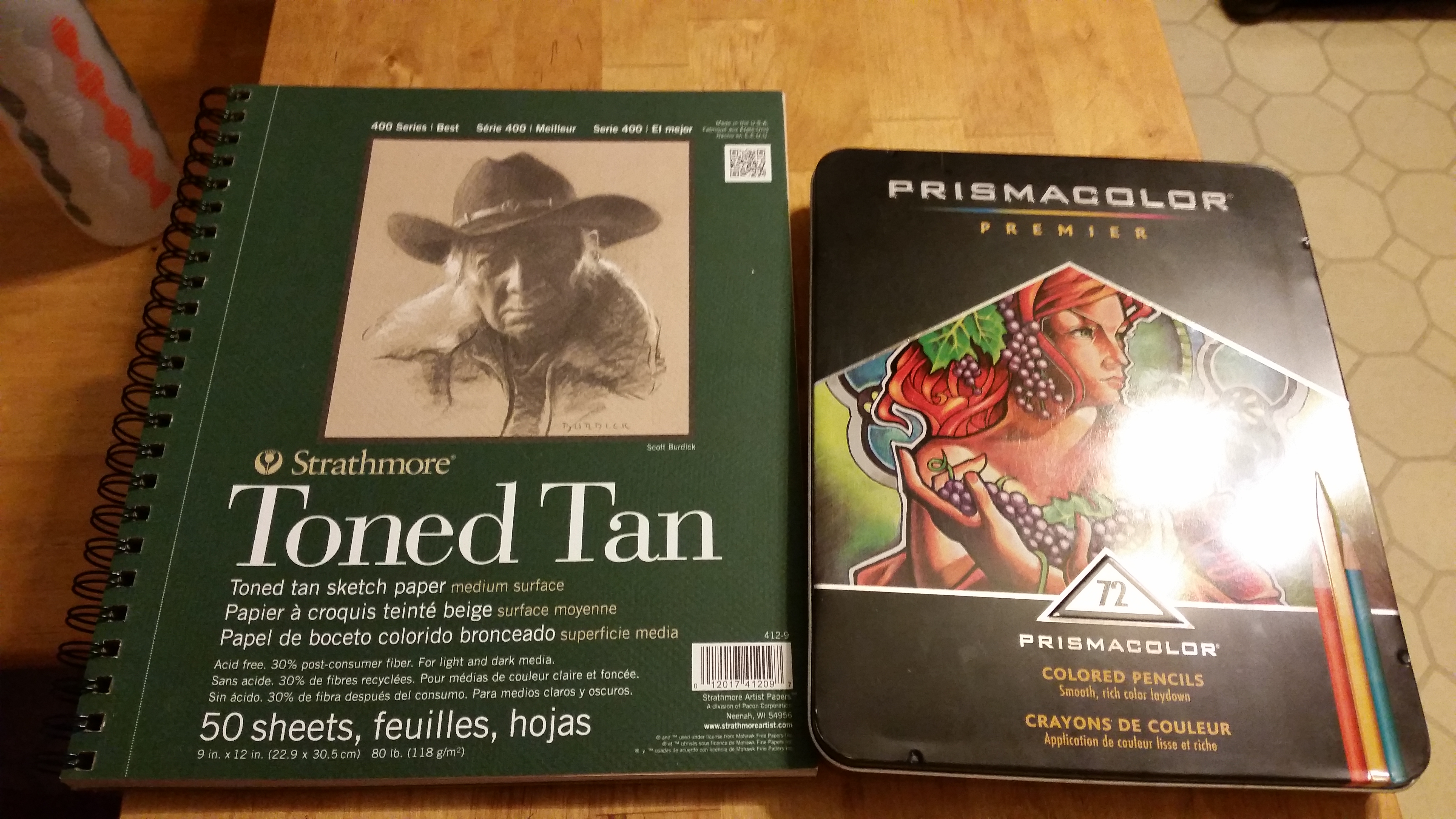
To start, I grabbed my Prismacolor 72 piece colored pencil set (which I had left over from my first ever art class in college. Hold on to your supplies, students!) and an 9 wide inch by 12 inch pad of Strathmore Toned Tan paper.
Once I got those, I drew the black and white version of what I wanted to color. I sketched in (lightly) where the shadows would lie with my trusty F hardness sketch pencil. I use that pencil for all of my drawing and sketching.
Then I go over those lines with my mechanical pencil, which I believe is a B hardness in lead, so it’s darker than the F.
Next, I color over the whole sketch with a white colored pencil. I do this so that…
I don’t lose my shadows
I have a layer of colored pencil between my pencil lines and my actual colors, thus
making my art much cleaner and less muddy.
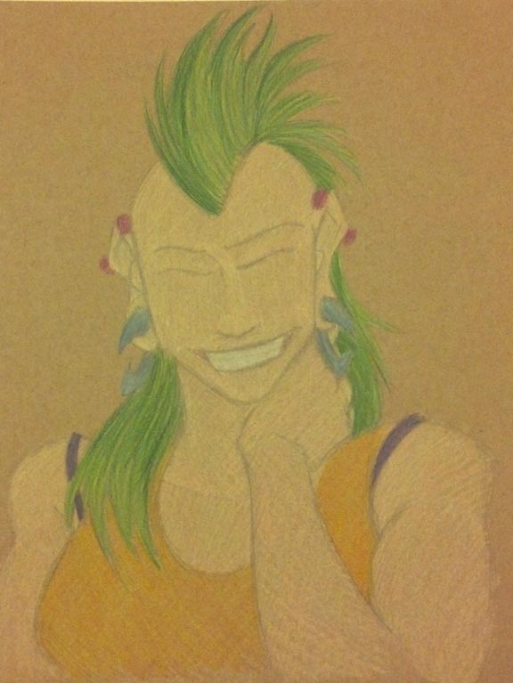
Once the white is laid down, I lay down the brightest colors I’m going to use, and color from light to dark.
The first layer of colors end up looking a little like this:
Click to enlarge.
It’s not the prettiest…yet.
Also, I did not use light peach straightaway for the skin tone. I laid down the highlight color, which is a mix of Cream and Beige.
Alright, so I drew the light colors first. What next?
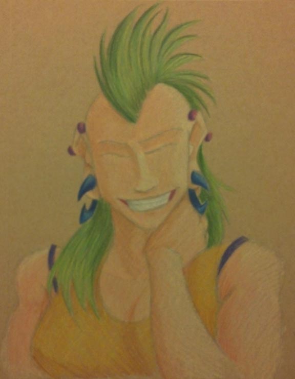
The shadows!
Click to enlarge.
I really wanted to try and find colors that would compliment Roxie’s hair, which is why I went with fuchsia industrial piercings, dark blue gauges, a purple camisole, and an orange-yellow tank top.
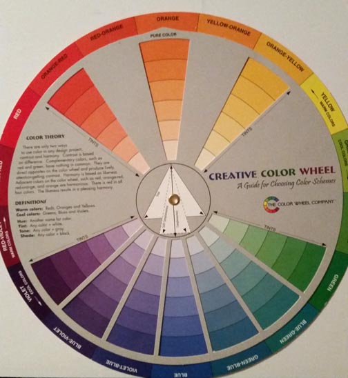
Also, use the color wheel. It is your friend.
I got this sucker for around 6 or 7 US Dollars at a craft store in college. (Click to enlarge). One side is tints and the other is shades.
I used this to help me find the complimentary colors mentioned above, and it also helped me find what colors to use for shading.
So at this point, I have colored the highlights and the shades. There’s just one layer missing…
Oh I know! The mid tones!
I took the colors I wanted for the mid tones in each area, which went a little like this:
Mohawk: Spring Green
Shirt: Canary Yellow
Gauges: Cloud Blue
Camisole: Violet
Piercings: Magenta
Skin: Light Peach
Teeth: Cool Grey 20%
But after I colored the mid tones and finished out a few minor details (like the teeth), I noticed that the shade tones got lifted up a little.
So I went back over the mid tone layer with the shades again. Which went like this:
Mohawk: Dark Green
Shirt: Dark Brown
Gauges: Ultramarine
Camisole: layers of Violet Blue, Ultramarine, and Indigo Blue
Piercings: Mulberry
Skin: Sienna Brown
Teeth: French Grey 60%
Then I added some neutral tones like brown in the linings of the mouth.
The last step was VERY LIGHTLY adding Black on the edges to help delineate shadow.
Finally, at long last…
FINISHED! Click to enlarge.
This portrait is finished!
Looking at it, there are still some errors that I notice (like her nose), but I have to say…
This is the first colored pencil piece of art I have made in a little over five years. I think I did alright. It’s not the best, but it’s not the worst. With practice, I’ll get better.
So what do you think? Should I do more portraits in colored pencil? Let me know your thoughts in the comments below!
In other news, the KickStarter for Seeing Him is wrapping up, and, to be honest, I don’t think we’ll make the goal.
But that’s ok! Kia and I have been talking behind-the-scenes and we have a few ideas for what to do next. I’ll be able to share them with you soon.