Review Day Tuesday: Bartez

bartez book cover

Bartez is a comic I found at Intervention Con, mostly because the author, Ryan, was right across the aisle from me. I never heard of the project before that weekend, so I bought a copy of the book. Once the convention madness died down, I finally sat down to read it.

And you know what? I like it.

Is it life-altering? No. Is it fun? Yes, and delightfully silly to boot.

The story follows Jimmy Barton, an average guy who works in IT, who still hangs out with a lot of his old high school buddies, and lives in the town he’s always grown up in. He’s also a bit of a quitter – he tries new things, but he never sticks to them for very long. Tae Kwon Do? Wrestling? Parkour? Nope, nope, and nope.

That is, until he discovers one of his old friends was murdered by a rogue member of a secret society. And now, Jimmy might be next on the murderer’s hit list! Will he be able to actually stick to something and learn how to save himself?

The book I read is the first volume in a series, but I don’t know how long the series will be. It’s a series I want to read, though! Now let me tell you why.

bartez by ryan peraro and gale williams

bartez by ryan peraro and gale williams

The art, which seems (very) influenced by the likes of Bryan Lee O’Malley and Vera Brosgol, is sharp, clean, and easy to read. In an art style like this it can be easy to make the characters look alike. Thankfully, the artist (Gale Williams) does a wonderful job creating unique character visuals. I could tell Jimmy apart from his friends, and even the ladies look varied and stylized.

The action scenes are sporadic, but are drawn very well. I look forward to seeing what future action scenes in later volumes will look like!

The writing is, at the start, slow. The writer definitely takes his time developing the characters and scenarios, which isn’t a bad thing. I appreciate the slowness a bit because in too many comics nowadays people are rushing to get to the action. In Bartez you’re supposed to see what life is like before things get crazy. And Ryan Peraro does a great job showing everyday situations.

Once things start getting crazy, Ryan has built up the characters and the scenario enough that you believe what happens in the story. It’s actually pretty brilliant.

And you know what? The art and the writing work fantastically together in this comic. There are two creators on the project but it feels like one unified voice. That, to me, is wonderful.

If you want to read Bartez, they have the comic online and in print. My vote? It’s worth the $10 to get the first volume.

Have you found any comics worth reading? Did you read Bartez? Let me know in the comments!

Thank you for reading, and I’ll see you tomorrow with new artwork.

The Art of Chloe Rose

I don’t usually update on Mondays, but when I do, it’s for a friend.

Chloe Rose is not only a good friend, but a fabulous artist. So maybe consider this a bonus Favorite Artist Friday…on a Monday?

Anyway, to Chloe’s work, because it’s worth talking about.

chloe rose artsycloudypard frozen artwork
Chloe made this piece for the recent Toledo Art Walk.

She doesn’t have any webcomics out (yet), but the things she would perhaps be best known for are her fanart (on her Tumblr) and her concepts for her original work, Queen’s Heart.

For example, this is perhaps one of my favorite things she’s done with Queen’s Heart.

queen's heart by chloe rose

Yes, it’s unusually large, but look at it! The colors, the amazing lighting, the visual effects, all of it is still stunning. This was originally made to be a three- to four-foot tall poster as part of a show she exhibited at, and you can see why it needed to be so large: the dichromatic colors and the intense lighting demands to be seen on a larger scale.

Chloe and I actually did a few pieces together, as part of our doujinshi circle called “MACPILT.”

puella magi madoka magika macpilt art piece

fullmetal alchemist brotherhood macpilt art piece

We’re both huge fans of Puella Magi Madoka Magica and Fullmetal Alchemist: Brotherhood, and we wanted to make our tributes to such great characters, stories, and art.

While she does great work with character design and line quality, her best strength (in my mind) is her use of color.

Do you see the Madoka Magika piece above? With the five girls illustrated? That’s Chloe’s mad coloring skills at play. And she has only gotten better since then.

This lady knows how to blend colors, how to design characters with colors that highlight their personalities, how to make light and shadows mix well, and how to use color to show mood. She’s even taught me a few Photoshop tips and tricks, and flipping through her sketchbook always makes me try harder to use color.

She updates her art mostly on her Tumblr nowadays, so if you haven’t seen her other work, you should. She also recently got a Facebook page.

She’s also getting ready to go to grad school, starting this quarter. So, to help fund the effort, you can get either of the MACPILT prints by going to my online store. For September only, all sales from either of these prints will go straight to Chloe, to help pay for classes and things. After that the sales are split evenly between the both of us.

Thanks for reading! And I’ll see you all tomorrow, where I review one of the comics I got from Interventioncon.

Favorite Artist Friday: K.S. Brenowitz

It’s the return of an old feature on this blog, Favorite Artist Friday! Here’s where I highlight an awesome artist I like and admire and talk about their work.

Today’s feature is K.S. Brenowitz, illustrator and artist of the webcomic “Delivery.”

I first met her at Intervention Con this past weekend (I talked about the con itself in a previous post). I had not met her before that weekend, or ever seen any of her work previously.

At first glance, what stood out to me the most in all of her pieces was her incredible attention to detail.

delivery webcomic page 23 by k.s. brenowitz
Click to view the larger image. CLICK IT!


It’s this detail that really adds texture to the art she makes. The tiles on the roofs, the grooves in a bike helmet, the metal grating on the side of a warehouse, all of these things are given depth and surface texture with her marvelous pen work.

(To tell the truth, it drives me to practice more so I can get better at inking. Brenowitz makes me feel like I need to step up my game because she makes me jealous…in a good way).

She also has very imaginative character designs and very fun comic page layouts. As I was going through her portfolio website and her tumblr, I stopped right in my tracks at this piece:

character art by k.s. brenowitz
Click to view larger image.


The vibrant colors! The textured armor plates! THAT SWORD! There’s so much about this design that keeps me glued to the screen to admire it, and try to understand the effort that went into making this.

So not only is her art fabulous, but her writing is just as great!

In reading her webcomic “Delivery,” I was surprised how quickly I was sucked into the story, and not just because of the intriguing page designs, or the overall amazing ink work, or the watercolor washes.

In “Delivery,” she has a great grasp on who the characters are and what they do, and what they will do in the story. I love the back-and-forth banter between the main lead, Clare, and the phone operator, Hassim. Not only that, but she knows how to pace out everything just enough to keep me hooked and turning the pages quickly. The mystery already has me fascinated and I can’t wait to see what happens next.

If you haven’t already, you can read “Delivery” here. It only updates once a week right now but it’s worth the wait.

She also did a smaller project with writer John Skylar. It’s a Convention Health Handout, all about how to stay healthy for your next convention. You can read that here. (Spoiler warning: It’s hilarious and the art is lovely.)

And don’t forget to check out Brenowitz’s portfolio. Check it out, and let me know what you think.

Have any artists that you like? Tell me about them in the comments!

Thanks for reading, and I’ll see you on Monday.

Intervention Con in Ten Points or Less


intervention con hotel 2014

From August 22 to the 24, I was at Rockville, MD for Intervention Con!

It was my first time at this particular convention (and my first time in Maryland, really). It was a get-together to celebrate webcomics, gaming, and an awful lot of Doctor Who.

I could overload you with details about the convention, but I’m going to condense everything into ten points or less so I won’t overwhelm you.

1) If you ever find yourself going from Ohio to Maryland, do yourself a favor and take Interstate 79 to Interstate 68, then onto Interstate 270. That way you can avoid Pennsylvania’s ridiculous tolls.

2) Take a hoodie. The air conditioning in the artist alley this year was freezing. I’m grateful I brought mine.

3) When there are no con-goers coming in to spend money (as happened a lot at this particular convention), talk to the other artists and make some new friends. That’s how I met the folks behind Shadowbinders, Bartez, Capes N Babes, and Lost Gamers as well as lovely artists like Magical Tea Time, K.S. Brenowitz, Tico Illustrations, and Kelsey Wailes (OK, gratuitous name dropping is done for now).

4) The Hilton that the convention took place in had the strangest elevators. Here’s a few pictures of the lobby to give you some context.

2014-08-22 16.01.36 2014-08-22 18.34.05

So you see how there are elevators in the corners? Some of them run only from the third floor to the seventh. Some run from the first floor to the sixth. There are more elevators that will run from other strange floor combinations. You may have noticed there are eight floors in the hotel. Whoever decided these elevators were a good idea must have been H.P. Lovecraft himself.

5) I almost forgot! This was the table I set up with.

intervention con table 2014-08-23 12.04.12

I wasn’t listed as a guest because the billing was mostly given to Christian (the writer of Validation) and Tony DiGerolamo (from The Webcomic Factory). But I was the one with the prints and stickers for Validation, so along I went!

And now I have the books, which leads me to…

6) There are some extra copies of the Validation Comic Con Special! You can get them now on my online store. There’s only five copies left, and if you order them, they’ll be signed by Christian and me. Plus, you’ll get a bonus print for your wall from me!

validation comic con special book print

Speaking of prints…

7) I got some new books and art from some awesome folks this past weekend.

intervention con grabs comic books prints

I’ll be reading the books and reviewing them in a new blog segment called “Review Day Tuesday.” It’ll appear on (surprise!) Tuesday.

And the prints? Will be on the wall soon.

8) If you’re ever in Rockville, MD, please for the love of all raw fish go and eat at Rolls N Rice sushi bar. The gang I went with and I had lunch there throughout the weekend, and every time we went it was all delicious!

There were other places we went out to eat, as well, but I didn’t catch their names. There was a Mexican restaurant that had the most delicious roasted duck (with olives) I’ve ever had the pleasure to stuff my face with.

The convention itself also provided food for the special guests, which was pretty good if you could get it. The food went really fast though.

9) If you’re ever at this con, find alternative parking places besides the hotel. Hotel parking is $18 a night (yeesh!). There are alternatives out there.

And I almost didn’t add this, but what the hey.

10) Sunday was my birthday! So Intervention Con was the best birthday present ever!

I should add a bonus thing: because I met so many great artists this weekend, I’m bringing back a feature I started a while ago, but neglected.

I’m talking about Favorite Artist Friday!

So come back on Friday, when I talk about one of my new favorite artists. I’m not going to tell you who it is yet, though, because it’s a surprise.

“Between the Sheets” by Erika Sakurazawa: The Review

Before I get to the review, I need to do some housekeeping.

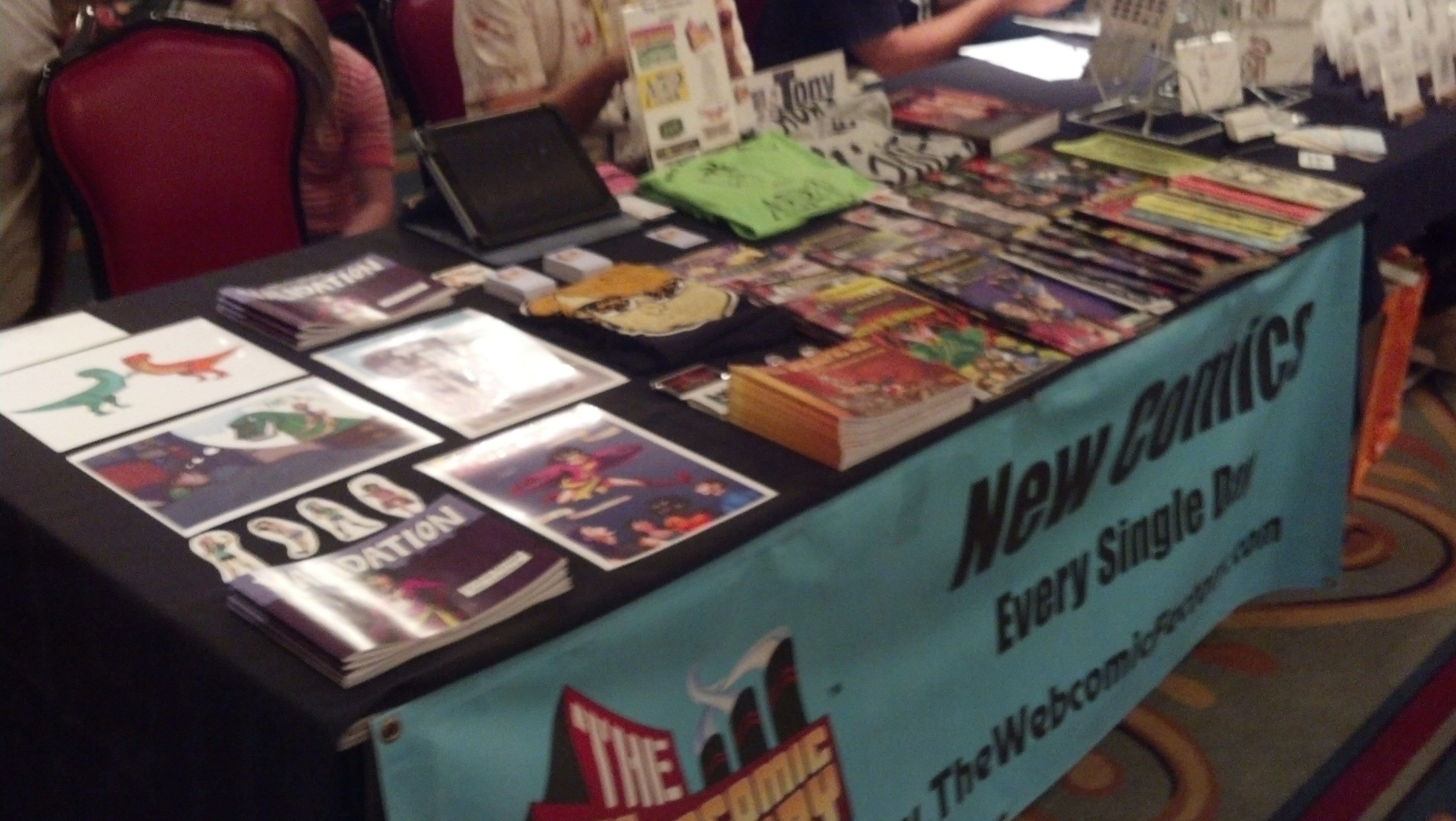
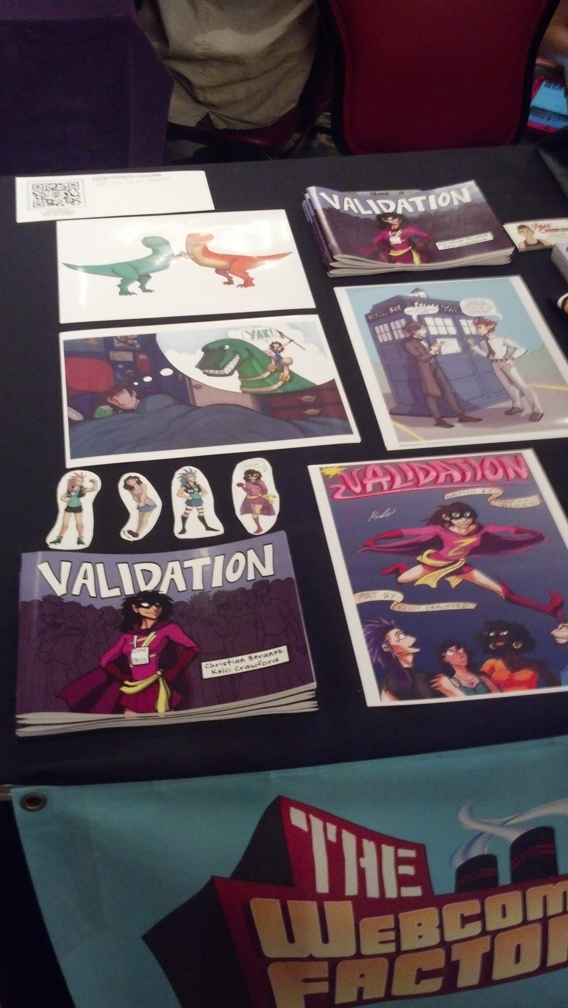
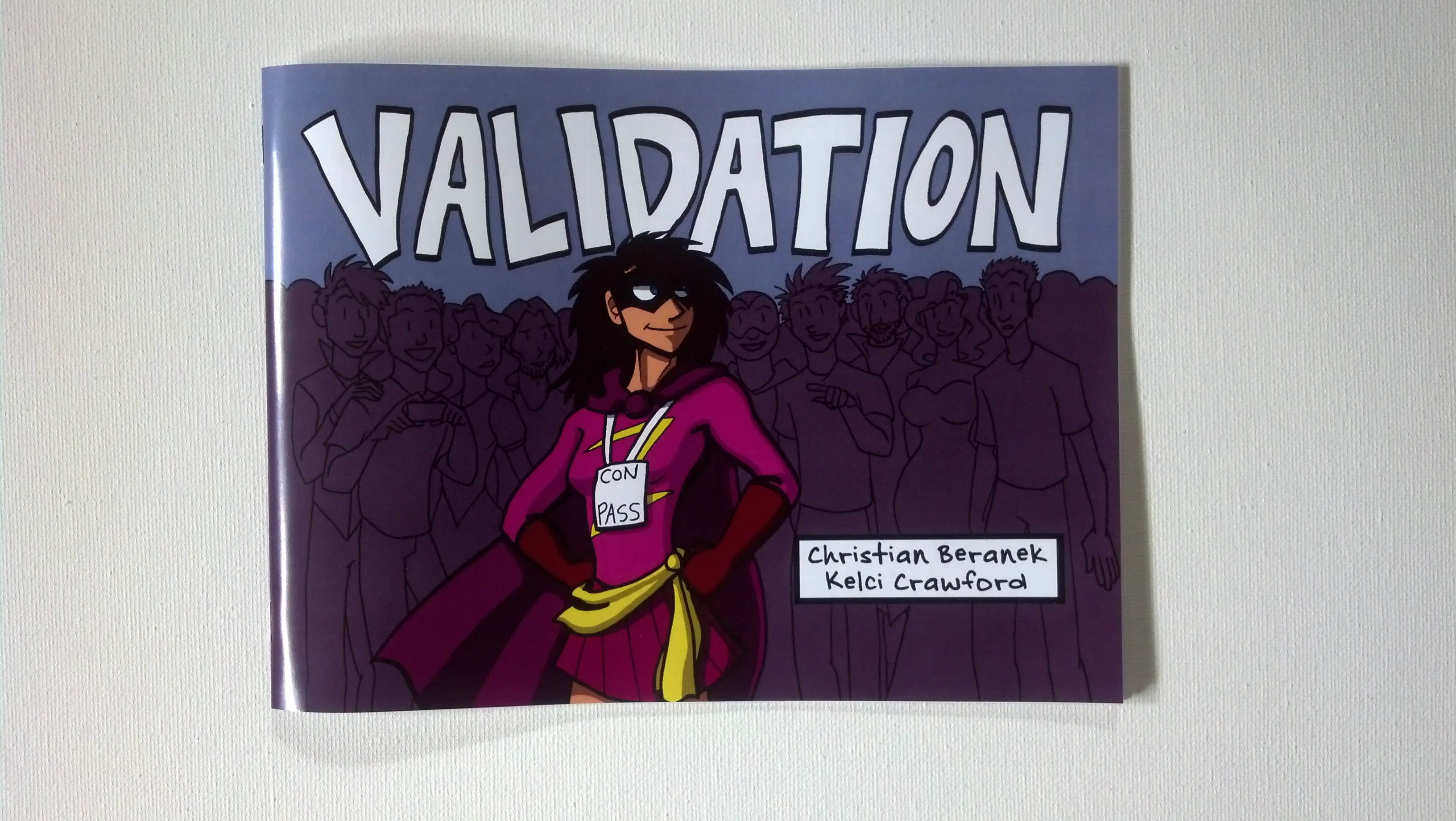
First, I’ll be making an appearance at Interventioncon in Rockville, MD/ Washington DC area this weekend, August 22 through the 24. Christian Beranek and I will be there promoting Validation and meeting everybody, so if you’re in the neighborhood, we’d love to meet you!

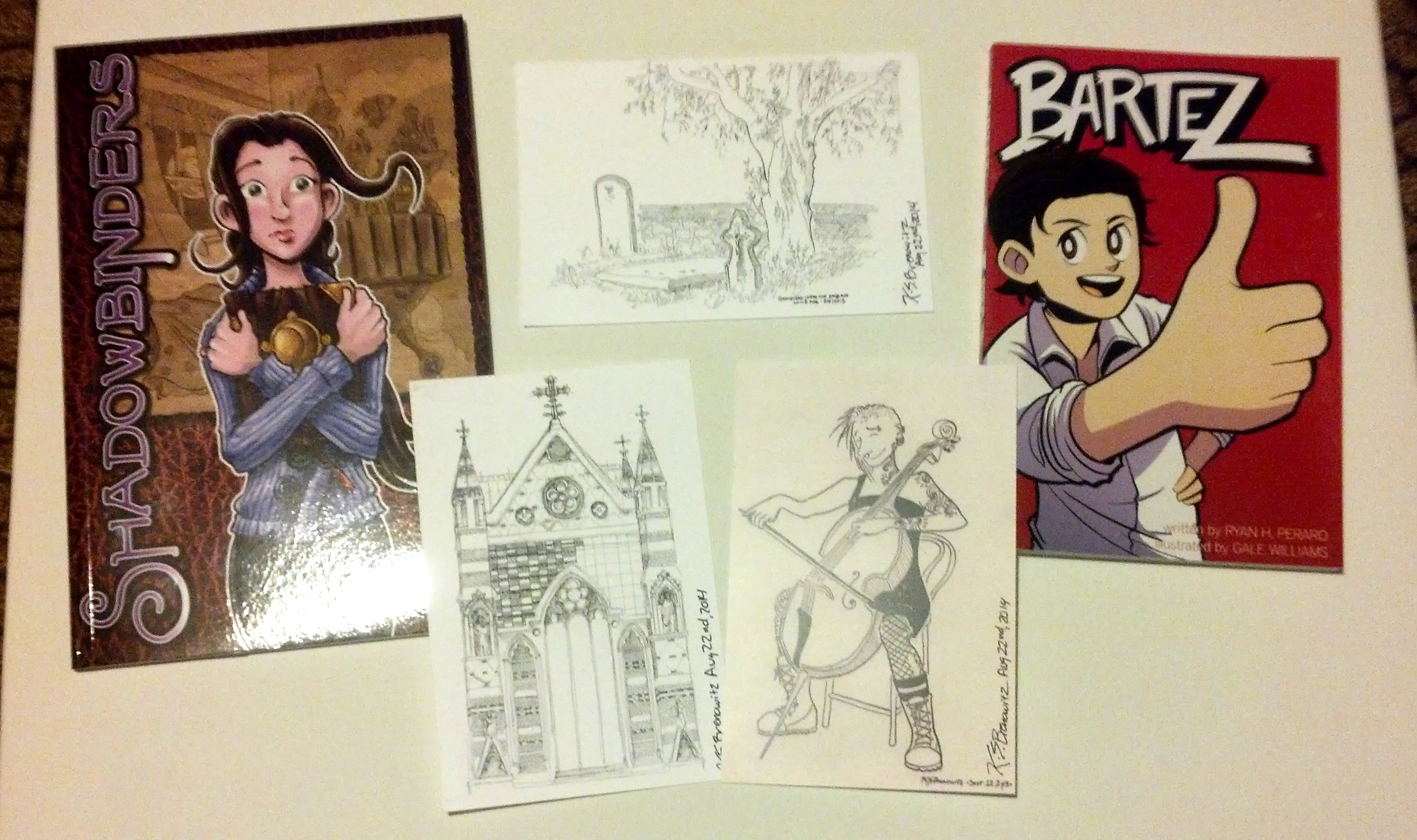
Second, I’ve added some new work here on the site. Check out the Sketches section if you’re interested in some character designs and other works I’ve done recently.

And now, the review, or as I like to put it, “How to Suck at Being A Romantic Lover.”

between the sheets manga cover

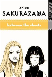
“Between the Sheets” was a rare find, especially since I got the Tokyopop copy, and Tokyopop is no longer a company here in the United States. Special thanks goes to my local comic shop, Hobby’s Inc in Bridgeport, for carrying this and other Tokyopop titles.

I bought this book expecting a great lesbian love story. Did it live up to what I had in mind?

No.

The book can be described pretty well as “watch two awful young ladies in Japan make terrible life decisions about relationships and pull shit to try and make each other jealous.”

The two characters, Saki (who I only know because the main character’s narration never stops talking about her) and Minako, are best friends. But Minako develops romantic feelings for Saki, who unfortunately is straight and keeps hooking up with absolutely terrible men who cheat on her with other women.

It eventually gets to a point where Minako sleeps with one of Saki’s boyfriends in order to prove that he is a grade-A douche and that she’s the only one that cares about Saki by protecting her from these men.

In case you can’t tell, I’m not a fan of this story.

The characters are flat and one-dimensional. You never see them do anything else other than talk to each other about boys. They go out shoe shopping at one point, but only because one of Saki’s lovers works at the shoe store. Saki is the driving force of the story, but she is the only driving force. She’s the reason the other characters act out, which is problematic, because they’re usually acting out to get her attention and love.

The romances (if you can call them romances) are actually quite poisonous. Saki herself has a double standard – where she can have affairs but her sexual partners aren’t allowed to have them (or at least, let her find out about them, as she tries to justify later). A relationship should be built on trust, and Saki is more than willing to break those bonds of trust for her own gratification.

Sadly, Minako is still in love with Saki, thinking that if only Saki could recognize her love, she would recognize she was a fool and just run away with Minako.

Except, no. That’s not how people work.

And then Minako sleeps with Saki’s partners in an effort to 1) get as close to her as possible, and 2) make Saki realize that the men in her life are terrible and therefore run to Minako, who is safe and wonderful and the “only one who really loves her.”

That is exceptionally problematic. Jealousy and bitterness are not sound foundations for a relationship of any kind. Sleeping with your best friend’s partners is an even bigger no-no, because it breaches trust with not just the partners, but with your friends.

Minako finds out about that at the end of the story (I’ll spoil it for you) when she tells Saki she slept with her boyfriends. Saki slaps her in the face (no surprise there) and screams at her to leave and never come back.

The story ends with Minako making love to one of Saki’s ex-lovers, and you can tell by the dialogue that they are both still very hung-up about Saki.

To me, Saki is not interesting enough to be a driving force in the story. As I said, she’s one-dimensional and that dimension is a terrible human being.

The art is very sparse throughout the whole thing, which sort of makes sense because the author probably wanted the focus to be more on the main characters’ emotions. Still, couldn’t Sakurazawa fill in more panels? Because the story is already empty enough without the unfinished panels and empty pages.

I am not kidding, there are some pages that are just word balloons and one or two faces. There’s no detail in the characters’ costumes or environments, either. The art is simple to the point of being boring and flat, not to mention that the tones are sloppy. A lot of people give Yoshihiro Togashi crap for some of the later volumes of Hunter x Hunter being “rushed,” but at least he made an effort and finished the artwork that he started drawing. Sakurazawa was in such a rush to make this story that sometimes whole pages are left empty and white and the tones are all over the place, like she didn’t have the time to clean up. Were her deadlines just brutal for this project? I don’t know.

In conclusion, “Between the Sheets” is a book you can definitely skip. There are, I’m sure, other lesbian love stories out there that are better crafted and care more about the characters than what can be seen in this work. Want a good place to start? Try Ai Yazawa’s work. She has far more enjoyable characters, facial expressions, and romances.

Know any good comics or manga I should review? Suggest them in the comments!

Also, I’m looking forward to meeting you all in DC for Interventioncon!

Thanks for reading, and I’ll see you on Wednesday.