This post does contain affiliate links. Bear with me.
So this started, initially, as a multi-part blog post series.
Then it got complicated.
Specifically, the art got complicated, and I wasn’t able to make a new blog post each week to detail the process of making this thing.
Let’s go into the details, though, so I can show you WHY this art took so long. And also how I make big illustrations like this one.
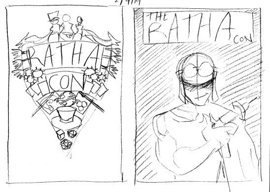
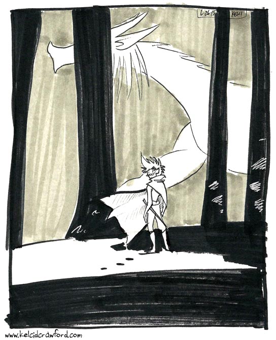
STEP 1: THUMBNAILS
Thumbnails are what I like to call the really rough sketches of an idea. It’s something I borrowed from animation film language.
I already wrote a post about this step, which you can read here.
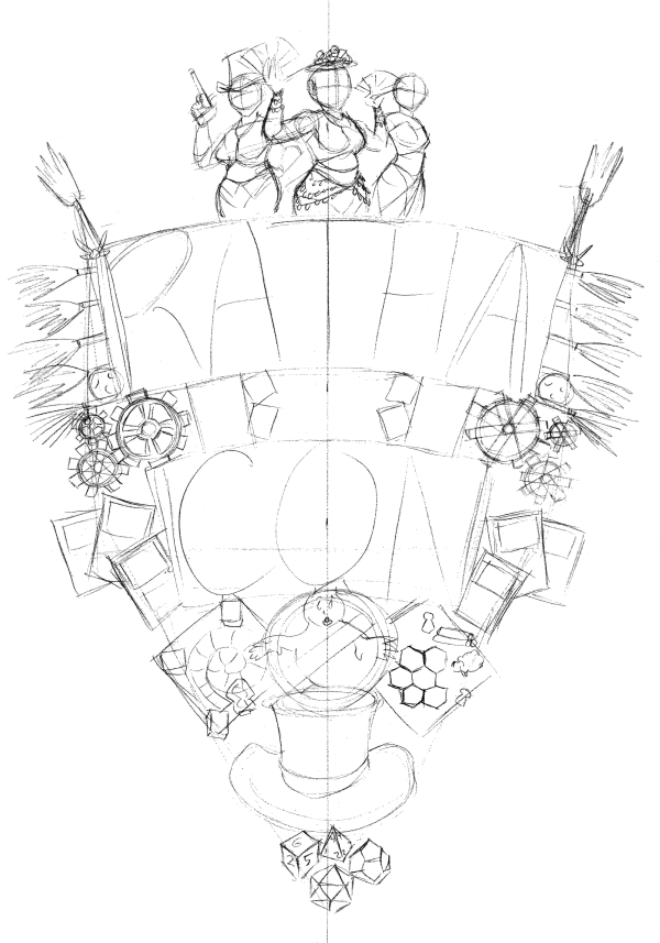
STEP 2: PENCILS
I wrote about why I choose this design, as well as the details of it, in the second part of the blog series. Now I’m going to get into the how.
It took a little while for the email chain with the convention staff to start (another reason that the weekly blog post idea had to get pushed). But once it got going, I was able to get feedback and get to work.
Pencils – or, the sketched the version of a thing – is something I do with just one pencil in one go.
When I first started in comics, I USED to do the undersketch with one pencil (usually a 2H), then the top layer in a darker tone (like B).
Now, I do all of my pencilling with just one pencil. Usually a mechanical one. I believe the RathaCon art was drawn with my Tombow monograph mechanical pencil, but right now I am in LOVE with the Zebra DelGuard mechanical pencil.
STEP 3: INKS
This step takes a deceptively long time.
It takes a long time for me because I try to control the line weight as much as possible: making some areas dark with a bolder line, but light with a lighter line.
Inking is also the stage where I have to squint at my pencil drawing and determine what lines will look the best when inked.
Because pencils are when I get real loose. Inks are where things get tight and snappy.
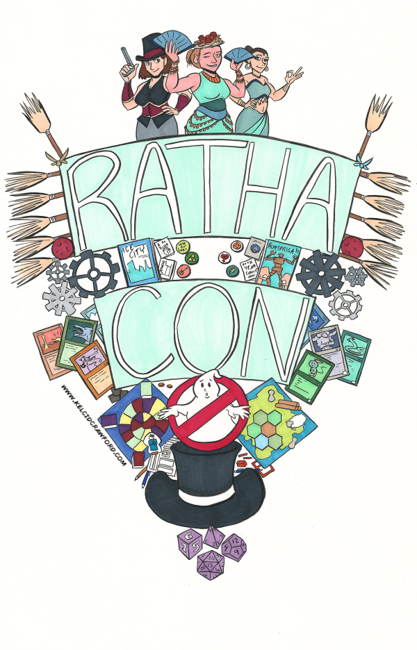
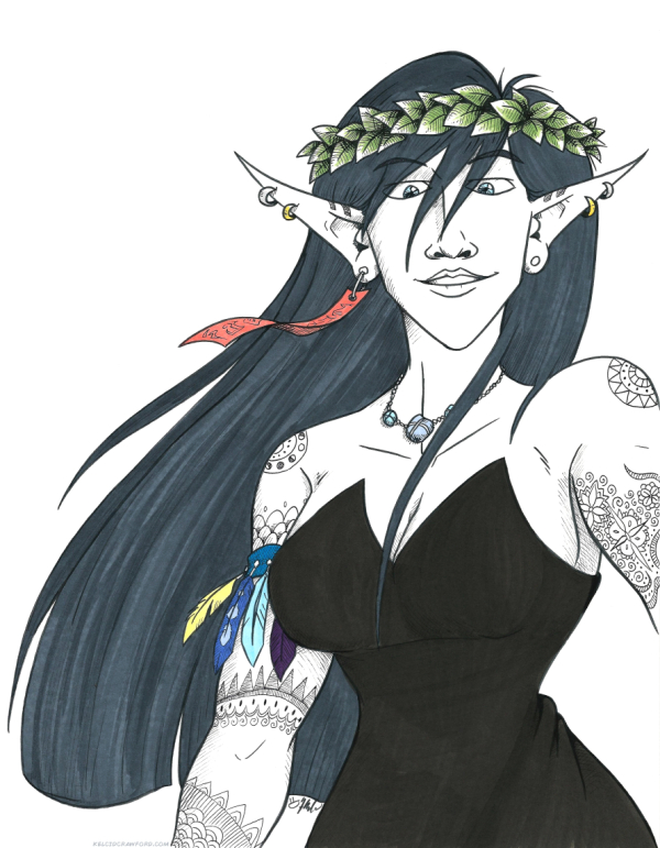
STEP 4: COLORS
Depending on the piece, I’ll make it either traditional-only (usually with Copic markers). Or I make it a combination of traditional and digital. Or I have all the colors be digital.
For the RathaCon print art, I opted to combine the traditional and digital modes. So I colored with my Copics first, then scanned the art, to start the next step…
STEP 6: DIGITAL EDITS
At this stage I go back over the art in Clip Studio Paint and erase any stray marks, fix any color bleeds, and generally just clean the piece up.
I also like to adjust how much the colors pop at this stage. So I play with the levels a little.
STEP 7: DIGITAL COLORS
With the RathaCon art, the only digital color I needed to add was the background tint.
In almost any other piece, I’ll add a layer over the art in Clip Studio Paint in order to add shadows. These make the art pop even more.
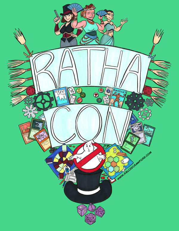
STEP 8: FORMATTING
I originally made the art for this print at 11 x 17 inches.
About a week ago, the RathaCon staff asked if I could make the piece an 8.5 x 11 inch one instead.
Pro tip: it’s WAY EASIER to shrink an illustration than to enlarge it.
It took a little wiggling to keep the scale of the piece consistent and not accidentally cut off bits of it. But a new scale was figured out.
And there you have it!
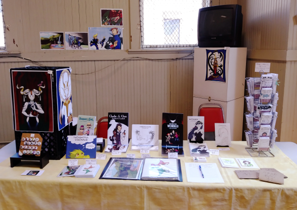
As I mentioned, this art will be available as a limited edition 8.5 x 11 inch print at RathaCon, for $10 a piece.
So if you’re in Athens, OH on April 27, I hope you get it! This is a limited print run, so once it’s gone – it’s gone.
I’ll have these beauties for sale at my table, and they’ll also be available at the RathaCon official table.
Thank you for reading!
You. Are. Awesome.