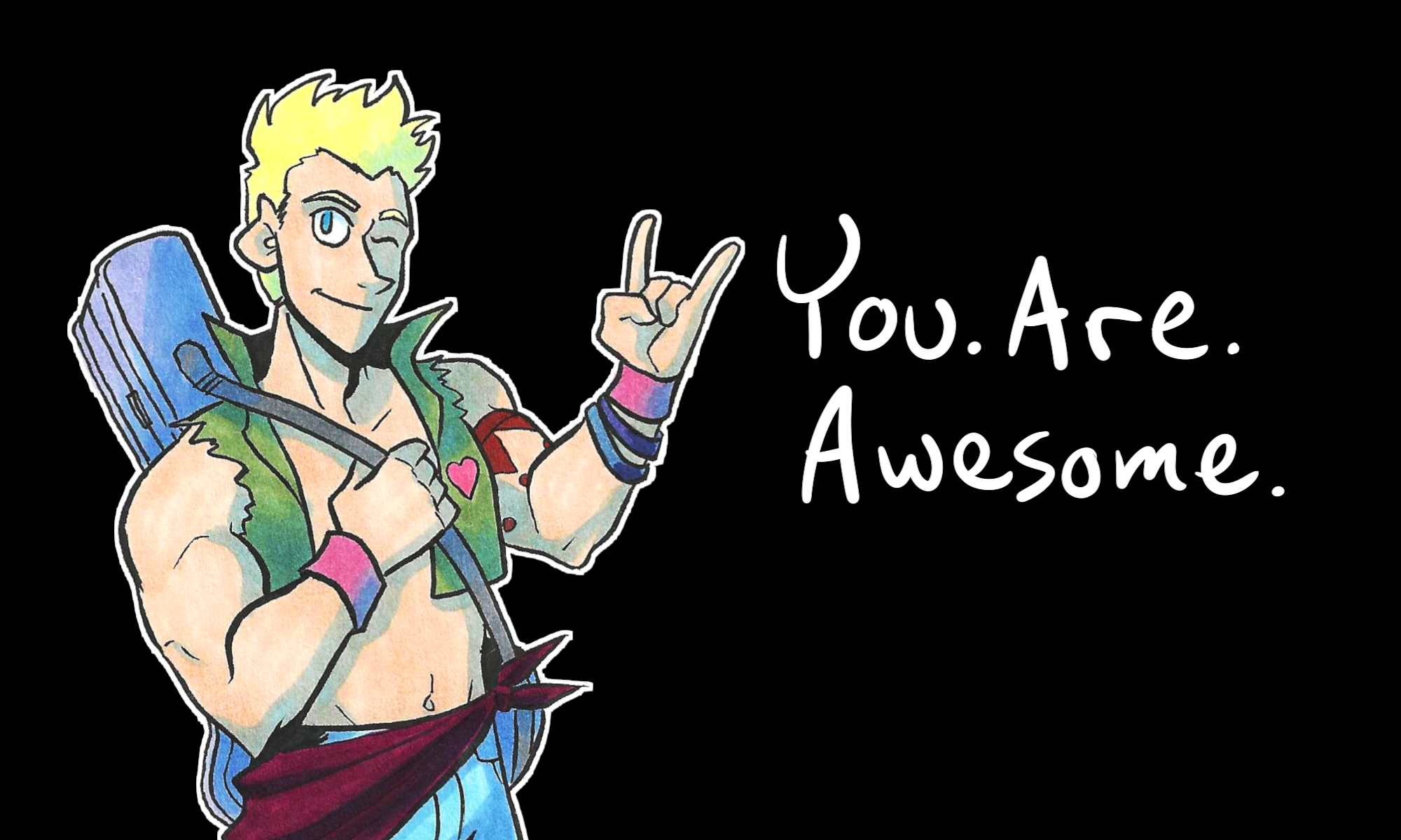
Today, I’ll show you how I use Trello to track and manage all of my comics and projects!
I have been using Trello for two years now. It has been an absolute game-changer for me and how I organize my projects. If you’ve ever wondered how I’m able to make so many comics, give this a watch.
Members of my Art Club saw this video before it became public. If you would like to get early access to tutorials (and club-only downloads), join on my Subscribe page.
Oh! If you’re in Toledo, OH, I’m at Toledo Game Room tomorrow (May 6) for Free Comic Book Day! I’ll have discounted merch and other cool stuff.
That’s all for now. Thanks for bearing with me and my shameless plugs. I gotta get back to packing boxes for Free Comic Book Day and the upcoming move.
Hold on to your seats, because I’m about to reveal how I have run 11 Successful KickStarter campaigns.
And unlike some folks, who put these kinds of secrets behind a pay wall, I’m sharing this learning for free in today’s post.
I started running campaigns specifically for comics way back in 2013. And I’ve averaged 2 or 3 campaigns per year since.
Now, here’s the thing: if you’re looking to raise millions of dollars, these tips COULD still help you. But keep in mind these things…
The most I have raised in one campaign is a little over $2,000, for Validation’s Final Push. This is still 419% of the asking goal. That said, I HAVE run one campaign that raised 800% over the asking goal.
How did I do it? Well here are my tips:
Know your BARE MINIMUM that you need to make a project happen.
Do the math. Factor in costs to print, shipping orders, KickStarter and credit card fees. Add up anything that could cost you money for the project. Know the bare minimum amount that you need to make your project come to life.
This is NOT the time for bells and whistles. If you’re raising funding to get a book printed, know the minimum you need to get JUST the book printed. And ONLY the book.
Often when I see first-time KickStarter campaigns launch, the asking goals are $3k or more – and yet the audience for it cannot raise that much.
And the asking goal is set so high so often because the math is just inaccurate. Because these folks ignore the next point…
Set the rewards to be easy on the budget – and related to the project.
Most of my campaigns are to get a specific product printed. Usually a book. So my rewards are copies of the book, MORE copies of the book, other books I have excess stock of, and something easy I can fulfill with little cost to make. Like commissions!
Often, when I see an unsuccessful KickStarter – and yes, this includes one failed campaign I have under my belt – the campaign fails because of one thing… The rewards offered cost extra to make. And the creator tries to tack on the cost of making those extra rewards onto the overall asking goal.
So for example: a creator may only need $600 to get a book to print…but they think “I could offer stickers! I’ll offer 3 different designs!” But those stickers cost an extra $500 to print. So they add it up and ask for $1100 on the campaign as the initial goal. But wait, there’s t-shirts they wanna make! And those cost $500 more to print, so they add it on and –
You see where this is going. Eventually there are so many rewards offered that the creator THINKS are essential. But they are stretch goals.
Offer stretch goals for after your bare minimum is met.
Stretch goals are goals to make when your campaign raises extra money past the initial asking goal.
Stretch goals are THE THING TO USE when you have extra products you could make, but are not considered essential to make it happen.
For example: if you want to get a book printed, stickers and T-shirts are NOT essential to make it happen. Make those your stretch goals.
Whether you succeed or not – POST. UPDATES.
I’m speaking here as both someone with successful campaigns AND as someone who has backed other campaigns. A creator who posts updates on the KickStarter page, before AND after the campaign ends, is a good creator.
I can count on one hand the number of people I have backed on KickStarter who have not posted updates. And those are the same number of people I would not support again if they launched another campaign.
Posting updates, even irregularly scheduled ones, is still better than dropping off the face of the earth.
And yes – you need to post these updates on the KickStarter page. There’s a link in the creator menu called “Post Update.” USE THAT FEATURE.
Updates can be little things or big things. Just keep your backers in the loop regarding the progress of the project they helped you launch.
Hopefully, with these tips, you can launch your own successful KickStarter, and make your project happen. I believe in you.
If you have any other questions, leave a comment below!
One of the backers of The Legend of Jamie Roberts, Chapter 1 had asked to see some scripts for the comic as part of the PDF reward. This question made me realize that my scripting process is not like how I’ve seen other comics makers work on their scripts.
Why?
Well, most comic makers I know only WRITE the script. Usually in a movie-script-like format, in which it goes like this:
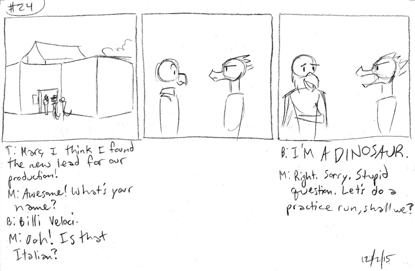
Panel 3:
Billy stares at Marc Macaw in disbelief. Marc Macaw realizes his gaff and smiles a bit sheepish.
BILLY: …I’M A DINOSAUR.
MARC: Right. Sorry. Stupid question. Let’s do a practice run, shall we?
Truth be told, this format is how I write my rough draft of my comic scripts.
The only comic I’ve made that this didn’t apply to was Johnson & Sir. That one, I wrote out the story page by page. It’s not a method I would recommend to anyone unless you’re writing gag comics.
Rough Draft: type it up in my version of a comic script format.
Second Draft: Read the rough draft and thumbnail the pages. I make adjustments as I go.
Sometimes the second draft is a re-typing of the rough draft. If that’s the case (like with The Case of the Wendigo), the thumbnailing stages will actually be my Third or even Fourth draft.
What are thumbnails?
This is a term I stole from animation – it means to VERY roughly sketch out how a page looks. I’m talking stick figures and bubbles. Thumbnails are in a sketchbook and are meant to just show how the page would look in a rough layout.
I find thumbnailing the pages to be helpful, even if I wait several months between the rough draft and the thumbnail draft (or, Thumb Draft, if you will).
When I work on the Thumb draft, I can sketch out how the page looks according to the script. And if I don’t like how many words a character says, or I don’t like how certain scenes pan out, I can draw a different result.
As a visual person, it helps me to SEE how a scene pans out, rather than just read about it.
So if you’re having an issue in your comic script, try drawing it out in rough stick fugure-ish form. It may help you visualize the scene easier.
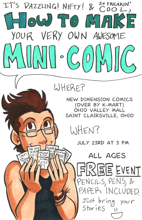
I just finished this little flyer for a workshop I’m running next weekend – New Dimension Comics in my area is having Not-At-Con Day on July 23rd and I’m running a workshop on how to make your own minicomics. If you can’t make it to this one, no worries – I’m planning on running another workshop in Wheeling, WV sometime after August 4th (dates are still TBA).
I’ve been doing a lot of flyer-type work lately outside of comics. I wonder if it’s a sign…
I’ve been drawing with watercolors for about 8 years now. I’m not a professional (at least, I wouldn’t consider myself such), but I’ve picked up a few tricks.
This is good because when I look online for the basics of how to get into watercolor drawing and painting, I’m frustrated with how hard it is to read the information.
It’s a shame because watercolors are one of the most fun mediums you can experiment with.
Do you have to draw landscapes? No, not unless you want to. You can draw whatever you want with watercolors.
(There are even some watercolorists who design awesome tattoos, but that’s a different topic for a different day.)
But where do you start?
Well, first, I want to talk about the tools.
We’ll talk about how to use them, and what to draw with them, in the next post.
So what do you need to start painting and drawing with watercolors?
A sample of the tools you’ll need.
First, you need two containers for water. The first one will rinse your brushes. The second one will be what you use to dilute colors.
Second. Brushes. This is really up to personal preference. However, keep in mind that in art stores there are brushes specifically made for painting with watercolors. These are going to be your best choices.
These brushes come in either of two types of hairs: synthetic, and natural. Again, your personal preference. My personal preference is for those made with natural hairs, because they retain water for longer.
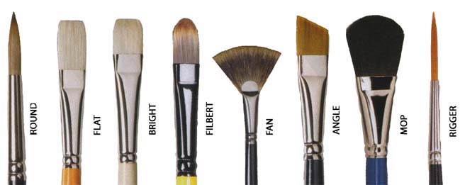
Brushes also come with a variety of tips on them. Each tip is used for a different techniques.
Here’s a handy chart.
Third, a rag.
Or a paper towel, or wash cloth. Or a dirty shirt. Anyway, You need something to wipe your brushes on between colors.
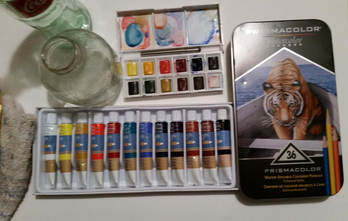
Fourth, the paints.
The paints come in three forms – cakes, tubes, and watercolor pencils.
Watercolor cakes, tubes, and pencils.
These have their own pros and cons.
Cakes are easy to carry, are perfectly portable, and come in a set. However, the color range can be limited, they’re tricky to mix, and the colors are more transparent (meaning you can see the paper underneath).
Tubes come in a large variety of colors and are easier to mix than cakes. They are also very opaque, meaning you can hardly see the paper underneath. However, they take up space and you need either a palette or palette paper (which is waxy) to mix them.
Watercolor pencils are unique. They work like colored pencils, and you can color with them like such. Then you add water in strokes and voila! You have a watercolor piece.
Watercolor pencils are easy tools to work with, and it’s easier to get gradients (which are swaths of color moving from dark and opaque on one side, to thin and transparent on the other) with these tools.
The drawback to these tools are that, like cakes, color selections are somewhat limited, though some sets have a nice range of colors. The other drawback to this tool is that they leave behind a texture, which can be a problem if you want a smooth color.
Back to supplies. You will need…
Fifth, a painting surface.
The best surfaces to paint watercolors on are papers. The best of the best are mixed media papers (which are nice and thick), Bristol paper (which is often smooth), and watercolor papers (which are thick and toothed. Toothed paper means it has ridges, which helps retain water).
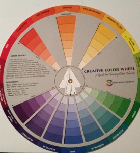
Sixth, a color wheel.
This is a necessary tool for any artist. It shows the primary, secondary, and tertiary colors on the color wheel, as well as their compliments, analogs, tints, and shades.
Preferably, this scrap paper will be the same type of paper you’re painting on. With this, you can test and mix your colors before committing them to your final painting. This is also the best surface for mixing cakes. I’ll talk more about how to do that later.
Those are the tools you need to get started with watercolors. I’ll talk about techniques, tips and tricks in the next post.