Time for some updates that aren’t related to the KickStarter for Johnson & Sir: The Collected Comics (which is going really well and you should totally show some support by checking it out, wink wink. Ok I’m done).
I have a ton of personal projects in the works, and I realize that it may be super confusing for you to keep up with all of them. Sometimes I myself have a hard time keeping up with the ones that don’t update online.
So, to make things easier for you and me, I’m making Wednesdays into a new feature,
I found out about this show from my friend Chloe, a grad student at the Savannah College of Art and Design. She and I are going to be in the Artist Alley April 25th and 26th, showing off and selling our work. If you can make it, I would love to see you there!
And if you want to help fund another campaign, Pink Dollar Comics (the soon-to-be publisher for Seeing Him) is raising funds to get to Flame Con. So if you can, pledge and spread the word for them too!
When I come back (on Tuesday), I’ll tell you all about my trip.
And, who knows? There may be a sale on my Storenvy soon after. ;)
So in yesterday’s post I talked about what I feel like makes bad character design for comics.
To be fair, creating unique designs for characters is hard, especially in comics. It’s too easy to fall into formulas and make your characters suffer Same Face Syndrome, or its cancerous cousin, Same Body Syndrome. (Don’t know what I’m talking about? You should have been here yesterday.)
It’s not an easy question to answer, even if you’ve been making comics and animated works for YEARS. What makes great characters tends to vary from artist to artist.
However, I try my best to keep these points in mind. Good character designs in comics (to me)…
express the full range of human emotions,
are visually individual from each other, and
embody necessary elements in your story.
Let’s take a look at some of my own character designs.
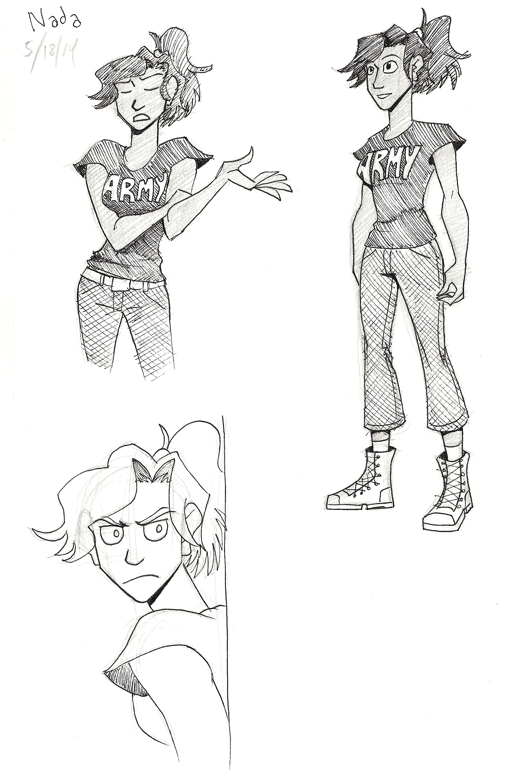
Character sheet for Nada.
Nada is a character I created for a work-in-progress, where she and several children are trying to escape a haunted house. Nada loves the wilderness, exploring, and practicing her survivalist skills. So in her design, I gave her sturdy hiking boots and a pair of pants that wouldn’t snag on anything from long sleeves, but still protect her legs from ticks and burrs. She’s still feminine in that she keeps her hair long, but she’s low maintenance and would rather keep her tangle of hair pulled back.
Let’s look at another story, which has the working title The Hoard.
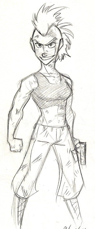
Claire.
Claire is a tough cookie. She’s also sharp and abrasive, which is why I drew her with sharper angles, especially in her face. She’s also muscular, having fought against the zombie hoard for a few years. Her clothes fit her snugly – she has no time for loose things to snag onto obstacles. She needs to do her thing quickly and get it done.
Let’s compare her to Tracy.
Tracy’s character sheet.
Tracy has softer edges and curves, including a round face. That’s because she’s much more innocent and timid than Claire is. Compared to Claire’s hardness, Tracy is squishy. She also has more introverted body language – she keeps her arms in and her mouth shut. Compared to Claire’s open and fierce body language, Tracy is quiet. She compliments Claire nicely for the story.
Ok, so what about in something like Validation?
Let’s look at the progression of Ally.
Ally in the first strip, compared to strip #151.
This isn’t just a comparison to see how my art improved over time. There’s some subtlety going on in Ally’s design.
When she first appears, her hair is much straighter, she’s quiet in her demeanor, and she keeps to herself for the most part.
As time goes on, she gets more outgoing, more outspoken, and that gets reflected in her appearance. Her hair is much looser and wilder, and she’s not afraid to wear a shirt that says “Boss.”
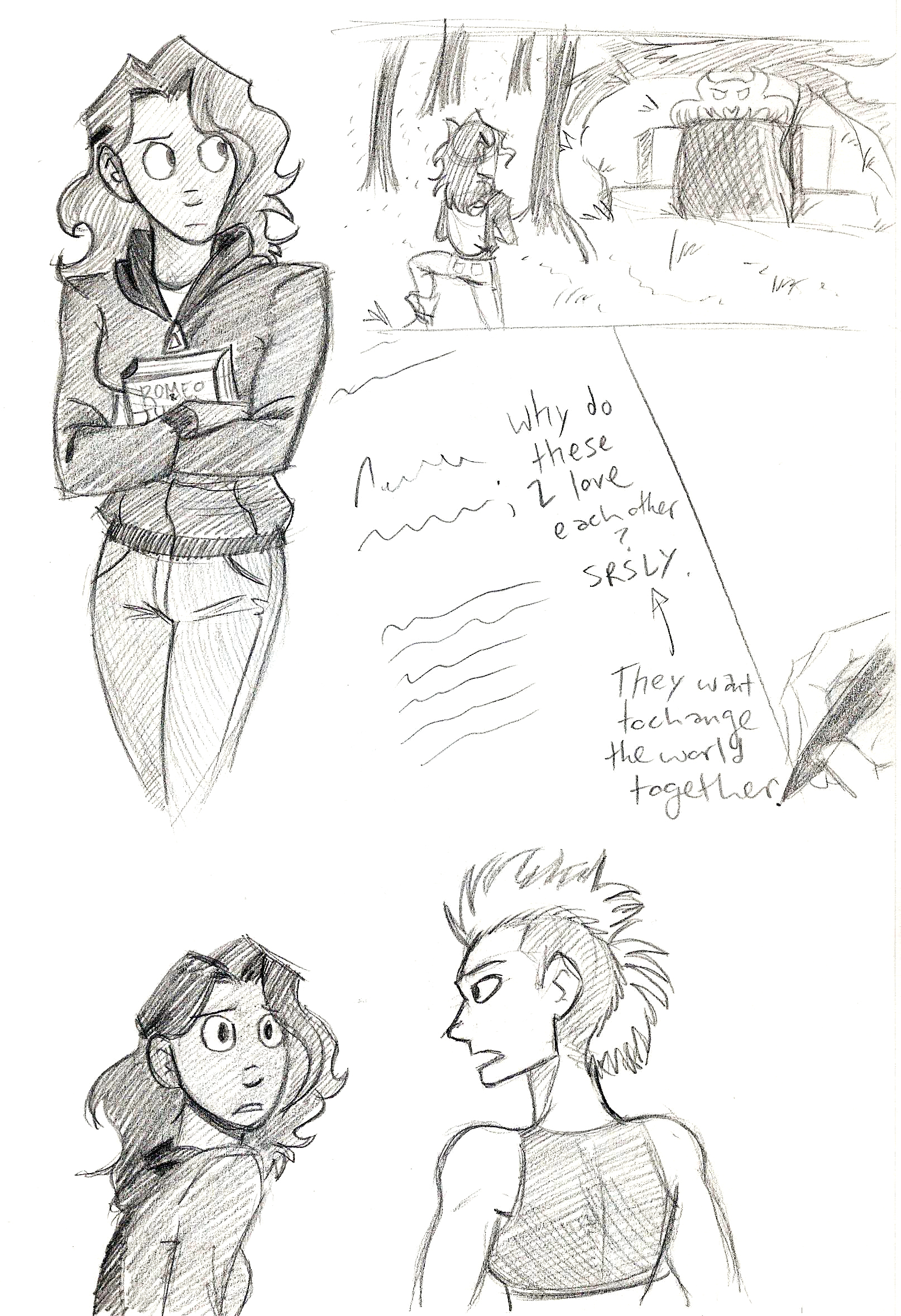
We can also see a change in Roxie, especially in one particular arc.
It’s almost like Roxie is two different people.
Roxie is a punk. She is loud, she is funny, she is energy personified. Even her hair is electric!
However, in a rather dramatic story arc, she hits a slump. She retreats inward and loses a little of her spark. Usually, her mohawk has vibrant color, but in her slump, her hair is apathetically white and lifelessly blank. Her hair is limp, her energy just sucked out of her. And instead of standing straight and proud and emphatic, she slumps over, drawing herself in, away from the world.
Thankfully the downturn doesn’t last long, but it’s still dramatic enough that her appearance changes to match her character.
There are even more character designs I want to show and discuss, but that will have to wait for tomorrow – I don’t want this post to get too long!